Baseball stats are ideally suited for display using a wide variety of charts, network graphs, and other visualization approaches. This is true whether we are using spreadsheet tools such as Microsoft Excel or OpenOffice Calc, data mining tools like Orange, RapidMiner or R, network analysis software such as Gephi and Cytoscape, or web-based visualization tools like D3 or Tableau Public. The sheer scope and variety of available baseball statistics can be brought to life using any one of these or countless other tools.
This is why I felt the need to create a book merging the rich statistical and historical data in the baseball archive with the advanced analytic and visual capabilities of the aforementioned tools. With a bit of good luck and perseverance, the book will be published in late April, coinciding with the early stages of the 2016 baseball season, under the title Baseball Grafika. This series of articles will share a few pieces from the book, which is still undergoing additions and revisions at this stage. I hope these will help provide some insight into how I view the possibilities for visualization, and perhaps generate your interest for how other datasets could benefit from a similar approach.
One of the chapters of the book deals with the creation of dashboards in Excel that allow us to distill large datasets into a single page summarizing information. Here’s an example of a single pennant race, and how it’s unique story can be told using an array of charts, tables, and graphics.

Now that we’ve seen an entire dashboard, we’ll look at the component pieces and how they were built. As a reminder, this is all created in Excel, which is often maligned as a visualization tool. Used well, Excel can produce highly effective visualizations, although deploying them to the web is not practical. In the book, I walk through how to create this dashboard using Excel, taking readers through all the steps needed to create formulas, charts, text summaries, and more.
Creating flexible, powerful data displays in Excel frequently involves the use of pivot tables and slicers (filters) that allow for data manipulation. Building charts on top of these tools permits maximum flexibility. Done effectively, this means we can create a template that can be used over and over, with only the source data changing according to our slicer selections. Here’s an example pivot table with slicer options:
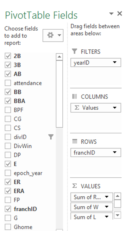
The slicer selections allow us to choose the data elements from our base dataset that are to be displayed in a pivot table. From there, name ranges and formulas can be used to select the data programatically, and feed it into charts that are not dependent on any additional manual intervention. One chart, used over and over, makes it simple to display new data with a single click of a slicer button.
Name ranges can be used extensively to automate the dashboard to a high degree, using native Excel functionality. Here’s a screenshot showing a name being defined in Excel:
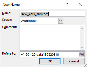
A virtually unlimited number of name ranges can be created, and then used as references in Excel cell formulas, making it easy to populate cells, tables, or charts with updated information.
Each of the following sections of the final dashboard are populated using one or more name ranges based on pivot table data in most cases. All that is required in the dashboard is a simple formula to grab the right data based on the slicer selection.
First, we create a basic text summary recapping each season, which is then pulled into the top section of the dashboard:

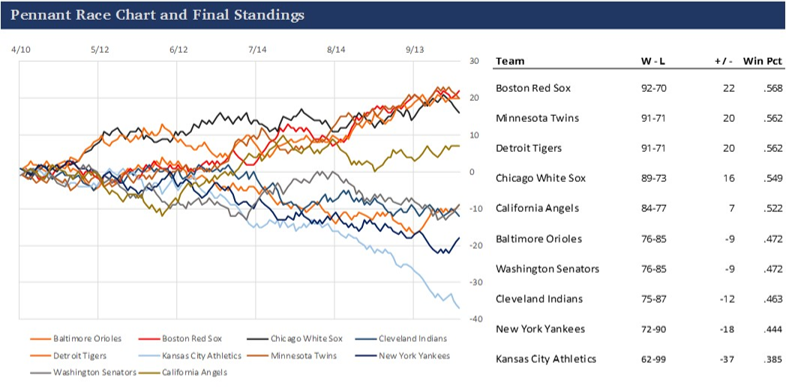
This is then followed by the pennant race section of the dashboard, including both the pennant race charts as well as a table of season-ending standings information. One pivot table and its references populate the chart, while a second pivot is used to provide the table data, with cell-level formulas performing calculations.
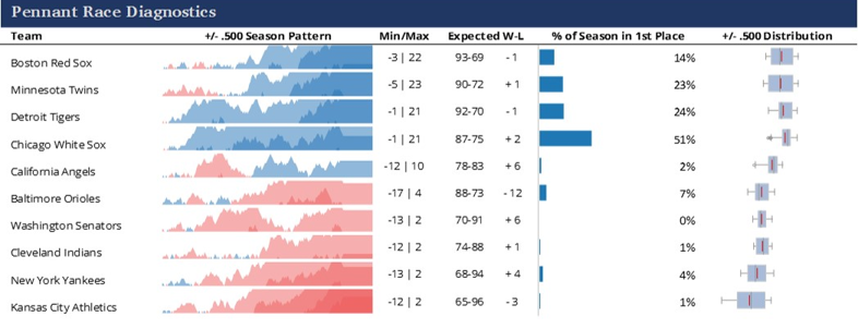
Our third section makes use of the wonderful Sparklines for Excel add-in. Our dashboard benefits from the use of horizon and variance charts, as well as box plots. In between, we’re able to add some additional Excel cell calculations to display metric values.
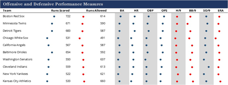
The final section of the dashboard takes advantage of some cell formulas to create dotplots displaying relative values within a category. This allows readers to see who was higher or lower in a specific measure, maximizing space along the way, which is often critical when building dashboards.
The book will provide much more, including tutorials on creating this type of dashboard, in addition to other visual displays of baseball information. Ultimately, the goal is to share some of my approaches and hope that they drive others to create their own unique approaches, all in the interest of advancing the discipline of baseball data visualization.
Future posts will examine other ways we can explore our baseball data. Text mining, statistical distributions, interactive charts, historical maps, and network graphs will be among our future topics. See you soon.