The last of my big three annual updates is now complete, as all 2016 & 2017 pennant race charts have been created, and now reside in the Visual-Baseball Project portfolio. These charts are created using NVD3, which is built on top of the powerful d3.js framework developed by Mike Bostock. These tools help make the charts highly interactive, allowing you to see where each team stands at any given point in the season, and also providing the ability to zoom in using a smaller sub-chart beneath the primary display.
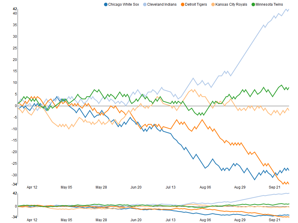
The structure of the charts is based on every team’s relationship to a .500 winning percentage – a situation where a team wins exactly as many games as it loses. This structure allows for easy interpretation of the results, as we can see which teams hover near the .500 mark (i.e.- consistent mediocrity), others that rise well above this level, and also those teams that descend far below the breakeven point. Allow me to illustrate these thoughts using the 2017 American League Central division, and my hometown Detroit Tigers, who suffered through their worst season since 2003.

As you can see, the darker orange line representing the Tigers takes a steep dive starting in early August, culminating in a final record 34 games below the .500 percentage. Meanwhile, the rival Cleveland Indians (light blue line) present a near mirror image of the Tigers failure, with a sensational month of September that ultimately lands then 42 games over the .500 break-even level.
Similar charts have been created for the other divisions for both the 2016 & 2017 seasons. In fact, you can now view any season, league, and divisional splits dating back to the 1901 campaigns, a total of 380 pennant races to explore! Find all the pennant race charts here. Have fun exploring, and as always, thanks again for reading!