A few years back, I created network graphs for many MLB franchises, using data from the Lahman Baseball Database. These graphs displayed the connections between teammates throughout the history of a given franchise from 1901-2013. Any players who were on a roster within the same season (or seasons) were connected to one another, with each node in the network representing a single player. These were then sized to reflect the number of seasons played with that franchise. Every graph was customized by using one or more of their official team colors, resulting in a visualization like this:
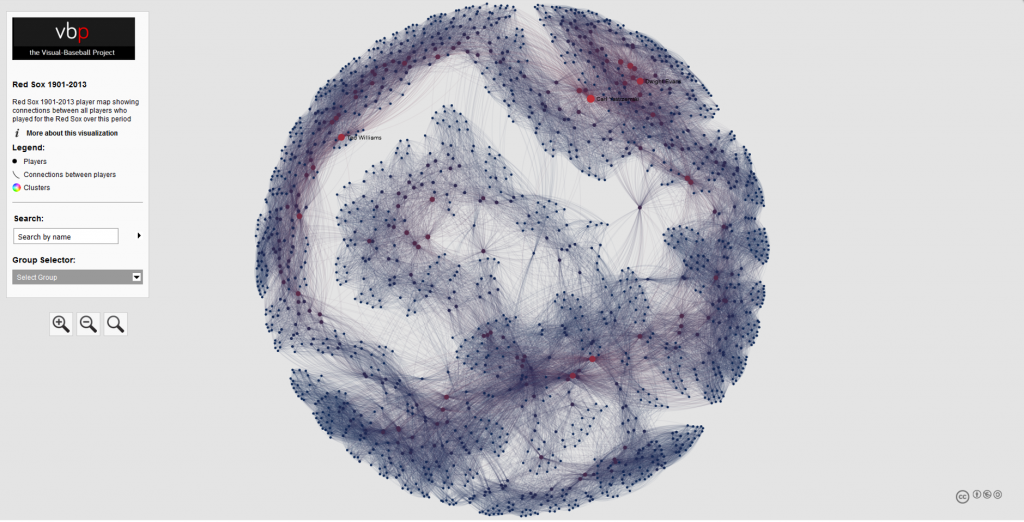
A full roster of the live versions can be found here.
Now that 2019 data is available, I thought it was about time to update the graphs, but this time with a new look that might make the graphs a bit more intuitive and perhaps even more visually attractive. Out of this was born the radial axis franchise graph, as shown for the 1901-2019 Detroit Tigers:

I’m pretty excited about the look the Radial Axis layout provides for this sort of data, and I think you’ll see why it is an effective method for visualizing all the players over the course of 119 seasons. Let’s have a look at the anatomy of this graph.
The graph runs in a counter-clockwise manner, starting with 1901 at the bottom of the graph, and working all the way around until we get to 2019, also at the bottom of the graph. Each set of nodes along the way represents the collection of players with their first Tigers season in that radian. We can see some years where there were many new players (1912 has an exceptional number), while other years had very few new players, 1915 being an example. Here’s a general diagram to help with this concept:
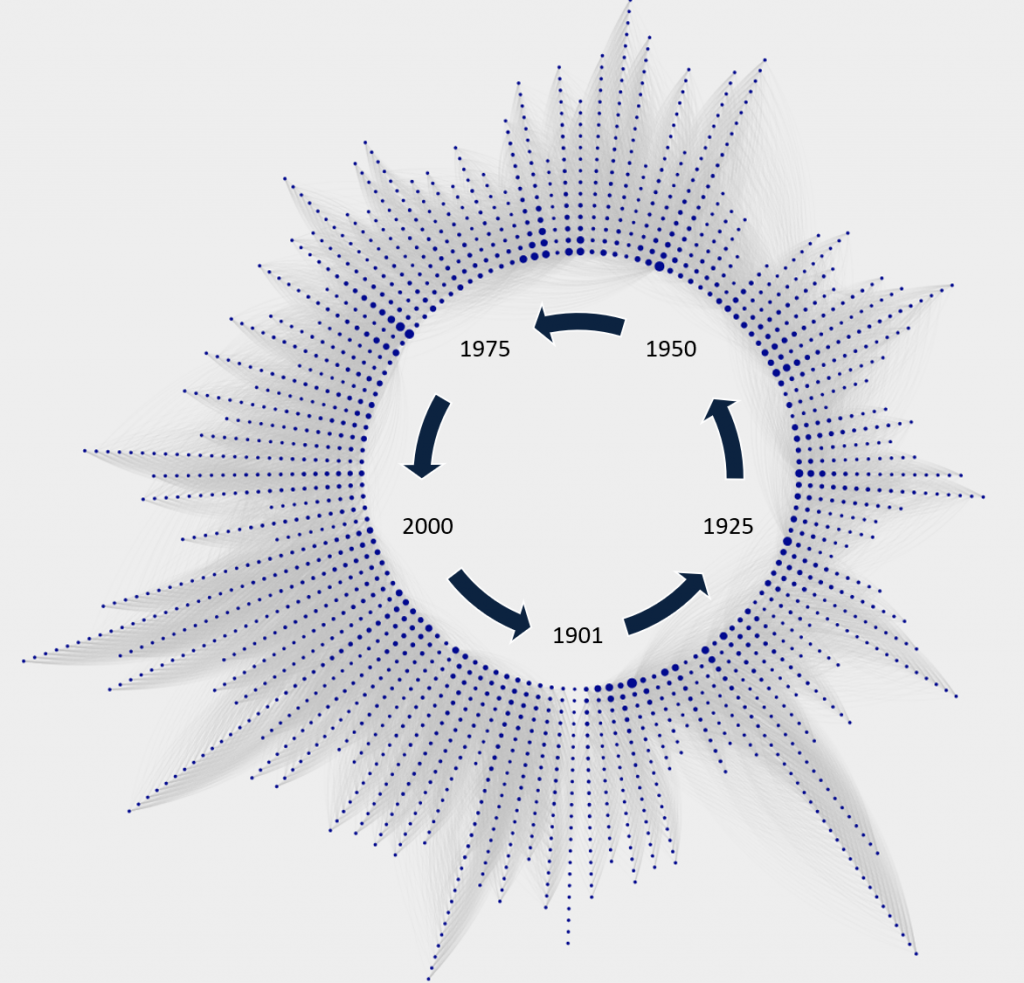
We can also identify a handful of players with especially large nodes, which indicate the number of seasons with the Tigers. These are sorted to make the graph clean and easy to interpret; players with the most seasons will all be closest to the center of the graph, with teammates from the same starting year sorted from longest to shortest tenure. The perimeter of the graph will be populated almost exclusively with one-season players.
For context, let’s examine a few of the large nodes, and identify who they are:
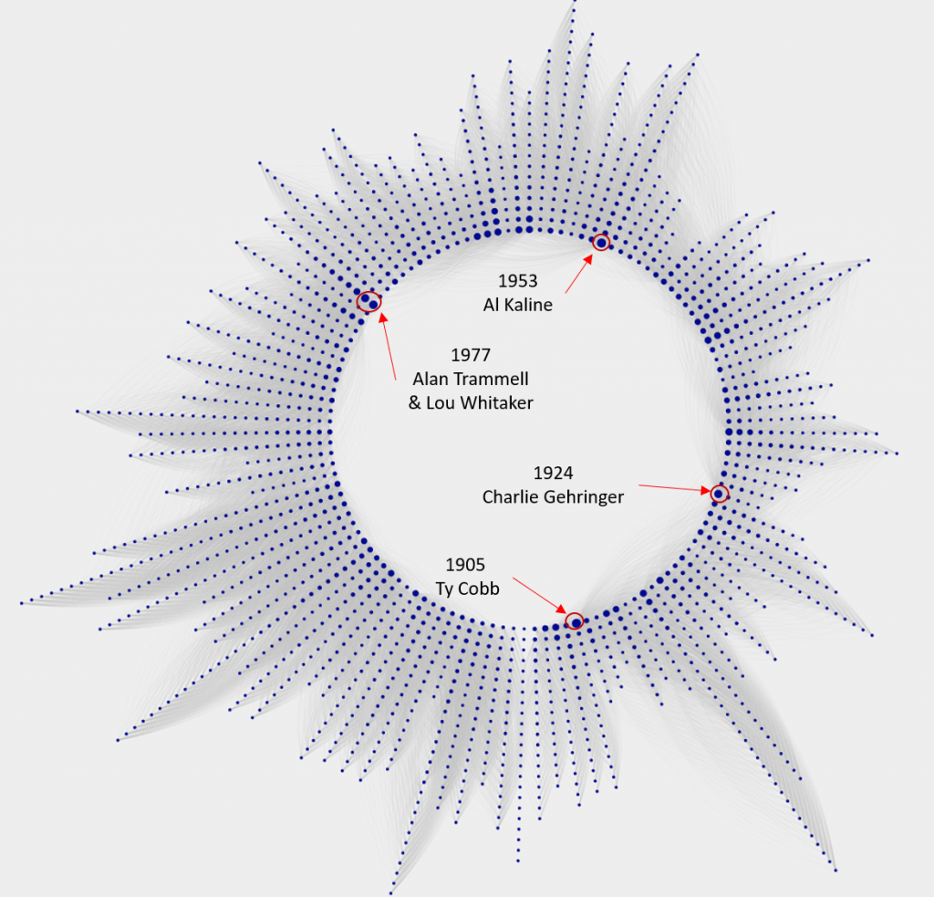
I hope this is starting to make sense. Each radian represents a season, and each node on a radian depicts a player, sized by their longevity with the team. The third critical aspect of the graph is the connectivity between players, represented by the thin gray lines running between them. These are called edges, and are at the heart of a network graph. Let’s have a closer look at the edges for Alan Trammell, as one example.
If we click on the Alan Trammell node, the graph is reduced to him and the players he played with over his career – or at least those who were on the roster in those seasons. This is the fun part of the graphs, as it facilitates exploration and pattern discovery. Here is a portion of the Trammell network, zoomed in so we can see the connections:
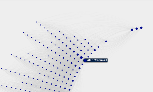
Now the edges are a bit more visible, and the graph detail begins to reveal itself. Notice the multiple large nodes in line behind Trammell; it turns out that this is the celebrated 1977 class, many of whom would ultimately be members of the great 1984 World Series champs. So while the 1977 Tigers were not a good team, they were beginning to see the fruits of a strong minor league pipeline. In order, here are the players in that group, and their connection to the 1984 team:
- Alan Trammell (20 seasons, WS Champ)
- Lou Whitaker (19 seasons, WS Champ)
- Jack Morris (14 seasons, WS Champ)
- Lance Parrish (10 seasons, WS Champ)
- Milt Wilcox (9 seasons, WS Champ)
- Dave Rozema (8 seasons, WS Champ)
Trammell is obviously connected to many other players who started in different seasons, given his 20 years with the team. In fact, he has a degree measure of 333, representing the number of players with a connection to Trammell. Thus, we can also see many connections to players who started their Tigers journey in other seasons. The three large nodes to the upper right of Trammell are interesting – who are they?
- Closest to Trammell is John Hiller (1965-80)
- Next is Mickey Stanley (1964-78)
- Followed by Willie Horton (1963-77)
What we have here are the three remaining holdovers from the 1968 World Series champs, finishing up their careers just as Trammell was starting his long tenure with the Tigers. Discovering patterns like this make network graphs very interesting for me, and I hope you will also find them interesting. I’m currently in the process of refining the Tigers graph, which will be followed by graphs for each MLB franchise, once again using their team colors to provide some visual context. Hope you found this informative, and we’ll see you soon.