Month: April 2022

Final WAR Trade Networks Published

The final 10 MLB WAR Trade Networks have now been published, bringing the total number of graphs to 31 – 30 teams and one overall network with all teams and transactions. For more information on the trade networks, click here. Here are the remaining networks:

Find your favorite teams and enjoy!
More WAR Trade Networks Published

I’ve added 11 new MLB WAR Trade Networks to the site, bringing us to 21 in all. One more round of updates should get us to the full complement of graphs. For more information on using the graphs, see here.

Here are the new adds:

All the networks can be found here. Enjoy!

First 10 WAR Trade Networks Published!

The first 10 WAR (Wins Above Replacement) Trade Networks are now available for exploring! This initial group includes nine team networks and one overall graph with all teams included. Here’s a list of the 10 graphs:

Each of these and any upcoming WAR trade networks can be found on this page.

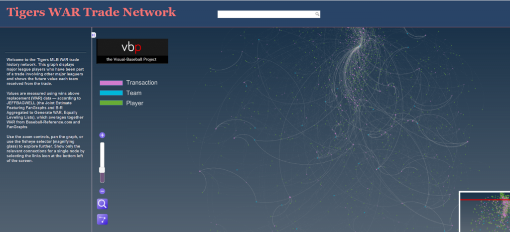
Let’s walk through how the graphs work, using the Detroit Tigers network as an example. We’ll begin with an anatomy of the graph display:

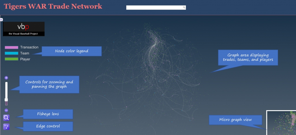
As the image shows, the primary focus will be the main graph area in the center of the window. This is where all nodes (transactions, teams, and players) will reside, connected by edges based on common relationships. Transaction nodes will vary in size based on the total value of a trade with the largest nodes indicating a trade that created significant future WAR for one or both teams. Team and player nodes are set to constant sizes so that the initial visual focus will be on the transaction nodes. The size differences become more noticeable when we zoom in to the network. More on that shortly.

Edges are also sized based on WAR value; this is where we see the value provided to a team and by specific players. Edge sizes (weights) will be more easily seen when we zoom in to the network.

On the left are some graph controls to assist in navigating the graph. We can zoom in using the slider control or the plus/minus buttons adjacent to the slider. Zooming can also be done with a mouse scroll if you prefer that option. The fisheye lens can be toggled on or off and can be used to highlight certain areas of the graph by hovering over a selected region. Finally, the edges button will enable showing or hiding edges and connected nodes. This is useful when you wish to reduce surrounding nodes and focus on specific transactions. We can also pan the graph by dragging it using a mouse – this is helpful in centering a network or viewing specific regions of the graph.

At the upper left of the window is a color legend for each node type, and hidden on the left (not shown in our image) is an information pane that will show specifics about the network. More on that in a bit.

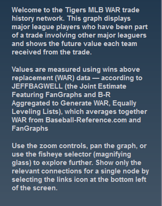
Now let’s examine the information window – this is what makes the network truly powerful. When the network is first displayed or the browser window is refreshed the information pane displays information about the graph (open it by clicking on the arrows icon at the top left):

You can see the simple overview of the graph, the source data, and what it aims to accomplish. Here’s an enlarged version for easier reading:

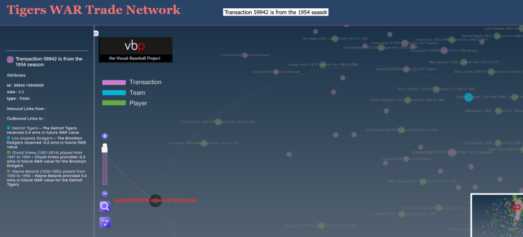
If we zoom in and select a specific transaction the pane displays the relevant details for that selection:

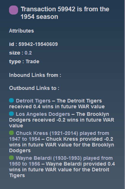
Now we have the details for the transaction – the season, teams, and players involved. Here’s the enlarged view:

You can do this for any transaction in a graph, or you could choose to select a team or player to see how they fit into the network. The possibilities are nearly endless and it’s a fun way to understand the relationships between teams, players, and trades.

We’ll do more exploring of the networks in upcoming posts; I’ll also be adding more teams until we have a complete set of trade networks. In the meantime, feel free to explore the graphs to learn more about the best (and worst) trades your favorite team has made over the last 120 years. Enjoy, and thanks for reading!

MLB Trade Networks Part 3: Edges Code

In our previous post I shared the SQL code I created to pull data for our upcoming set of trade networks based on WAR (Wins Above Replacement) numbers from the Neil Paine 538 MLB data set. The prior post dealt with creating nodes for a network graph; this post will share code for edge creation. In simple terms, a graph needs edges that connect related nodes; for our case we need to connect transaction (trade) nodes to the teams and players involved in each transaction.

Part of what makes this case interesting is my desire to show edge weights based on the future WAR value each team received. Showing edges with varying weights will quickly help users to identify the relative importance of a trade. Wider edges will indicate a trade that involved high future value for one or both teams. In seeing the individual players involved in a common trade we can pinpoint where the future value (or lack thereof) comes from. This will become much clearer when the graphs are posted; I’ll do one or more posts on how to use and interpret each graph.

For now let’s examine the code. Gephi requires users to identify Sourcenodes and Targetnodes whether the edges are Undirected(i.e.- it doesn’t matter which node leads to the other) or Directed. Our initial code is for transactions to teams:

SELECT CONCAT(tr.TransactionID, ‘-‘, tr.PrimaryDate) AS Source, t.franchID AS Target, CONCAT(‘The ‘, t.name, ‘ received ‘, ROUND(SUM(h.WAR162),1),
‘ wins in future WAR value’) AS Label,
IF(ROUND(SUM(h.WAR162),1) = tr.season and tr.Type = ‘T’ AND tr.Season >= 1901 and LENGTH(tr.TeamTo) = 3 AND LENGTH(tr.TeamFrom) = 3
AND tr.Season = t.yearID
GROUP BY tr.TransactionID, tr.PrimaryDate, t.franchID, t.name;

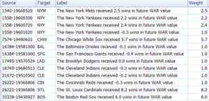
With this code we are linking every transaction to the teams receiving one or more players in a trade. Note that we are summing the WAR value to create an edge weight based on the total value received by each team. If four players were involved (two to each team) these edge weights will reflect the combined values of these players. Note that we are setting edge weight = 1.0 if the future WAR is less than 1 (some will actually be negative so we need a minimal edge to show). Here’s a sample of results:

In contrast, the edges linking a transaction to individual players are based solely on that one player’s value. In the case cited above we will wind up with four lines of varying weights. Otherwise the code is quite similar:

SELECT CONCAT(tr.TransactionID, ‘-‘, tr.PrimaryDate) AS Source, p.playerID AS Target, CONCAT(p.nameFirst,’ ‘, p.nameLast, ‘ provided ‘, ROUND(SUM(h.WAR162),1),
‘ wins in future WAR value for the ‘, t.name) AS Label,
IF(ROUND(SUM(h.WAR162),1) = tr.season and tr.Type = ‘T’ AND tr.Season >= 1901 and LENGTH(tr.TeamTo) = 3 AND LENGTH(tr.TeamFrom) = 3
AND tr.Season = t.yearID AND t.franchID = h.franch_ID
GROUP BY tr.TransactionID, tr.PrimaryDate, p.nameFirst, p.nameLast, p.playerID, t.name;

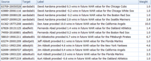
The same logic on edge weights applies but now at the player level. Here are a few results:

I hope this makes sense – it will all become much more clear when the network graphs are produced. The good news is that I already have three graphs created and many more to come shortly. I’ll have some of them available on the site later this week. As always, thanks for reading.

Trade Network Updates, Part 2 (node code)

Over the last 10 days I’ve been playing around with code that will enable some new versions of the MLB trade networks I premiered way back in 2015. The goal this time around is to factor in the future value of a trade to each of the participating teams. There are multiple measures that could be used for this assessment but I’m going with the WAR162 value from Neil Paine’s 538 github data source. Here’s how the site describes the War162 measure: JEFFBAGWELL WAR per 162 team games. Now you may ask why Jeff Bagwell? While he was a talented hitter for many years, his name is used as an acronym for this:

“The file “jeffbagwell_war_historical.csv” contains wins above replacement (WAR) data — according to JEFFBAGWELL (the Joint Estimate Featuring FanGraphs and B-R Aggregated to Generate WAR, Equally Leveling Lists), which averages together WAR from Baseball-Reference.com and FanGraphs — plus various other metrics for MLB since 1901.” Fun stuff, right?

The bottom line from my perspective is that this measure provides a robust way of assessing the value of a trade based on performance after the trade date. Did one team benefit while another team received a player who added no future value? Or did both teams make out equally well? Or was the trade of minimal value for both sides? These are the questions I’m attempting to visually address using network analysis and visualization.

Now comes the technical aspect for all you database and code lovers. First step is to create the network nodes; in this case we need to display the individual trade transactions, teams, and players. Let’s look first at the transactions using the Visual-Baseball MySQL source data:

SELECT CONCAT(a.Id, ‘-‘, a.PrimaryDate) as Id, CONCAT(‘Transaction ‘,a.Id,’ is from the ‘, a.Season, ‘ season’) AS Label,
‘Trade’ AS Type, SUM(a.Size) AS Size
FROM
(SELECT tr.TransactionID AS Id, tr.Season, tr.PrimaryDate, ROUND(SUM(h.WAR162),1) as Size
FROM historical_WAR_and_more h
INNER JOIN People p
ON h.key_bbref = p.bbrefID
INNER JOIN trades2021 tr
ON p.retroID = tr.Player
INNER JOIN Teams t
ON tr.TeamTo = t.teamID

WHERE tr.Season >= 1901 and h.year_ID >= tr.season and tr.Type = ‘T’ and tr.TeamTo = t.teamID and LENGTH(tr.TeamFrom) = 3
AND tr.Season = t.yearID and t.franchID = h.franch_ID

GROUP BY tr.TransactionID, tr.season, tr.TeamFrom, tr.TeamTo, tr.PrimaryDate) a

GROUP BY a.Id, a.PrimaryDate, a.Season;

Here we are simply creating a node for each trade transaction, a label showing the teams involved and the trade date, and summing up the previously mentioned WAR162 to size the nodes. This will be an important part of the graph – trades that created large future values (for one or both teams) will be more prominent in the graph. Small value trades will be represented by very small nodes indicating their relative lack of importance. This one was a challenge, but finally got the code to deliver the expected results.

The next step is to create team nodes; in this case we’ll provide a constant size:

SELECT t.franchID AS Id, tf.franchName AS Label, 15 AS Size

FROM historical_WAR_and_more h
INNER JOIN People p
ON h.key_bbref = p.bbrefID
INNER JOIN trades2021 tr
ON p.retroID = tr.Player
INNER JOIN Teams t
ON tr.TeamFrom = t.teamID
INNER JOIN TeamsFranchises tf
ON t.franchID = tf.franchID

WHERE tr.season >= 1901 and h.year_ID >= tr.season and tr.Type = ‘T’ and h.team_ID = tr.TeamTo and LENGTH(tr.TeamFrom) = 3

GROUP BY t.franchID, tf.franchName;

By applying a constant node size of 15, each team will have a similar appearance in the graph which will not distract us from the trade values (some will be much larger than 15).

Our third and final node step is to provide information on all players involved in one or more trades:

SELECT Id, Label, ‘Player’ AS Type, 5 AS Size
FROM
(SELECT p.playerID AS Id,
CONCAT(h.player_name, ‘ (‘, p.birthYear,’-‘,p.deathYear,’)’,’ played from ‘,LEFT(p.debut,4),’ to ‘,LEFT(p.finalGame,4)) AS Label

FROM historical_WAR_and_more h
INNER JOIN People p
ON h.key_bbref = p.bbrefID
INNER JOIN trades2021 tr
ON p.retroID = tr.Player

WHERE tr.season >= 1901 and h.year_ID >= tr.season and tr.Type = ‘T’ and LENGTH(tr.TeamFrom) = 3
and LENGTH(tr.TeamTo) = 3
AND p.deathYear > 1900

GROUP BY h.player_name, p.playerID, p.birthYear, p.deathYear, p.debut, p.finalGame

UNION ALL

SELECT p.playerID AS Id,
CONCAT(h.player_name, ‘ (‘, p.birthYear,’-‘,’ )’,’ played from ‘,LEFT(p.debut,4),’ to ‘,LEFT(p.finalGame,4)) AS Label

FROM historical_WAR_and_more h
INNER JOIN People p
ON h.key_bbref = p.bbrefID
INNER JOIN trades2021 tr
ON p.retroID = tr.Player

WHERE tr.season >= 1901 and h.year_ID >= tr.season and tr.Type = ‘T’ and LENGTH(tr.TeamFrom) = 3
and LENGTH(tr.TeamTo) = 3
AND ISNULL(p.deathYear)

GROUP BY h.player_name, p.playerID, p.birthYear, p.deathYear, p.debut, p.finalGame) a
GROUP BY Id, Label;

Here we are running a UNION query so we can gather information about the players moving in each direction of a trade (from one team to another). We then combine that information and apply a fixed size of 5 since there are far more players than teams. We’ll have the ability in the finished networks to zoom in and see more about each player.

Each of these 3 outputs (trades, teams, and players) is combined into a single input file that will feed Gephi. We should wind up with between 10k and 20k nodes which we’ll be able to filter
and zoom on in the network graph. I have high hopes for this set of networks (there may be one for each team as well as a comprehensive one) as it should really help display the most important trades in MLB history.

That’s it for our node creation process; the next post will share how we create the edges that will connect trades to teams and teams to players. Thanks for reading!

Trade Network Updates, Part 1

A few years back (2016 o be specific) I created network graphs displaying the history of trades made for each MLB franchise, using transactions data from the wonderful Retrosheet project. These graphs presented more than a few challenges in how to present the data but I wound up with what I consider to be a very interesting set of results, which you can find here. I also created some posts on the process at that time, found here and here.

Here’s a snapshot within a graph:

Six seasons have elapsed since I created those graphs, so I thought it was beyond time to update them, but this time with a twist. Last fall I came across a great dataset that captures an array of advanced sabermetric statistics which I hope to use on a regular basis. These statistics can be used to assess a player’s true value relative to his peers each season. What if I could incorporate those into the trade network updates to show the post-trade value of each player to their new team? Ideally, this will help to show the value of each trade and which team wound up getting the better part of the deal.

Of course this would involve adding a degree of complexity to the MySQL code for pulling the data and shaping it for use in creating network graphs. However, the end result could be very revealing and worthwhile. Today I’m at the start of the process, tinkering with SQL code to extract the data in a proper format. Here’s an example:

SELECT h.player_name, p.playerID, tr.season, tr.TransactionID, tr.TeamFrom, tr.TeamTo, ROUND(SUM(h.WAR162),1) as WAR

FROM historical_WAR_and_more h
INNER JOIN People p
ON h.key_bbref = p.bbrefID
INNER JOIN trades2021 tr
ON p.retroID = tr.Player

WHERE tr.season >= 1901 and h.year_ID > tr.season and h.team_ID = tr.TeamTo AND tr.Type = ‘T’

GROUP BY h.player_name, p.playerID, tr.season, tr.TransactionID, tr.TeamFrom, tr.TeamTo

In this case, I’m looking at the cumulative WAR (Wins Above Replacement) for each traded player with their new team. This could be a single season total or the sum of many years in some cases. Here are some results:

We now have post-trade results (starting if the season following the trade) as measured by WAR for each traded player. We see one fairly substantial figure – the second Aaron Harang trade which netted 16.9 WAR points for his new team, the Cincinnati Reds (CIN in the results). Given that a single season WAR above 3 or 4 is considered substantial, it’s clear that his new team probably benefited from a few of those high-value seasons. What we can’t see yet is what they gave away in their half of the trade.

Fortunately, we can access this using the TransactionID field, which provides all the information for each party within the trade. But we’ll save that for another day as I figure out the next progression of the code. As always, thanks for reading!