Author: kc2519

Book Progress – Part 1

This week marked the real start of putting some effort into the structure of my upcoming Career Arcs book; the onset of cold weather and the passing of the Thanksgiving holiday have afforded me a bit of writing time, even as multiple December holiday gatherings approach. So I have started with some necessary components including an introduction, resources and tools pages, and an about the author page.

I’ve also been looking at which versions to publish; I love the idea of print books, especially for such a visually dense volume filled with color charts and graphs. However, there is a considerable production cost associated with full color books which might push the price beyond many buyers comfort level. My likely solution is to produce both e-book and softcover versions and perhaps a hardcover volume as well. This option will allow buyers to make their own choice based on their preferred format and price point. At the moment I’m leaning toward Amazon’s Kindle Direct Publishing (KDP) platform due to its ability to easily produce all three versions.

Another current exploration involves the book cover and layout. While I’m good with visual information display, I am certainly not a graphic designer, so those tasks will likely be covered by a freelancer with book design experience.

The next step will be determining the specific content of the book and the order of sections and chapters. I have some idea of the flow, but need to define it more precisely. Of course the written and visual content will follow closely behind once I’ve made the content selections. There is a lot of work to come but I’m optimistic about the process and my ability to produce the content of the book. December time may be at a premium, but January through March has proven to be a productive period for me in years past. Stay tuned as I provide updates on my progress!
My New Book – The Work Begins

I’ve had a baseball visualization book in my head for the better part of a decade but kept setting it aside. Finally, things have come together, and the work has begun. My working title is “Career Arcs: A Visual Analysis of MLB Player Performance”, as the focus will be on the value players have achieved across their playing career.

The initial stage, as is so often the case, is centered on data wrangling, the art of procuring, loading, creating (formulas), analyzing, and finally, visualizing the base data. My process starts with the source data, available under the MIT license, which gives me the ability to use the data however I choose. I will always acknowledge Neil Paine for his great dataset focused on multiple interpretations of WAR (Wins Above Replacement), a widely used metric for baseball statheads. Without this data, creating the book would prove far more challenging.

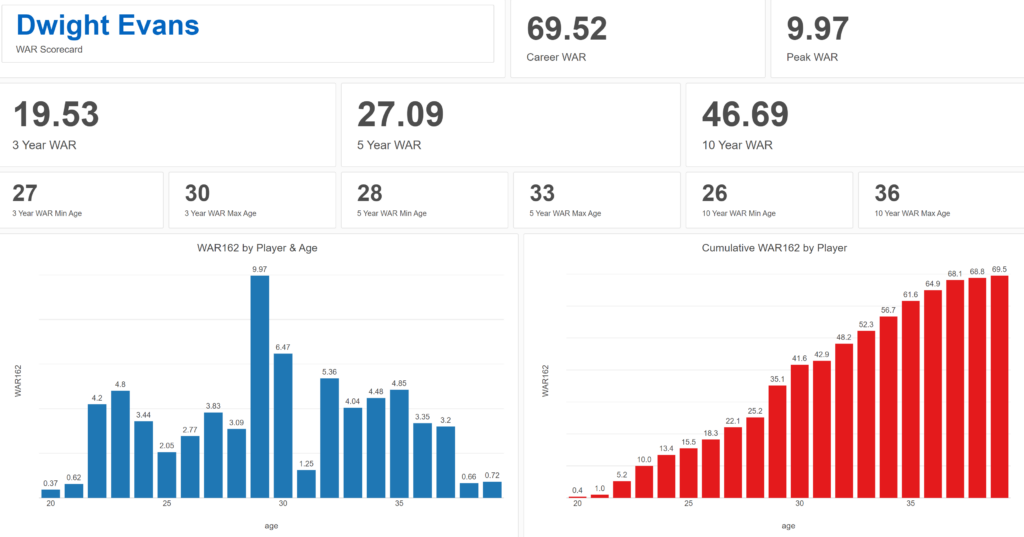
Exploratoryis one again my primary data wrangling tool; it makes the powerful capabilities of R accessible to a non-coder like myself. In Exploratory, I can load the data, create filters and formulas, and do some pretty cool visualizations. My use is twofold (at least); I can analyze the data on the back end while simultaneously building charts and dashboards for potential use within the book. Here’s an example dashboard I’ve created (in process) where I can see career WAR numbers for any MLB player through the 2024 season:

Dwight Evans WAR Scorecard

These dashboards allow for data discovery on my end while painting a nice visual picture that may wind up in an appendix section of the book. I love creating charts and dashboards that can be used for more than one purpose!

In addition to working in Exploratory, I am learning the ins and outs of Adobe InDesign, which will be used for page layout, titling, fonts, styles, colors, and any other elements used for book publishing. I have yet to decide how I’ll publish the various versions of the book, other than being fairly certain there will be both e-book and printed versions. Full color printed books can become very expensive to print, so I’m wrestling with a variety of approaches at this stage to maximize readership while also having a print version available at a potentially high price point.

I’ll provide updates as my work progresses, including potential section and chapter content, release dates, and so on. In the meantime, thanks for reading, and let me know your thoughts through my Substack site at Visual Excursions. See you soon!

Updated Pennant Race Charts

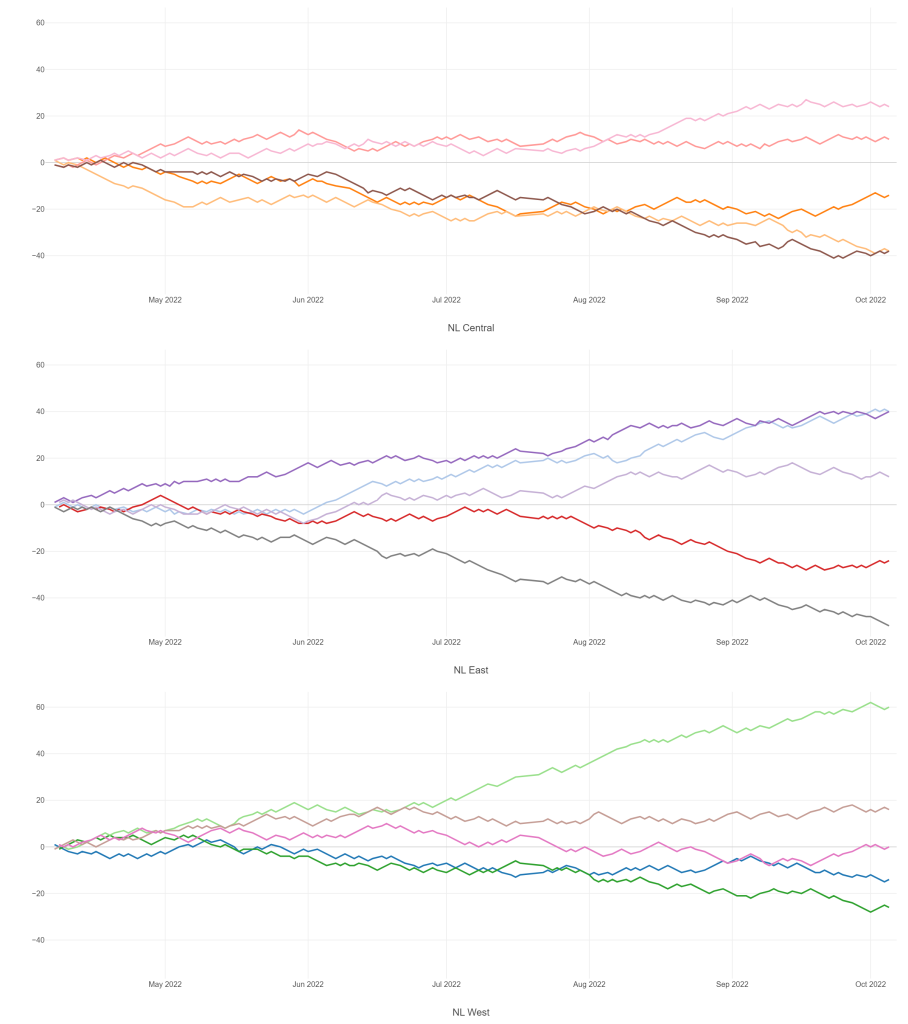
The 2020, 2021, and 2022 MLB pennant race charts using Retrosheet data have been updated on the Exploratory Server: https://exploratory.io/dashboard/kc2519/Pennant-Races-1901-current-aUu5vDT1EW. All seasons from 1901-2022 are now available using the simple parameter selection (just make sure it’s set to the interactive mode).

Here’s a screenshot:

Views of the 2022 National League pennant races by division

Meanwhile, I’m struggling with some JSON output for my traditional version, so no updates there yet.

Interactive Pennant Races in Exploratory

I’ve been creating MLB pennant race charts for years now, covering every season from 1901 through 2019, with 2020, 2021, and 2022 to come soon. These charts have been available on the site in single charts for each season at a league (American or National) and division level (since 1969). This has always worked reasonably well, but I have always yearned for something a bit more interactive, where users could go to one place and enter the season and league they want to view. Finally, courtesy of the Exploratory Server, such a solution is now available.

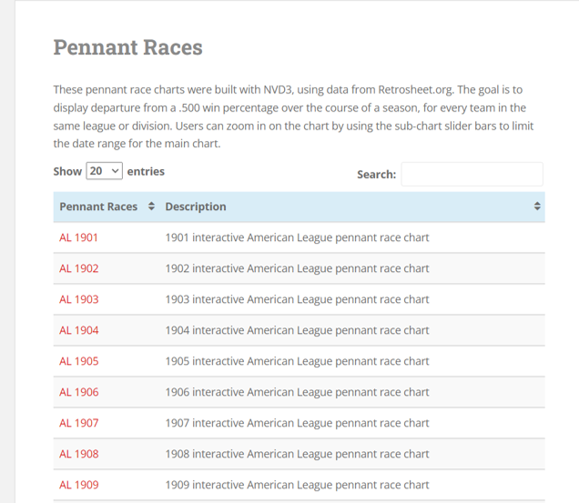
Here’s a glimpse of what I’m talking about – first, the old way of doing things, which I’ll continue to maintain. The process starts with a visit to the pennant races page on this site:

Pennant races chart selection

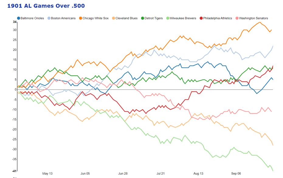
Selecting a specific menu option will display a single pennant race, such as the 1901 American League race shown here:

1901 American League pennant race

These charts work well, and provide some interactivity, but it is strictly one chart per link, so not very efficient.

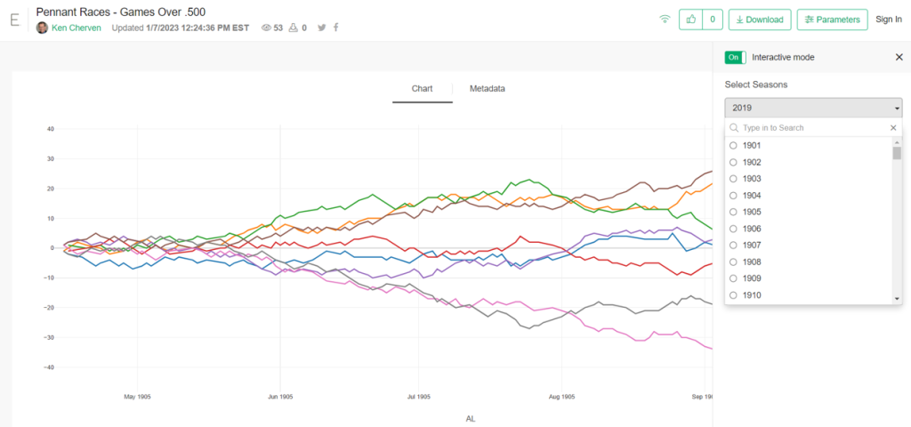
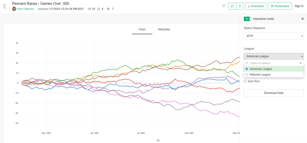
Now, here’s the alternative option using the Exploratory server. Here I can create very similar charts but with a parameter-driven menu enabling users to select a season and a league:

Exploratory pennant race seasons filter
Exploratory pennant race league filter

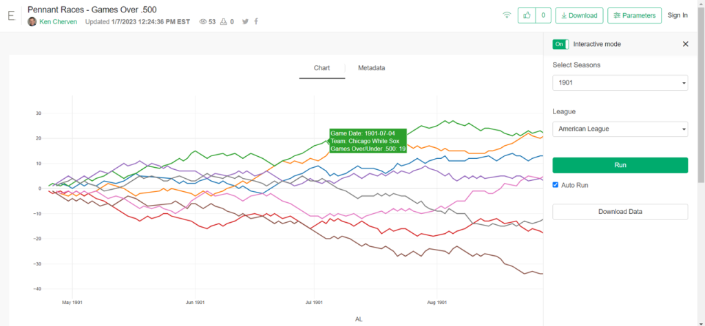
Here’s a case where we select the 1901 season and the American League filters, with the following result:

1901 AL pennant race in Exploratory

The real power in this approach comes with the seasons from 1969-2019, where each league had two and then three divisions. Selecting the 2019 season and the American League filter options will now deliver all three divisional charts on a single page!

You can try this out yourself; just make sure to set the Parameters interactive mode to “On” which will activate the filters; you can control the display as well to show one or more columns. I find that a single column works best for the pennant race charts.

https://exploratory.io/viz/kc2519/Pennant-Races-Games-Over-500-Qvx9ZEF0In

I’ll be working more on this as part of the visualization options going forward; there are other cases where I can use similar functionality. Thanks for reading, and see you soon!

Retrosheet 2022 Data is Here!

One of the primary source data sets I use to create baseball visualizations is the amazingly detailed information captured by the Retrosheet project, a dedicated group of volunteers providing play-by-play and game level information for each MLB season. They have recently passed the 100-year milestone, with data from the 1921 & 1922 seasons now available. I have some catching up to do on the older seasons, but just downloaded the 2022 season for adding to my databases.

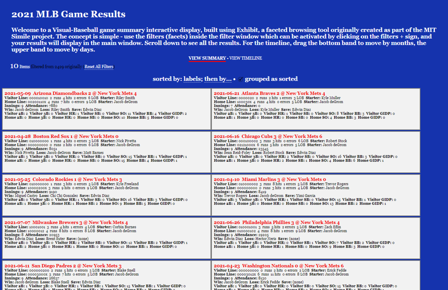
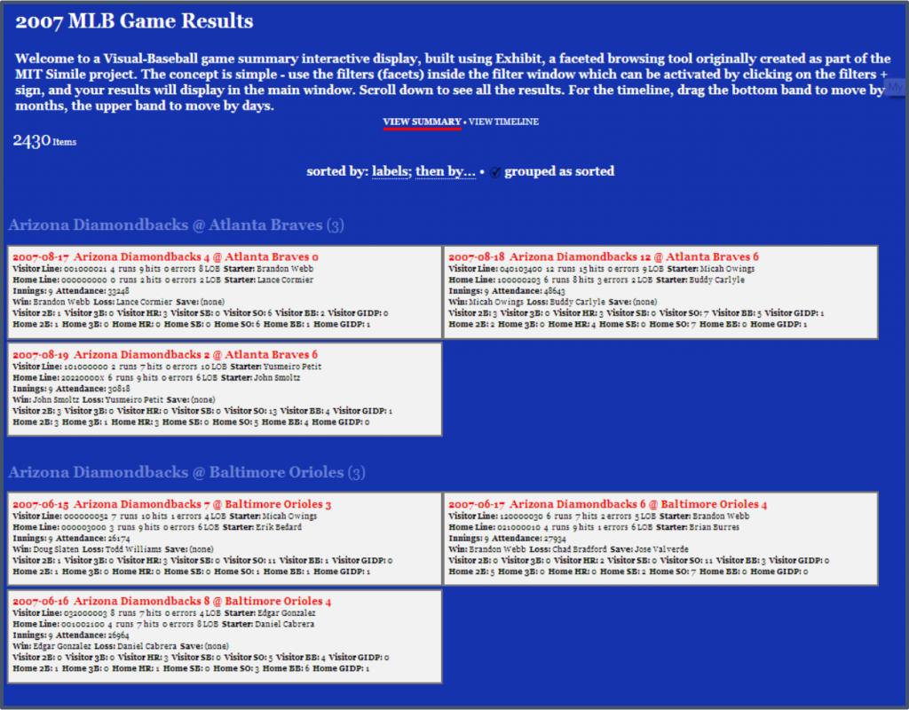
The data comes in two distinct sets – game logs being the much easier of the two to work with, due to the smaller data size. Each game played in a season is captured at a summary level (~ 2,400 records), with information pertaining to the score, players, umpires, attendance, and much more. This information is used to feed my game summary visualizations:

2007 Game Summary results

As you can see, these are bite-sized summaries of every game, showing some of the important summary data for a game. They can be filtered to find specific teams, pitchers, scores, and much more. These visualizations are currently available covering the 1955-2019 seasons; one of my immediate goals is to add the 2020, 2021, and 2022 seasons, before starting to work in reverse with pre-1955 campaigns.

Fortunately, I have lots of SQL code built up over the years to make the data update process fairly simple; the 2022 game logs have already been added, and now I’ll get to work on the play-by-play data. Stay tuned for updates, and thanks for reading!

Bad Trades, Red Sox Edition

This is the first in a series of posts where I take a look at notoriously one-sided baseball trades, using the baseball trade networks published on this site earlier in 2022. I won’t necessarily rank these deals in any sort of order; rather I will pick out a few from the network trade graphs and provide some analysis and context for some of the most notorious transactions.

If you haven’t seen the trade networks previously, here’s a link.

The networks were built using data from Retrosheet and Neil Paine, loaded into Gephi, a network analysis and visualization tool, and ultimately pushed to the web where I could finish styling the graphs. Graph nodes (the circles in the networks) are sized based on the total future WAR (Wins Above Replacement) accrued by the teams involved in the trade. All values must occur at the major league level (MLB), so players involved in the deal who don’t reach the MLB level with their new team will have a zero value. Only the cumulative WAR value while playing for the new team is included; we are not calculating WAR once a player leaves one of the teams involved in the transaction.

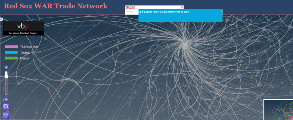
Finding a bad trade by scanning the networks is more an art than a science; the key is to look for large nodes (indicating a lot of future WAR value), and then dissecting the trade to see how much value each team received. The other alternative is if we already know the player(s) we are looking for; in these cases we can perform a simple search to find the trade. Here’s a classic example that Red Sox fans would love to forget – trading future Hall of Famer Jeff Bagwell for journeyman reliever Larry Anderson. Let’s go to the Red Sox trade network and search for Jeff Bagwell.

Red Sox trade network

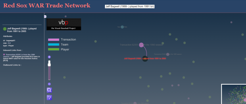
Typing in Jeff Bagwell locates him quickly within the trade network. Note that even if a player is involved in multiple trades to or from the same team (rare but possible) the search will locate each transaction. Here’s the Bagwell transaction, showing his player node and future WAR value connected to the transaction node; every player involved in that transaction will be connected to the trade node, as long as there is some future WAR value. If a player in the trade did not play in the majors for the receiving team, they will not be reflected in the graph. Here’s a view of Jeff Bagwell relative to the trade:

Jeff Bagwell transaction

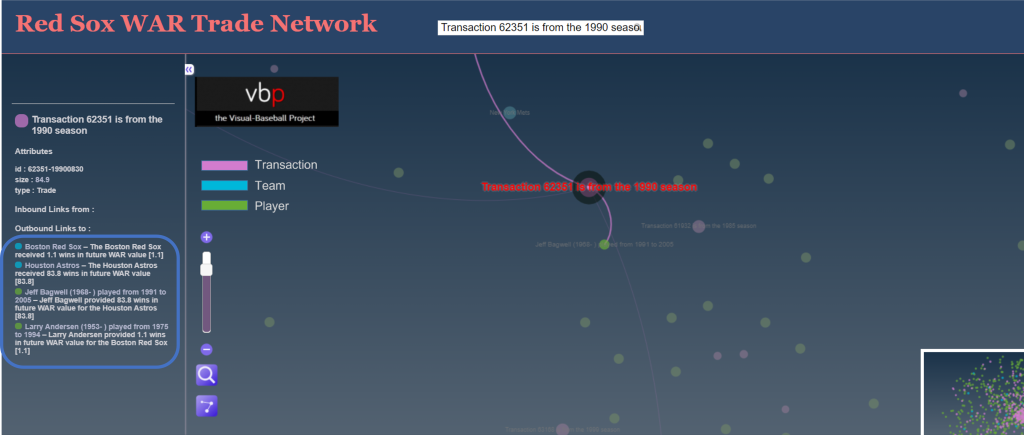
We can also click on the transaction node to see the value provided to each team by all of the players involved in the trade, again assuming they spent time with the team and were not limited to the minor leagues. Clicking on that node will display the respective WAR values in the sidebar on the left of the screen:

WAR values of the trade

Here’s where we get to the details of the trade, and specifically the direct benefits accrued to each team. The Red Sox received 1.1 future WAR from Larry Anderson; to put this in perspective, we might expect this sort of value for an average player for a single season. The Astros, on the other hand received an incredible 93.8 WAR from Jeff Bagwell, or close to 6 WAR per season for 16 years! That is a Hall of Fame level performance, and it eventually led to his selection to Cooperstown in 2017. Here’s a profile that mentions the one-sided trade.

While we have the Red Sox network open, let’s see if there are any other disastrous transactions (other than the cash sale of Babe Ruth to the Yankees, technically not a trade). After scanning the network, we find this one from 1928:

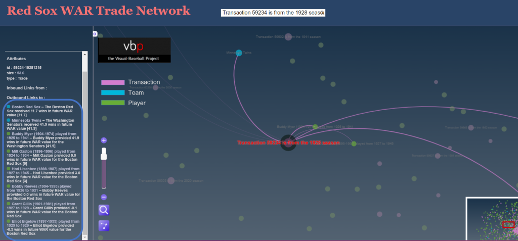
Transaction 59324 – Buddy Myer

This one is clearly not a Bagwell-level disaster, but was still quite negative for the Red Sox, with a WAR differential of 30 points. The primary villain here is Buddy Myer, a solid infielder who hit .300 or better seven times for the Senators. Not a major star, but the owner of a very nice career, including leading the American League in batting average in 1935.

Let’s try to find one more before closing this piece, this time favoring the Red Sox. We zero in on this deal:

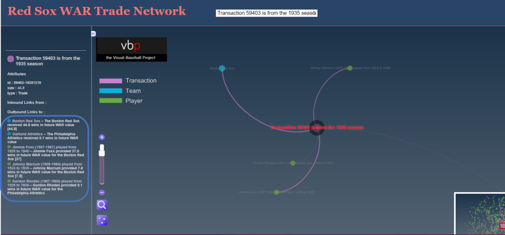
Transaction 59403 – Jimmie Foxx

The Red Sox netted nearly 45 future WAR value while surrendering just 0.1; most of the benefit was generated by slugging future Hall of Famer Jimmie Foxx, but they also received a nice three season contribution from pitcher Johnny Marcum. Note how we also removed nodes not involved in the trade by clicking on the edges icon on the bottom left of the display area; this makes it easier to focus on the details.

Feel free to try your hand at finding more of these one-sided deals in the Red Sox or any other trade networks. I’ll be back with some other teams before long. Thanks for reading!

Final WAR Trade Networks Published

The final 10 MLB WAR Trade Networks have now been published, bringing the total number of graphs to 31 – 30 teams and one overall network with all teams and transactions. For more information on the trade networks, click here. Here are the remaining networks:

Find your favorite teams and enjoy!

First 10 WAR Trade Networks Published!

The first 10 WAR (Wins Above Replacement) Trade Networks are now available for exploring! This initial group includes nine team networks and one overall graph with all teams included. Here’s a list of the 10 graphs:

Each of these and any upcoming WAR trade networks can be found on this page.

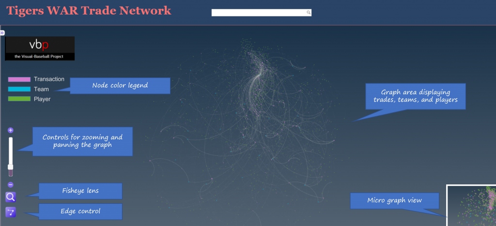
Let’s walk through how the graphs work, using the Detroit Tigers network as an example. We’ll begin with an anatomy of the graph display:

As the image shows, the primary focus will be the main graph area in the center of the window. This is where all nodes (transactions, teams, and players) will reside, connected by edges based on common relationships. Transaction nodes will vary in size based on the total value of a trade with the largest nodes indicating a trade that created significant future WAR for one or both teams. Team and player nodes are set to constant sizes so that the initial visual focus will be on the transaction nodes. The size differences become more noticeable when we zoom in to the network. More on that shortly.

Edges are also sized based on WAR value; this is where we see the value provided to a team and by specific players. Edge sizes (weights) will be more easily seen when we zoom in to the network.

On the left are some graph controls to assist in navigating the graph. We can zoom in using the slider control or the plus/minus buttons adjacent to the slider. Zooming can also be done with a mouse scroll if you prefer that option. The fisheye lens can be toggled on or off and can be used to highlight certain areas of the graph by hovering over a selected region. Finally, the edges button will enable showing or hiding edges and connected nodes. This is useful when you wish to reduce surrounding nodes and focus on specific transactions. We can also pan the graph by dragging it using a mouse – this is helpful in centering a network or viewing specific regions of the graph.

At the upper left of the window is a color legend for each node type, and hidden on the left (not shown in our image) is an information pane that will show specifics about the network. More on that in a bit.

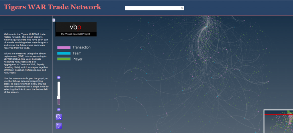
Now let’s examine the information window – this is what makes the network truly powerful. When the network is first displayed or the browser window is refreshed the information pane displays information about the graph (open it by clicking on the arrows icon at the top left):

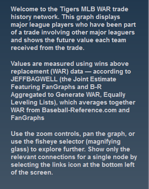
You can see the simple overview of the graph, the source data, and what it aims to accomplish. Here’s an enlarged version for easier reading:

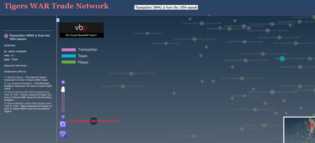
If we zoom in and select a specific transaction the pane displays the relevant details for that selection:

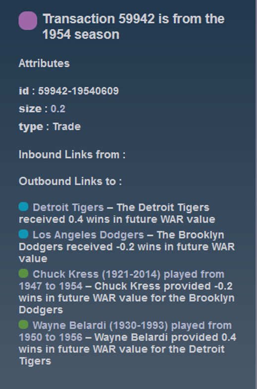
Now we have the details for the transaction – the season, teams, and players involved. Here’s the enlarged view:

You can do this for any transaction in a graph, or you could choose to select a team or player to see how they fit into the network. The possibilities are nearly endless and it’s a fun way to understand the relationships between teams, players, and trades.

We’ll do more exploring of the networks in upcoming posts; I’ll also be adding more teams until we have a complete set of trade networks. In the meantime, feel free to explore the graphs to learn more about the best (and worst) trades your favorite team has made over the last 120 years. Enjoy, and thanks for reading!