Author: kc2519

Trade Network Updates, Part 1

A few years back (2016 o be specific) I created network graphs displaying the history of trades made for each MLB franchise, using transactions data from the wonderful Retrosheet project. These graphs presented more than a few challenges in how to present the data but I wound up with what I consider to be a very interesting set of results, which you can find here. I also created some posts on the process at that time, found here and here.

Here’s a snapshot within a graph:

Six seasons have elapsed since I created those graphs, so I thought it was beyond time to update them, but this time with a twist. Last fall I came across a great dataset that captures an array of advanced sabermetric statistics which I hope to use on a regular basis. These statistics can be used to assess a player’s true value relative to his peers each season. What if I could incorporate those into the trade network updates to show the post-trade value of each player to their new team? Ideally, this will help to show the value of each trade and which team wound up getting the better part of the deal.

Of course this would involve adding a degree of complexity to the MySQL code for pulling the data and shaping it for use in creating network graphs. However, the end result could be very revealing and worthwhile. Today I’m at the start of the process, tinkering with SQL code to extract the data in a proper format. Here’s an example:

SELECT h.player_name, p.playerID, tr.season, tr.TransactionID, tr.TeamFrom, tr.TeamTo, ROUND(SUM(h.WAR162),1) as WAR

FROM historical_WAR_and_more h
INNER JOIN People p
ON h.key_bbref = p.bbrefID
INNER JOIN trades2021 tr
ON p.retroID = tr.Player

WHERE tr.season >= 1901 and h.year_ID > tr.season and h.team_ID = tr.TeamTo AND tr.Type = ‘T’

GROUP BY h.player_name, p.playerID, tr.season, tr.TransactionID, tr.TeamFrom, tr.TeamTo

In this case, I’m looking at the cumulative WAR (Wins Above Replacement) for each traded player with their new team. This could be a single season total or the sum of many years in some cases. Here are some results:

We now have post-trade results (starting if the season following the trade) as measured by WAR for each traded player. We see one fairly substantial figure – the second Aaron Harang trade which netted 16.9 WAR points for his new team, the Cincinnati Reds (CIN in the results). Given that a single season WAR above 3 or 4 is considered substantial, it’s clear that his new team probably benefited from a few of those high-value seasons. What we can’t see yet is what they gave away in their half of the trade.

Fortunately, we can access this using the TransactionID field, which provides all the information for each party within the trade. But we’ll save that for another day as I figure out the next progression of the code. As always, thanks for reading!
2021 Data is Here!

Happy day! Just finished uploading the 2021 baseball dataset from the Lahman baseball archive and Baseball-Databank, just in time for the 2022 season. Next step is inserting and updating the existing tables (with data back to 1901!) with the 2021 season stats. I can then move on to the fun side of the equation – updating existing visualizations and creating some new analyses and visuals. Stay tuned!

Welcome to 2022!

I for one am looking forward to 2022 after a couple of interesting, often challenging years affected my desire to generate interesting analytics and data visualizations. The less said the better – simply excited to get back to updating some existing visuals and adding a host of new ones.

I’ll be doing a lot of work using the Exploratory toolkit which keeps improving by the day. It is simply a great tool for handling large (or small) data sets from start to finish; I especially love it’s data wrangling capabilities.

On the data source side, Retrosheet and the Lahman database will continue to feed my analysis and visuals; none of what I create would be possible without these great resources. Retrosheet data (used for game level and play level detail) is already updated through the 2021 season; part of this year’s plan is to add older years (pre-1955) to my local database. The Lahman data (season level) is typically available around February and I’ll be downloading it to my databases at that time.

Stay tuned for updates throughout 2022 – they should be a lot more frequent than the last two years. Happy New Year!

2019 Game Summaries Are Here!

I’m happy to note that the 2019 Game Summary visualization is now complete. This is season 65 in our series of summaries (1955-2019), providing line scores for every game played during the 2019 season. You can filter by starting pitchers, teams, dates, umpires, and much more.

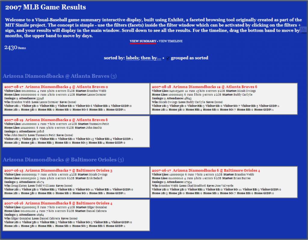
Here’s a screenshot from the 2007 season:

So while you’re waiting for the 2020 season to get underway, check these out to fill your baseball fix – Game Summaries

Radial Franchise Networks for all MLB Franchises

All 30 MLB Radial Networks are now complete, and available for you to explore. One thing to notice is that each network will have a slightly different (or radically different) shape, depending on how many (or few) players started in a single season. If the team was in the midst of a successful run, the radians will tend to be short, as fewer rookies or acquired players will debut. On the other hand, teams that are retooling will tend to have long radians, as there are many new players making the team. This could also be reflected in the number of players getting a September call-up from the minors.

While these networks are pretty attractive to view as static images (IMHO), the real fun comes from the interactivity, where you can click, zoom, pan, and see all the details for who played with whom over the course of a franchise’s history. Note that this is based on seasonal rosters, so not all connections actually played together at the same time of the season.

Anyhow, check out a handful of examples, and then try them out yourself at the Franchise Radial Networks 1901-2019 page.

[foogallery id=”1560″]

Team Franchise Radial Axis Network Anatomy

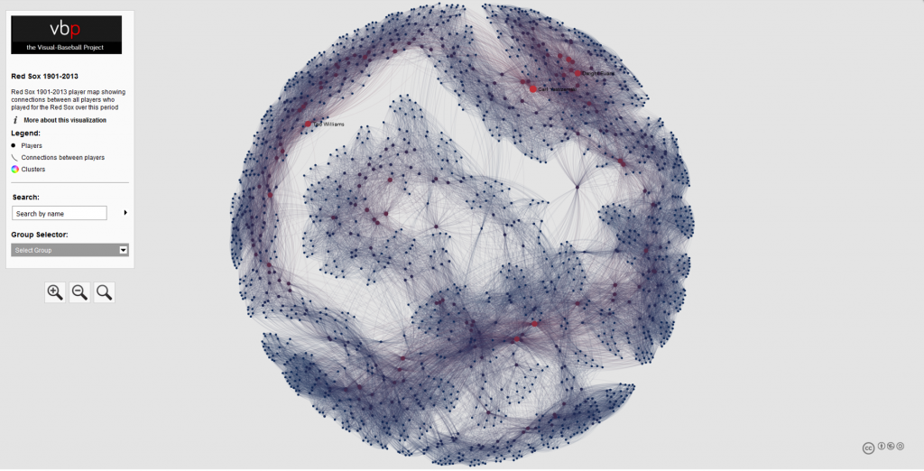
A few years back, I created network graphs for many MLB franchises, using data from the Lahman Baseball Database. These graphs displayed the connections between teammates throughout the history of a given franchise from 1901-2013. Any players who were on a roster within the same season (or seasons) were connected to one another, with each node in the network representing a single player. These were then sized to reflect the number of seasons played with that franchise. Every graph was customized by using one or more of their official team colors, resulting in a visualization like this:

A full roster of the live versions can be found here.

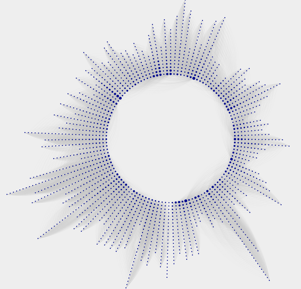
Now that 2019 data is available, I thought it was about time to update the graphs, but this time with a new look that might make the graphs a bit more intuitive and perhaps even more visually attractive. Out of this was born the radial axis franchise graph, as shown for the 1901-2019 Detroit Tigers:

I’m pretty excited about the look the Radial Axis layout provides for this sort of data, and I think you’ll see why it is an effective method for visualizing all the players over the course of 119 seasons. Let’s have a look at the anatomy of this graph.

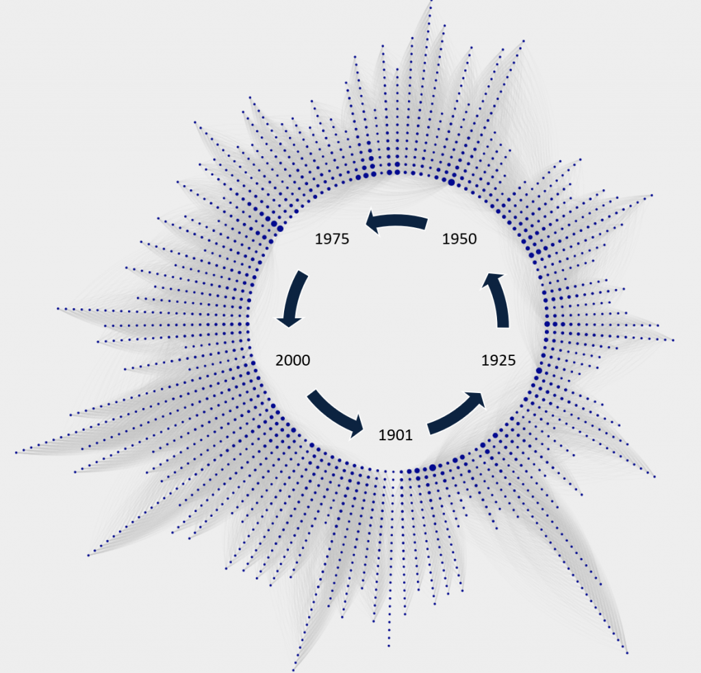
The graph runs in a counter-clockwise manner, starting with 1901 at the bottom of the graph, and working all the way around until we get to 2019, also at the bottom of the graph. Each set of nodes along the way represents the collection of players with their first Tigers season in that radian. We can see some years where there were many new players (1912 has an exceptional number), while other years had very few new players, 1915 being an example. Here’s a general diagram to help with this concept:

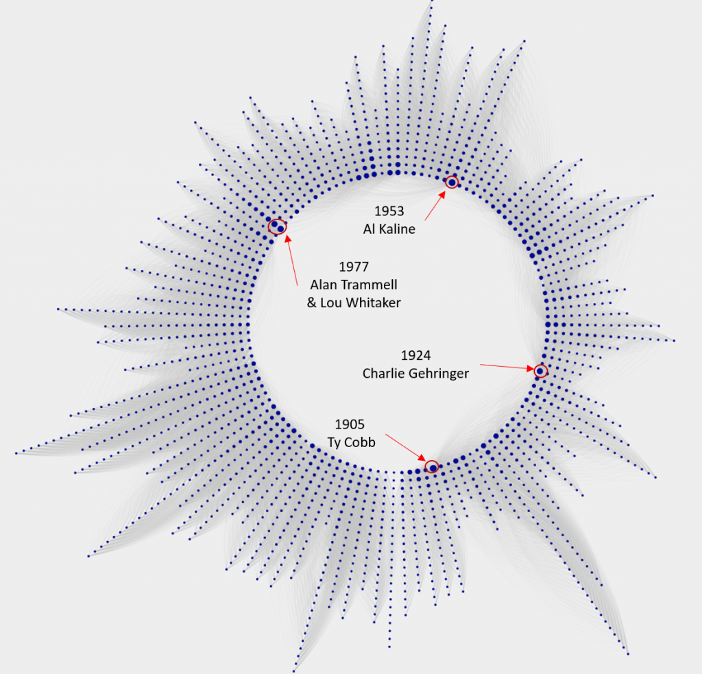
We can also identify a handful of players with especially large nodes, which indicate the number of seasons with the Tigers. These are sorted to make the graph clean and easy to interpret; players with the most seasons will all be closest to the center of the graph, with teammates from the same starting year sorted from longest to shortest tenure. The perimeter of the graph will be populated almost exclusively with one-season players.

For context, let’s examine a few of the large nodes, and identify who they are:

I hope this is starting to make sense. Each radian represents a season, and each node on a radian depicts a player, sized by their longevity with the team. The third critical aspect of the graph is the connectivity between players, represented by the thin gray lines running between them. These are called edges, and are at the heart of a network graph. Let’s have a closer look at the edges for Alan Trammell, as one example.

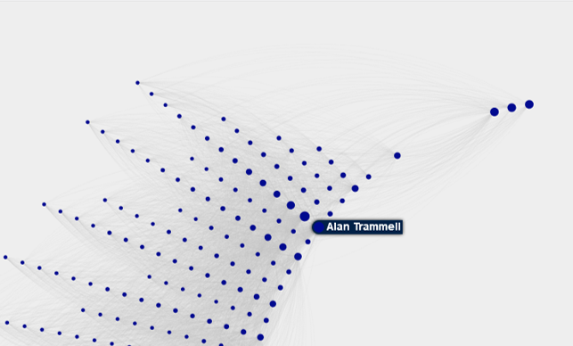
If we click on the Alan Trammell node, the graph is reduced to him and the players he played with over his career – or at least those who were on the roster in those seasons. This is the fun part of the graphs, as it facilitates exploration and pattern discovery. Here is a portion of the Trammell network, zoomed in so we can see the connections:

Now the edges are a bit more visible, and the graph detail begins to reveal itself. Notice the multiple large nodes in line behind Trammell; it turns out that this is the celebrated 1977 class, many of whom would ultimately be members of the great 1984 World Series champs. So while the 1977 Tigers were not a good team, they were beginning to see the fruits of a strong minor league pipeline. In order, here are the players in that group, and their connection to the 1984 team:

  • Alan Trammell (20 seasons, WS Champ)
  • Lou Whitaker (19 seasons, WS Champ)
  • Jack Morris (14 seasons, WS Champ)
  • Lance Parrish (10 seasons, WS Champ)
  • Milt Wilcox (9 seasons, WS Champ)
  • Dave Rozema (8 seasons, WS Champ)

Trammell is obviously connected to many other players who started in different seasons, given his 20 years with the team. In fact, he has a degree measure of 333, representing the number of players with a connection to Trammell. Thus, we can also see many connections to players who started their Tigers journey in other seasons. The three large nodes to the upper right of Trammell are interesting – who are they?

  • Closest to Trammell is John Hiller (1965-80)
  • Next is Mickey Stanley (1964-78)
  • Followed by Willie Horton (1963-77)

What we have here are the three remaining holdovers from the 1968 World Series champs, finishing up their careers just as Trammell was starting his long tenure with the Tigers. Discovering patterns like this make network graphs very interesting for me, and I hope you will also find them interesting. I’m currently in the process of refining the Tigers graph, which will be followed by graphs for each MLB franchise, once again using their team colors to provide some visual context. Hope you found this informative, and we’ll see you soon.

2019 Batting Explorer Updates Complete

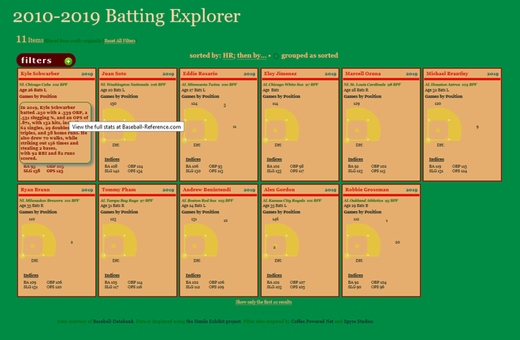
Welcome to Visual-baseball.com! I’ve just completed an update where data for the 2019 season is now part of the Batting Explorer 2010-2019 interactive visualization. This is a tool where we have every batter in a given season depicted via a baseball card type of framework, showing their key stats for the season, as well as the positions played in the field (by number of games), using a visual of a baseball diamond. It’s a highly interactive way to filter through multiple seasons worth of data by team, player, position, and more.

So while you’re waiting for on the field action to start, have a look at the Batting Explorer to answer some of the questions on your baseball mind. For example, here’s a quick look at all of the left fielders who played at least 110 games at the position in 2019 (by using the filters pill at the top left):

We can take the same results and sort it by the number of home runs, to see who the power hitters in the group were for 2019, by sorting from high to low:

Now we see Kyle Schwarber and Juan Soto at the top of the display. Let’s look at Schwarber’s details by simply hovering over his card:

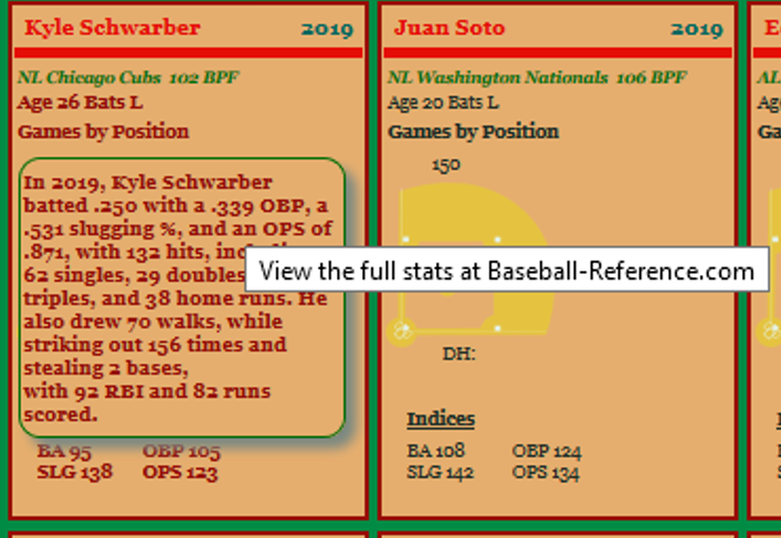
We now have a pop-up within Schwarber’s card telling a mini-story about his batting stats for the 2019 season. Here’s a closer look:

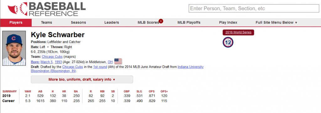
From this, we learn that Schwarber hit 38 home runs, batted .250, and had an OPS (on-Base + Slugging) of .871, as well as multiple other details. Additionally, you likely noticed the “View the full stats at Baseball-Reference.com” pop-up tag. To get there, simply click on Schwarber’s card, and you’ll be transported (in a new tab) to his page at Baseball-Reference:

Pretty cool, right? Give it a try, or pick your own filters, look at specific teams and seasons, and so on. Here’s the Batting Explorer page, with every decade back to 1900-1910 available for your curiosity.

More updates to come soon on the 2019 data, and thanks for reading!

2018 Game Summaries Complete

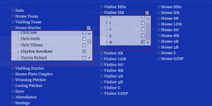
The 2018 game summaries have been updated, using data from the Retrosheet project. This is the latest update in a series that goes all the way back to 1954. As a user, you have the ability to filter on a wide array of fields, as seen below:

The summaries provide basic data about every individual game played in a selected season – the line score, winning and losing pitchers, home runs, and much more. Here’s an example:

To have a go at the 2018 summaries, or any other season, go to the Game Summaries page in the portfolio section of this site.

Batting Explorer 2018 Data Updated

I’m happy to announce that the 2010-2019 version of the Batting Explorer has been updated with 2018 stats, courtesy of the kind folks at seanlahman.com and baseball-databank.

The Batting Explorers were built using the Exhibit software from the MIT Simile project. A wide array of facets (filters) enable searching, sorting, and data discovery in a fun manner, with every batter having his basic stats packaged in a representation of a baseball card. Here’s a screenshot of some 2018 cards:

For the full roster of Batting Explorers dating back more than 100 years, click here. Enjoy!

2018 Game Summary Updates Begin

I’m pleased to announce that the 2018 Retrosheet game log files have been uploaded to the VBP database. This data can be used to create analysis at the game level, with a wide array of data elements, including the following:

  • Scores
  • Attendance
  • Umpires
  • Winning pitcher
  • Losing pitcher
  • Home runs
  • …and much more

This data provides the input for the Game Explorer visualizations on this site, which will be updated shortly to include the 2018 season. If you haven’t seen them previously, the Game Explorers allow users to filter across many data attributes to retrieve specific results. Here’s a screenshot:

The next step is to create the 2018 version of the explorers, adding to the existing files covering the 1955-2017 seasons. I’ll keep you posted as soon as 2018 is available on the site. Thanks for reading!