Visual-Baseball Project Site Updates Continue

Updates to the Portfolio section of the VBP site continue, in an effort to reverse some lost functionality in the wake of one or more WordPress updates. The plus side of this setback is that the updates allow us to introduce a more easily maintained infrastructure with improved usability. Users can now search and scroll through content links while also accessing pages through an enhanced menu system.

Here’s an example of the new Portfolio menu:
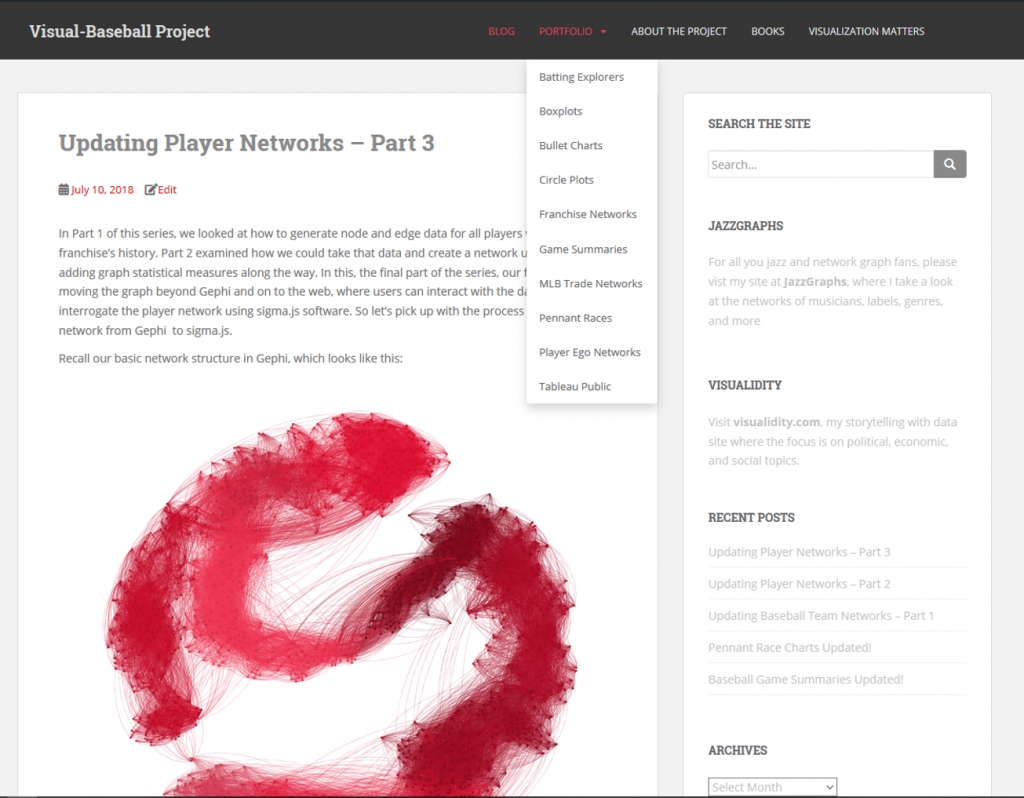
Selecting one of the menu items will take you directly to a relevant page, now composed of a brief intro as well as an example of the visualization type, as seen here:

The lower half of each page will now have a searchable list format, with both a link and a description of the associated content. Users can also adjust the pagination settings to show the desired number of links to view at one time:
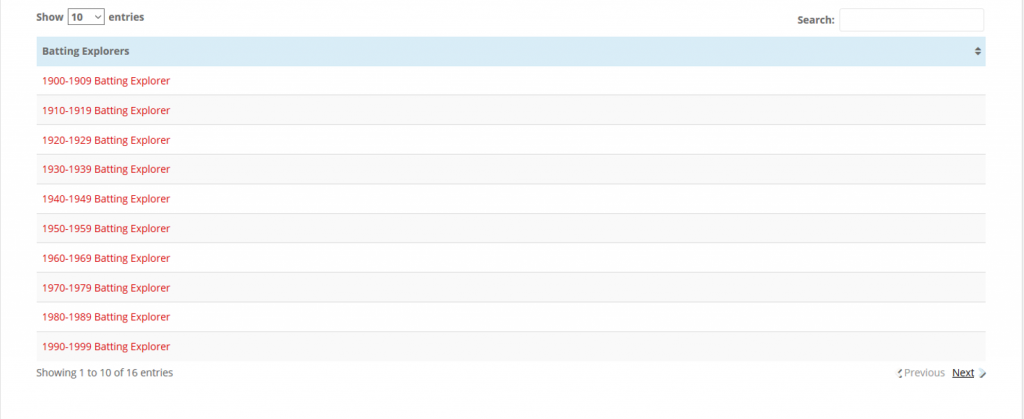
These enhancements should make it far easier to navigate the site and view the desired content. Once these are complete, I can begin to deliver new content; the 2018 game and season files will soon be upon us, and much of the content is itching for an update. In the meantime, enjoy what’s already here!

 

Updating Player Networks – Part 3

In Part 1 of this series, we looked at how to generate node and edge data for all players within a single franchise’s history. Part 2 examined how we could take that data and create a network using Gephi, adding graph statistical measures along the way. In this, the final part of the series, our focus is on moving the graph beyond Gephi and on to the web, where users can interact with the data and interrogate the player network using sigma.js software. So let’s pick up with the process of moving the network from Gephi  to sigma.js.

Recall our basic network structure in Gephi, which looks like this:

One of our goals when we export the graph to the web is to enable user interaction, so the above graph becomes a bit less intimidating. As a reminder, this is at most a moderate sized network; the need to provide interactive capabilities becomes even greater for large networks.

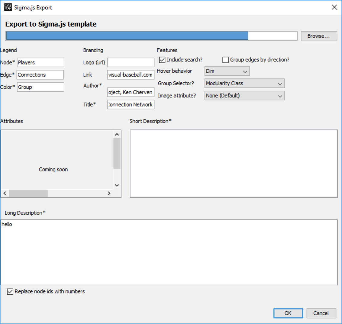
There are a few ways we can create files suitable for web deployment using Gephi. In this case, the choice is to use the simple sigma.js export plugin located at File > Export > Sigma.js template. Selecting this option will provide a set of options similar to this:

This template allows for a modest level of customization, including network descriptions, titles, author info, and other attributes relevant to the network. When all fields are filled to your satisfaction, click on the OK button to save the template. Your network will be saved to the location specified in the blank space at the top of the template window (grayed out in this case). A word of caution is in order here – if you make some custom entries to the template, and then make adjustments to your network, be sure to specify a new location to save the generated files. Otherwise, the initial set will be overwritten. This is especially critical if you have gone behind the scenes to customize colors, fonts, and other display attributes. More on that capability in a moment.

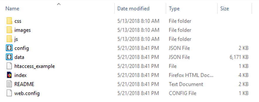
Once the template is complete and the OK button is clicked, a set of folders and files is generated that can then easily be copied to the web. Here’s a view of the created file structure:

These files and sub-folders are all housed within a single folder named ‘network’. If you wish to tinker with your graph in Gephi, rename the network folder to something else prior to exporting a second (or 3rd or 4th time). This will help keep you sane. 🙂

Without going into great detail here, let’s talk about the key files:

  • data.json stores all of your graph data, including positioning attributes, statistics created in Gephi, plus node and edge details
  • config.json contains many of the primary graph settings that can be easily edited for optimal web display. It’s quite easy to go through a trial and error process, since the file is so small. Simply make changes, then refresh your browser to see the result.
  • index.html has a few basic settings relevant to web display, most notably the title information that the browser will use

Within the css folder are .CSS files where you can make changes to many display attributes. This is typically where you will adjust fonts and font sizes, as well as some colors. The js folder has javascript files that can be edited to a certain degree, although caution is recommended if you’re not a javascript guru. Finally, the images folder contains any relevant image files to be used for web display, such as logos.

Alright, now that we have had a brief view of the technical details, let’s have a look at the network graph in the browser. Note that this is still a bit experimental at this stage; I’m attempting to customize each graph based on the official team colors or close variations in the color family.

To see some of the interactive functionality, let’s select a specific player. Simply type Ted Williams (the greatest Red Sox batter of all time) in the search box, and view the results:

Now we see only the direct connections (a 1st degree ego network) for Ted Williams (270 degrees in this case), as well as a wealth of statistical information previously calculated in Gephi, seen in the right panel. At the bottom of the panel are hyperlinks where any one of the 270 connections may be clicked, allowing us to view their network. As you can see, sigma.js quickly provides great interactivity for graph viewers.

Even better, we can scroll in to the network at any time:

Hovering on a node generates a pop-up title for that node, as seen for Ted Williams in this instance. We also begin to see the names of other prominent players at this zoom level. Additional zooming will reveal more player titles – a great way to embed information without making the original graph visually chaotic by displaying all titles at every level.

For the current web version of this graph, click here. I’ll try to keep this version active, even if I make improvements to the final network. Once again, thanks for reading!

Updating Player Networks – Part 2

In our previous post, we looked at how to acquire and load our baseball player data into Gephi. In this second installment, the focus will be on creating a player network graph in Gephi, and customizing many settings to deliver a network graph we can export to the web. Player networks are used to detail the connections between all players who are connected to one another in some fashion. In this instance, it is based on players having played for the same team in one or more common seasons. So let’s begin with the process of creating the graph using our raw data from the first installment.

Importing .csv data into Gephi is quite simple – we create individual node and edge files (as we showed in the previous post), and use the Gephi import functions to pull the data in. I always start with the node file, since it will typically have additional information not included in the edges file. After importing the node data, I then import the edge data, which gives us the information to form our initial graph. If we were to start with the edge file, Gephi will create our node data automatically, and we will not have the detail needed for our graph. This approach may work for simple graphs, but not for our current case.

Once both data files have been imported, we can begin thinking about what we want form our graph. Here are several questions we might pose:

  • How will we use color?
  • What sort of layout will be best?
  • Which measures should we calculate?
  • How should we depict node sizes?

In many cases, the answers to these questions come about through trial and error. We may have some ideas going into the process, but invariably, there will be modifications along the way. So be patient, and be willing to experiment as you create network graphs. The graph you will see in this post went through many of these modifications, which I won’t take the time to detail. Instead, this post will detail my final choices, along with some explanations for why these choices were made. So let’s take a walk through the various facets of the visualization.

Layout

While a network will retain the same underlying structure from a statistical point of view (degrees, centrality, eccentricity, etc.) regardless of our layout choices, it is still important to select a layout that will visually represent the underlying patterns in the network. Otherwise, we could just as well deliver a spreadsheet with all of the network statistics. So layout selection is critical, and often involves an iterative process.

For the baseball network graphs I built in 2014, I eventually settled on the ARF layout algorithm, which ran quickly and created an attractive circular network graph display using the player connection data. Alas, there is no ARF algorithm available for Gephi 0.9.2, so I required a different approach for the updates. Ultimately, this led to a 2-step approach using a pair of layout algorithms – OpenOrd followed by Force Atlas 2. OpenOrd is especially effective at creating a quick layout from large datasets, although with far less precision than some other force-directed approaches. Still, it is a great tool for creating a general understanding of the structure of a network very quickly. Force Atlas 2, is the near opposite of OpenOrd – a very precise approach that can be tweaked easily using the various settings in Gephi. It is ideal for putting the finishing touches on what OpenOrd started.

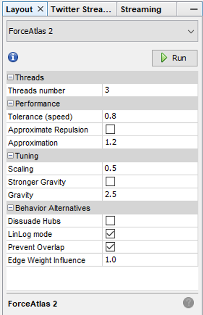
Here are the settings I eventually settled on for Force Atlas 2, after much trial and error:

Force_Atlas_2

Some of the more important things to note here are the Scaling and Gravity settings. I reduced the scaling to 0.5 so the network would display appropriately in a single window without the need for scrolling. The Gravity setting was increased to 2.5 to force nodes slightly toward the center of the display. The LinLog mode and Prevent Overlap options are also selected in order to make this particular graph more visually effective. For other graphs, I have used the Dissuade Hubs option, forcing large nodes to the perimeter of the graph; in this case, that was not an ideal choice.

Color

The use of color is also important within a network graph display. Color can be used to highlight nuances in the data that distinguish one or more nodes relative to another group of nodes. Often we use color to visually represent clusters within the graph, as grouped using the modularity classes statistic or some similar input. In the case of this series of graphs (ultimately one graph per team), I made a decision to use the official team colors to differentiate each graph. Thus my initial graph for the Boston Red Sox would be based on the two primary hex colors for the current team (these colors do change over time for many teams).

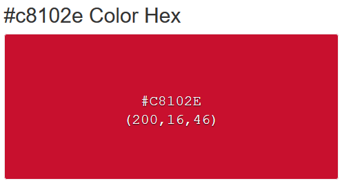
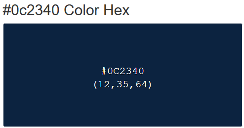
Here are the Red Sox primary colors:

c8102e_Color_Hex_-_2018-06-10_09.15.48 0c2340_Color_Hex_-_2018-06-10_09.16.33

After capturing current team colors in a spreadsheet for easy reference, I used the color-hex.com site to select complementary colors for the Red Sox graph. Using complementary colors allows me to differentiate clusters in the graph while remaining true to the original concept of employing team colors for each graph. So instead of a wide range of colors one would normally see in a Gephi output, I was able to input the complementary colors for each group. Thus, one team color could be used for the graph background, while the other color (and it’s complements) could be used for the graph structure (nodes & edges). We’ll share the effect later in this post.

Statistics

Graph statistics are critical to the full understanding of the structure of a network. While we can view a graph and begin to understanding the general structure of a network, the various statistics will aid and reinforce our initial visual comprehension. Gephi provides a nice range of statistical measures to choose from:

  • Eccentricity (the number of steps needed to traverse the network)
  • Centrality – betweenness, eigenvector, closeness, harmonic closeness (various measures of importance of an individual node)
  • Clustering coefficient (to discern cliques in the network)
  • Number of triangles (a friends of friends measure)
  • Modularity Class (clusters)
  • Degrees (the number of connections)

Sizing

Node sizing is another key element of effective graph design. In this case, there were a few options I could pursue for node sizing – the number of seasons played (I used this in the 2014 graphs), one of the various centrality measures we calculated, or the number of degrees (connections) an individual player possesses. After computing each of these statistics, I eventually decided to use the number of degrees as a representation of influence in the graph. Visually, I want to show how many other players a single individual is related to, and using node size is an effective means of doing so.

Summary

Our final graph in Gephi is shown below; the eventual web-based version will differ slightly and include additional functionality, but that’s for another post.

red_sox_20180610

Next Post

My third and final post in this series will address exporting this graph to the web using the sigma.js plugin, and making some additional customization to the web version. Thanks for reading, and see you soon!


Updating Baseball Team Networks – Part 1

A few years back, I used Gephi and sigma.js to create a series of interactive baseball team networks, one for each current MLB franchise. These networks displayed all players through the 2013 season, going all the way back to 1901 for the original American and National League franchises. Now that we have data through the 2017 season, it’s time for an update, not only from a data perspective, but also stylistically. This post will walk through the process of creating one of these networks using Toad for MySQL, Gephi, and sigma.js to create web-based interactive network visualizations.

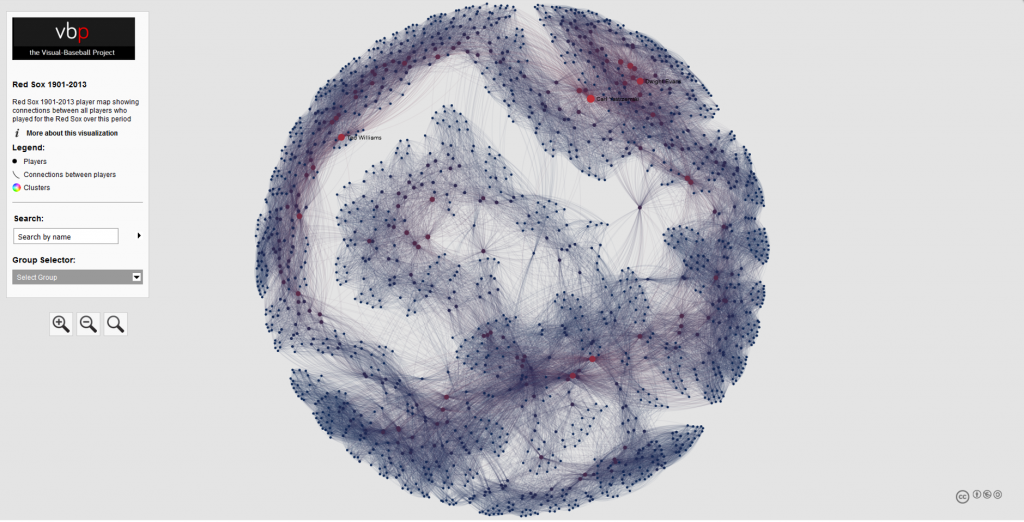
Here’s a typical network from the 2013 series; the full list of networks can be found here. We’ll use the existing networks as a baseline for the new networks, although a few modifications will be made.

baseball_team_network_2013
a 2013 baseball team network for the Boston Red Sox

Source Data & MySQL Queries

Let’s start our discussion with the source data. Season-level baseball data is available through the seanlahman.com website, in the form of .csv files or Microsoft Access database tables. I use the .csv format, as it can be easily added to existing MySQL databases on the visual-baseball.com server. MySQL also makes it simple to add derived fields through some simple coding. These fields can be utilized later for a variety of activities.

For the purpose of our network graphs, there are a handful of critical fields we want to use. These include the following:

  • playerID, a unique identifier for every player who ever donned a major league uniform
  • player name, which can be used to provide a meaningful reference based on the playerID field
  • yearID, which refers to the season (or seasons) a player suited up for a specific franchise
  • franchID, a unique identifier for each MLB franchise

We also need to do a little manipulation of the source data in our code to deliver our results in the proper form for use in Gephi. This means we need to create two input files – one for nodes, and a second for edges. The nodes will contain information about each player, the number of seasons played for the franchise and the first and last seasons, which may differ from the number of seasons, as players frequently leave a franchise only to return later in their career. Here’s our node code:

SELECT Id, Label, MAX(Size) as Size
FROM
(SELECT bp.playerID AS Id, CONCAT(bp.name, ” “, MIN(bp.yearID), “-“, MAX(bp.yearID)) AS Label, COUNT(bp.yearID) AS Size
FROM BattingPlus bp
WHERE bp.franchID = ‘BOS’ and bp.yearID >= 1901
GROUP BY bp.name

UNION ALL

SELECT pp.playerID AS Id, CONCAT(pp.name, ” “, MIN(pp.yearID), “-“, MAX(pp.yearID)) AS Label, COUNT(pp.yearID) AS Size
FROM BattingPlus pp
WHERE pp.franchID = ‘BOS’ and pp.yearID >= 1901
GROUP BY pp.name)  a
GROUP BY Id
ORDER BY Id;

Here’s the simple interpretation – since we are attempting to display all players for a given franchise, we are executing a UNION ALL statement to combine batters and pitchers into a single result file. We have used the playerID field to create the required Id value for Gephi, while also creating a Label field by combining the player’s name with their first and last years playing for this franchise. Finally, we have created a Size field based on the number of seasons played for the franchise. We can then choose to use this in Gephi to size each node, if we so choose.

We also need to create the edge file for Gephi. In this case, we want to understand how many seasons two players were on the same team. This code is a bit trickier, since we want to show only one connection between two players, since this will be an undirected graph. More on that distinction later. Here’s our edge code:

SELECT b.playerID AS Source, m.playerID  AS Target,  ‘Undirected’ as Type,  ‘ ‘ as Id, ‘ ‘ as Label, count(*) as weight
FROM
(SELECT a.playerID, CONCAT(m.nameFirst, ” “, m.nameLast) name, a.yearID, a.franchID

FROM Appearances a
INNER JOIN Master m
ON a.playerID = m.playerID

WHERE a.franchID = ‘BOS’ and a.yearID >= 1901) b

INNER JOIN Appearances a
ON b.yearID = a.yearID and b.franchID = a.franchID and b.playerID <> a.playerID and a.playerID > b.playerID
INNER JOIN Master m
ON a.playerID = m.playerID

GROUP BY b.playerID, a.playerID
ORDER BY b.playerID

Here we use the Master table to provide player name information, and we also gather the ID information to match the node values. The critical piece in this code is in our join criteria:

INNER JOIN Appearances a
ON b.yearID = a.yearID and b.franchID = a.franchID and b.playerID <> a.playerID and a.playerID > b.playerID

Here we are matching players based on the same season and the same franchise. We then specify that we do not want to connect any player to himself, and that we want only values where the playerID value from our main query is greater than the playerID value from the sub-query. This gives us a single connection between two players, which is what we need for an undirected graph. We then define a Source node (required by Gephi) and a Target node (also required), as well as specifying ‘Undirected’ as the graph type. We leave the ID and Label values empty, and then summarize the number of seasons played together as an edge weight. This value can be used in Gephi to show the strength of a connection between two nodes (e.g.- did they spend one season together, or 10 seasons together?).

After exporting each of these files to a .csv format, we have our source data for Gephi. In Part 2 our focus will shift to creating the network in Gephi.

Pennant Race Charts Updated!

The last of my big three annual updates is now complete, as all 2016 & 2017 pennant race charts have been created, and now reside in the Visual-Baseball Project portfolio. These charts are created using NVD3, which is built on top of the powerful d3.js framework developed by Mike Bostock. These tools help make the charts highly interactive, allowing you to see where each team stands at any given point in the season, and also providing the ability to zoom in using a smaller sub-chart beneath the primary display.

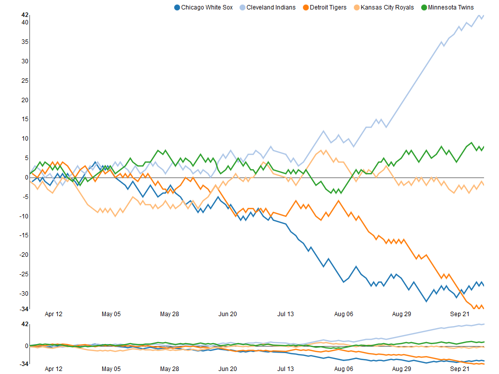
The structure of the charts is based on every team’s relationship to a .500 winning percentage – a situation where a team wins exactly as many games as it loses. This structure allows for easy interpretation of the results, as we can see which teams hover near the .500 mark (i.e.- consistent mediocrity), others that rise well above this level, and also those teams that descend far below the breakeven point. Allow me to illustrate these thoughts using the 2017 American League Central division, and my hometown Detroit Tigers, who suffered through their worst season since 2003.

2017_AL_Central

As you can see, the darker orange line representing the Tigers takes a steep dive starting in early August, culminating in a final record 34 games below the .500 percentage. Meanwhile, the rival Cleveland Indians (light blue line) present a near mirror image of the Tigers failure, with a sensational month of September that ultimately lands then 42 games over the .500 break-even level.

Similar charts have been created for the other divisions for both the 2016 & 2017 seasons. In fact, you can now view any season, league, and divisional splits dating back to the 1901 campaigns, a total of 380 pennant races to explore! Find all the pennant race charts here. Have fun exploring, and as always, thanks again for reading!

Baseball Game Summaries Updated!

Thanks to some unusually cold and rainy weather, I’ve been able to focus on updating both my source databases as well as some of the visualizations built from the data. That’s a roundabout way of saying that the baseball Game Summary exhibits have been updated for both the 2016 & 2017 seasons. They can be found in the portfolio section of the site by following this link.

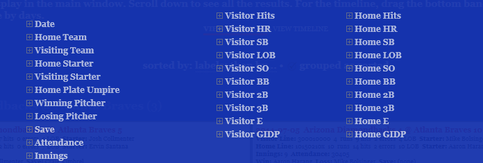
As a refresher, the baseball game summaries give you a sort of visual box score for every game played in a season, featuring the line score for the game, winning and losing pitchers, attendance, and much more information pertaining to each specific game. The real power comes from the ability to filter results to find all games that match specific criteria.

game_summary_filter_1

As you can see, there are many available filter options, right down to who the home plate umpire is for every game.

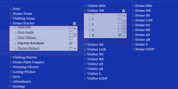
Here’s a quick illustration of how the filters can be used. We’ll filter 2017 results where Clayton Kershaw was the starting pitcher at home, and gave up 4 home runs (a very rare event!). First, we select Kershaw as the Home Starter, and then we open the Visitor HR filter, and select 4 (there’s just one instance). We can then apply these filters to see at which game this unusual event took place.

Kershaw_4HR

Closing the filter window, we see the single game box score returned by our filters:

Kershaw_4HR_game

Ironically, we can see that the Dodgers not only won this game, with Kershaw as the winning pitcher, but that they too hit 4 home runs (Home HR in the box score). We can also see that the Mets struck out 13 times (Visitor SO) and the Dodgers 12 times (Home SO). Must have been a wild day at Dodger Stadium on June 19th for the 43,266 in attendance!

As you can see, a lot of information can be gleaned using just a couple of selections to filter the data. There are nearly endless possibilities for using the filters to return the information that most interests you. So have a look at the game summaries and any other items in the portfolio section. Enjoy, and thanks for reading!


Batting Explorers Updated Through 2017 Season

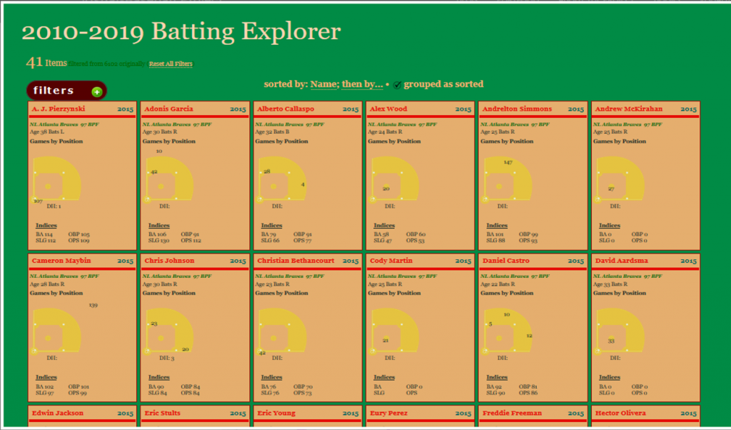
I’m pleased to share that the Batting Explorer visualization for the 2010s decade has now been updated with 2016 & 2017 statistics. This ongoing project captures batting statistics at the season level for every major league batter, and visualizes them in a baseball card type of format, as seen below:

Batting Explorer
Batting Explorer

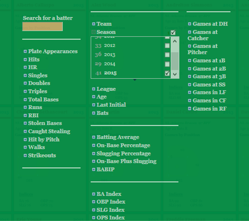
A number of filters are provided to make it easy to browse across a wide range of attributes, including all of the major batting categories:

Filters
Filters

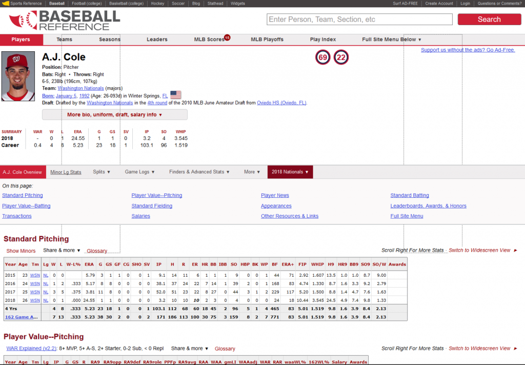
One of my favorite aspects of the Batting Explorer is the ability to link to greater detail by clicking on a specific player card, which will transport you to the Baseball-Reference page for that player:

baseball_ref_1

This project uses the Exhibit project software originally developed years ago as part of the MIT Simile project, as well as a lot of HTML & CSS for styling purposes. Give it a try, and thanks for reading.

2017 Baseball Data Updates Coming Soon!

Happy to report that the annual 2017 baseball data has been downloaded from seanlahman.com, meaning it’s time to start the annual updates. This data is a great resource for building many of my data visualizations that are featured in the portfolio section of this site. Likewise, the Retrosheet game event data has also been downloaded, meaning the onus is now on me to run the various upload and update processes for my databases.

Looking forward to putting these resources to work as I make updates to the following data visualizations (among others):

Stay tuned for updates on these and other projects, and please pay a visit to my JazzGraphs site, where the focus is on network graph analysis of jazz artists, labels, releases, and songs. Thanks for reading!

Recapping 2017

Observers of this blog will note that posts were scarce in 2017 – in fact this is the only one, and it’s being completed in 2018! This is the result of a variety of causes, including external projects, busy schedules, and focus that was shifted in other, unrelated directions. Still, 2017 was not without its moments.

For starters, I managed to create three data visualization courses for Packt:

Learning Data Visualization

Data Visualization Techniques

Advanced Data Visualization

Retrosheet data for the 2016 and 2017 seasons has also been downloaded, and is in the update process as we speak, which will enable some new visualization work (and perhaps a new book title) in 2018. Soon, annual season data from the Baseball-Databank and Sean Lahman will be available as well.

I’m also in the process of launching a new site at jazzgraphs.com, where I’ll use network visualizations to uncover the complex web of relationships between jazz musicians, labels, and recordings. Posters and a book are in the plans for 2018, so stay tuned.

Wishing all a happy and prosperous 2018, and I promise more content to come this year!

Player Ego Network Visualization

Ego networks are an interesting concept within the realm of network visualization using graph analysis, as they allow us to easily see direct connections within the network of a particular individual. Using Gephi, we can navigate large networks using this technique, which enables us to filter and view only those connections relevant to our current criteria. All remaining nodes and edges are simply filtered out from a visual perspective, giving a very clean look at individual networks. The ego network can be set to a depth of 1 if the goal is to show only direct connections, or to 2 or even 3 if our goal is to see the so-called “friends of friends” via indirect connections.

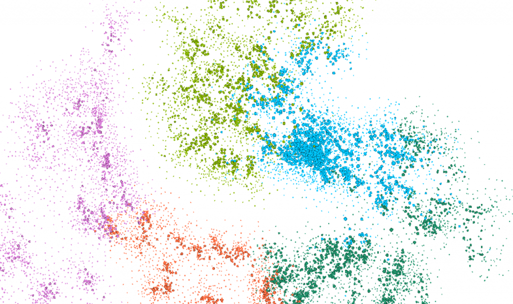
My latest venture uses a network of all MLB players between 1901 and 2015, which consists of a somewhat unwieldy mass of nearly 17,000 players with close to 1.2 million connections. Even when we cluster the results using Gephi’s modularity class option, it is still a difficult network to navigate, both from a visual perspective and a resource allocation viewpoint. Here’s a view of the network as a whole:

mlb_players_20161230

While the modularity class coloring helps identify groups of related players, there is an awful lot of small detail that is not easily discerned, and the graph is computationally expensive, often crashing my version of Gephi if I try to do too many things with the full graph. Fortunately, ego networks are a great way to filter the data for greater understanding of some of the details within the network.

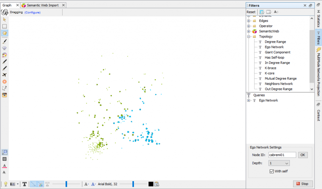
Using the ego network option as a filter, I am able to view the individual network of any player in the graph with ease. Here’s a look at my settings for the Miguel Cabrera ego network, and the resulting network, which is now a very manageable 300 nodes and 11k edges:

mlb_ego_filter_20161230

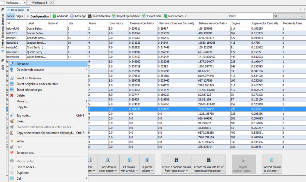
With a little editing in Gephi, such as increasing the size and adjusting the color for the central node, I can easily create a series of ego networks that can later be exported to a JSON format for use with Sigma.js. These can then be turned into interactive web-based networks quite easily. Here, we change the existing node settings so that the Cabrera node stands out in the graph. First, we locate Cabrera’s record in the data worksheet, and then select the node edit menu option:

mlb_edit_node1_20161230

This then takes us to the node properties, where size and color can be edited:

mlb_edit_node2_20161230

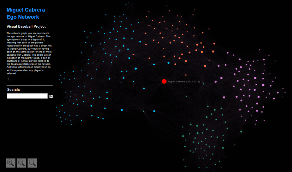
If this step causes some overlap in the graph, we can easily run the Noverlap layout algorithm to optimize graph spacing. Here’s a view of the completed Cabrera network after using Sigma.js and tweaking a few of the config settings:

Cabrera_20161130

As of now, there are five of these ego networks available for viewing on the visual-baseball site. They can be found here. I promise more to come in 2017 as time permits. Update – 25 networks as of 1/15/2017.