It’s absolutely a great time to be alive and involved in data viz, courtesy of the wealth of exceptional open source projects. Several recent open source discoveries are currently on my radar, and worthy of further exploration. Over the next few weeks I’ll examine a few of these options, using baseball data (of course) to illustrate the possibilities within each application. Specifically, we’ll take a look at Trelliscope, bokeh, rbokeh, and Exploratory, and provide some insight and examples into how each of these projects function. This post will focus on Exploratory, an exciting new tool from Kan Nishida.
Exploratory is another R-based application that leverages a multitude of R capabilities while providing its own intuitive interface. While still in beta testing, Exploratory appears to have a very bright future as a powerful visualization tool that allows non-coders to tap into the enormous power of R. The ability to harness a considerable portion of the R language through Exploratory’s GUI is a powerful option for those (like me) with limited R experience and expertise.
Exploratory has a very clean, intuitive interface that may feel a little unusual to long-time R users accustomed to multiple panes and workspaces. Yet beneath the surface, it possesses considerable power, as we’ll see in this tutorial. To start our process, we’ll need a data frame, a familiar object for R users. Let’s begin by examining our data frame options.
First up, we can load a local source file in a variety of formats:
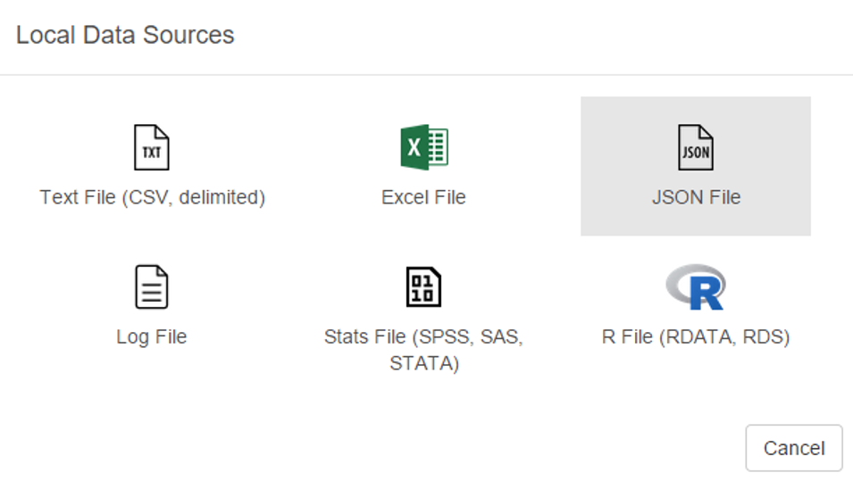
Some of the usual suspects are here – text and Excel files, but we also have the ability to load json data as well as some of the more prominent statistical formats including SAS and SPSS data. Very cool. We’ll come back to this later.
Now let’s see the remote options:
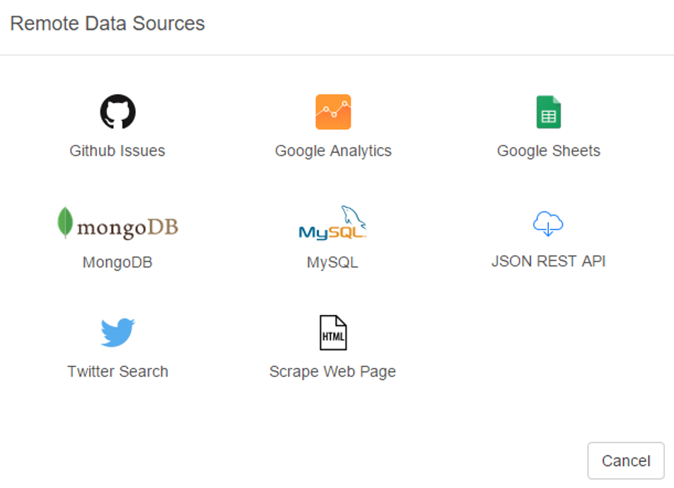
Great! Not only can we gain direct access to MySQL databases (a huge plus for me), Exploratory also provides access to a diverse range of option including Twitter search, MongoDB, and web scraping. We’re going to look at some specific examples later, but for now, here’s a glimpse of the MySQL data import window:

As with the entire app, the design is clean and intuitive. In a bit, I’m going to load details into this window so we can test the MySQL functionality.
A third import option exists in the availability to access any existing R scripts you may have previously created:

I’m not going to spend a lot of time here, due to the fact that I don’t have a lot (any?) of personal scripts. However, for seasoned R coders, this seems like a great feature.
Now let’s walk through some of Exploratory’s capabilities using a MySQL connection. The MySQL setup is really easy – just fill in your database connection parameters and you’re good to go. Here’s what it looks like for this example, with a few fields grayed out for security reasons.
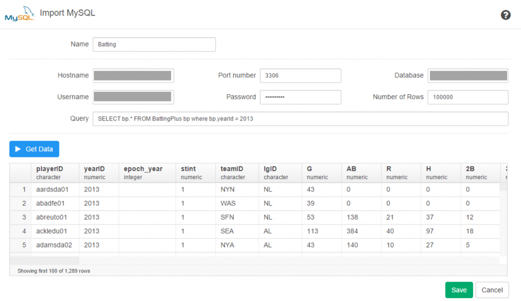
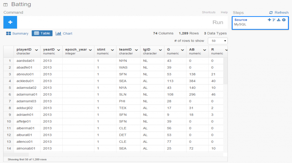
Once the connection is established, Exploratory will display the initial rows in the dataset. If we click the Run button, our data is pulled into a Summary view, where every variable in the data is summarized. This is a great way to see if our data looks as expected, and allows us to determine if the correct variable type (integer, date, etc.) is associated with each field.
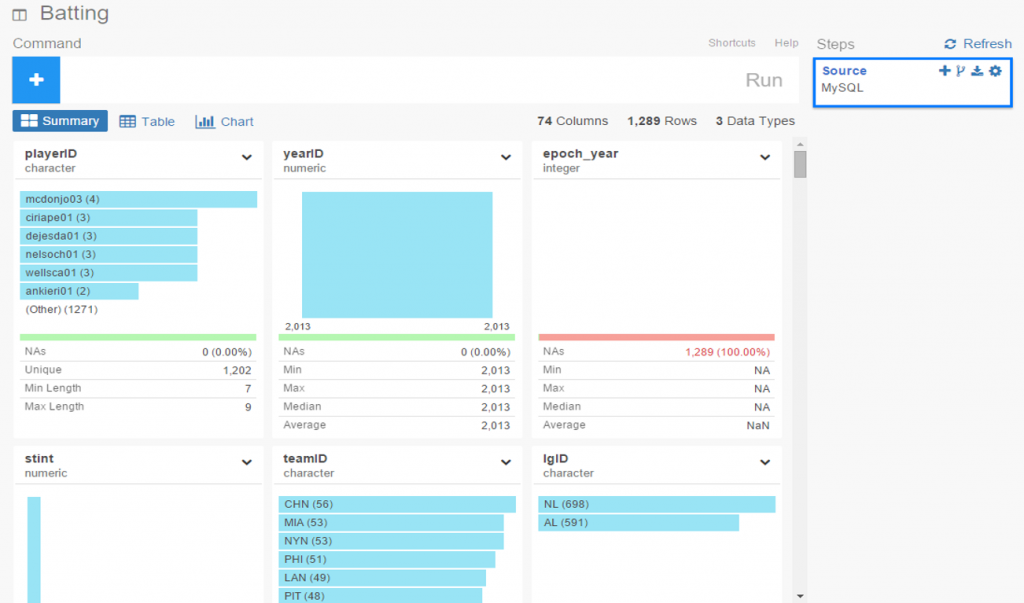
If everything looks good, we can move on to the Table option, which will resemble the MySQL view we just saw. No surprises here:
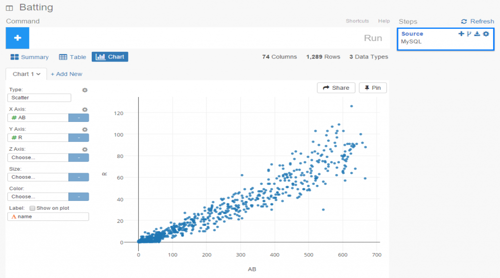
If we’re satisfied so far, then it’s time to move on to the fun aspects of Exploratory. For me, this starts with viewing data using the Charts selection. As of this writing, there are 10 chart options (two are actually mapping selections for geo data) including bars, scatter plots, box plots, heatmaps, and more. For me, this is a real strength of Exploratory; the ease with which we can see plots of our data is great! Here I’ve chosen a couple stat fields (at bats (AB) and runs (R)) to illustrate the scatter plot functionality.
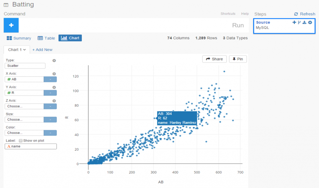
The charts are clean and attractive, and provide some additional options. For scatter plots, labels can be added via a simple check box. This permits me to add hover labels, as seen below:
Pretty nice so far, don’t you think? But as the old commercials used to say ‘wait, there’s more’. The considerable power of R lies beneath the surface, enabling statistical testing, filtering, data manipulation, and so much more. Here’s a glimpse of just a handful of available options for working with your data:
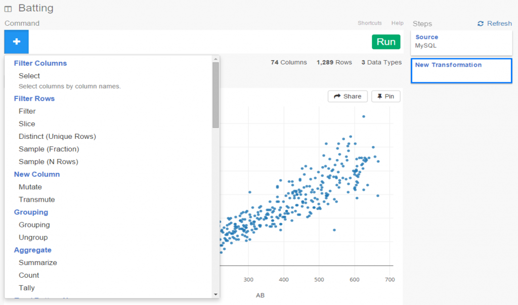
Let’s select a filter option, where we’ll reduce the data to look only at players age 30 or greater. One of the other great aspects of Exploratory is it’s exposition of R code. We can use the built in menu commands while viewing the actual R code. For experienced R users, the functions can be entered directly in a text box, and for us less experienced coders, we can learn on the fly by seeing the output.
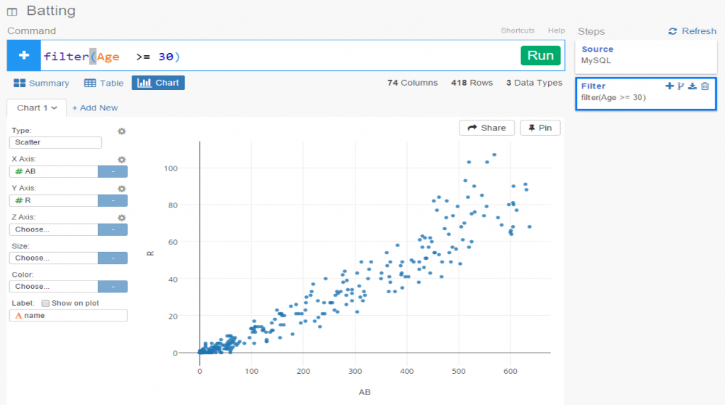
Now we see the same scatter plot populated with players 30 and older.
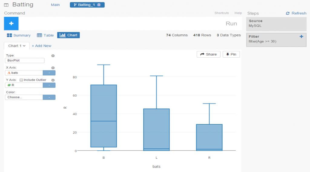
Another great feature is the ability to create branches within a project. This facilitates going down multiple paths within one workspace, rather than having to retrace our steps or rerun charts each time something changes. All we need to do is click the branch button, and a new tab is created for us. Very simple and intuitive, as is virtually everything in Exploratory.
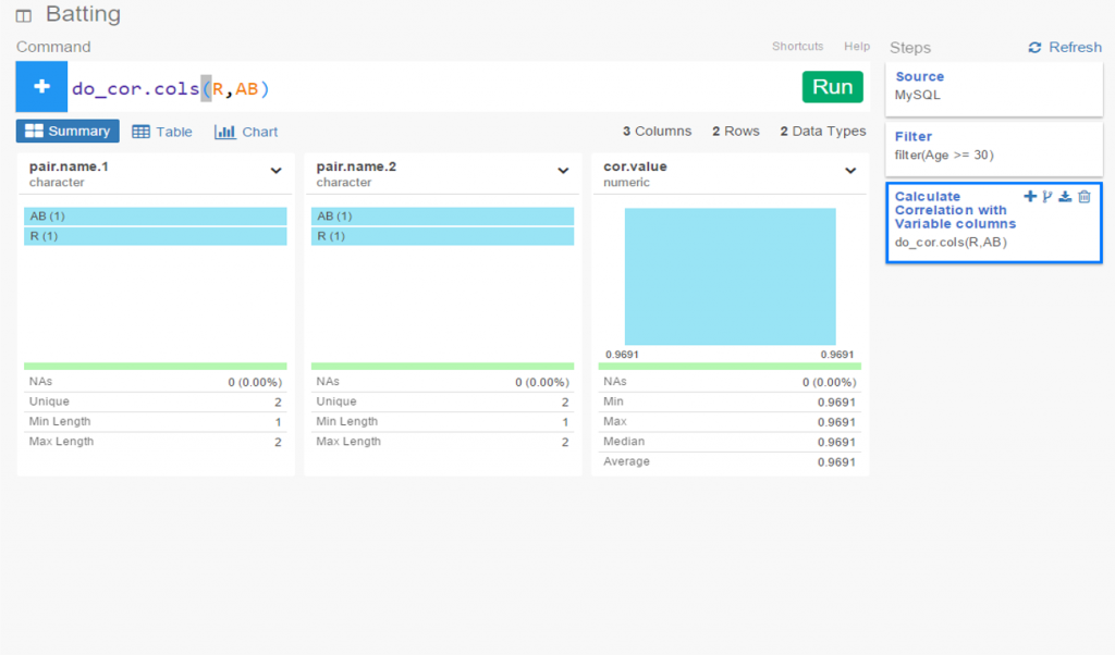
In this instance, we’ve elected to run a correlation on the chart variables in our main flow, while we create a new box plot in our branch.
I’ve been very impressed thus far with Exploratory, and have barely scratched the surface. My next step will be to create some real content that can be shared in a post or via some new visualizations on the site. I love the ease of accessing my data via MySQL, and immediately having the ability to create plots, filter data, and run statistical explorations.