Having discussed some of Exploratory’s cool features in a prior post, I thought it would be fun to continue the exploration using JSON data as a starting point. I happen to have a fair amount of JSON on hand, thanks to a series of network graphs produced using Gephi and sigma.js, so why not put it to use with Exploratory and start creating a new dataviz?
If you have previously worked with JSON, you’re no doubt aware that it can be a bit fickle – miss a bracket or brace in one place and the entire file fails to load a visualization. However, knowing that my JSON has been successful in producing network graphs (see here for examples), I figured it was worth a shot with Exploratory.
To begin, start with the local import option, selecting the json option, and pointing it to your local file. Give it a name, run the process and cross your fingers! After a few seconds, I’ve got my results, and Exploratory has done a good job categorizing the data:
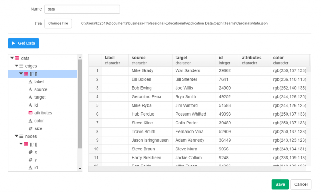
Since this is network data, we have nodes and edges, as well as any additional attributes, such as color or size. Exploratory has picked up those groupings, first the edges, and now the nodes.
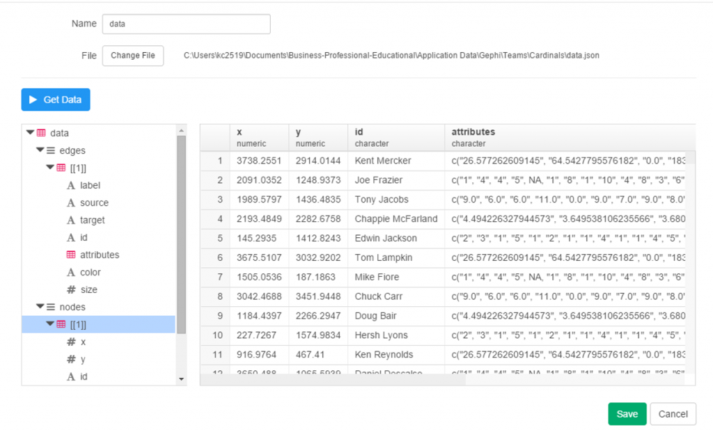
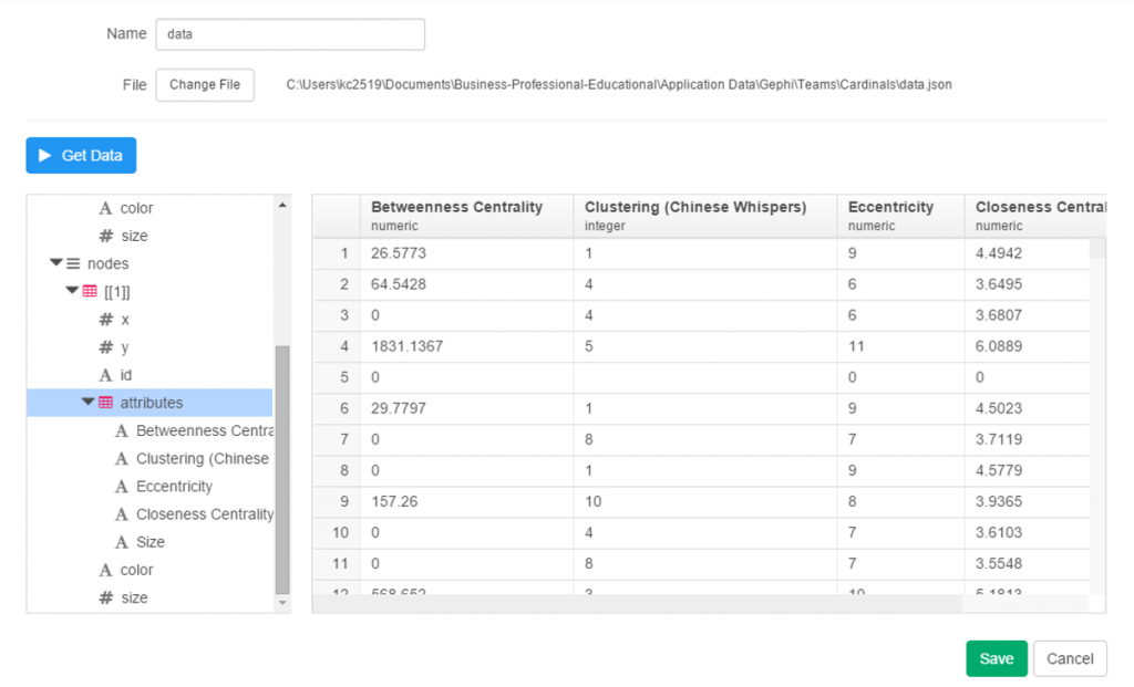
Finally, the attribute values:
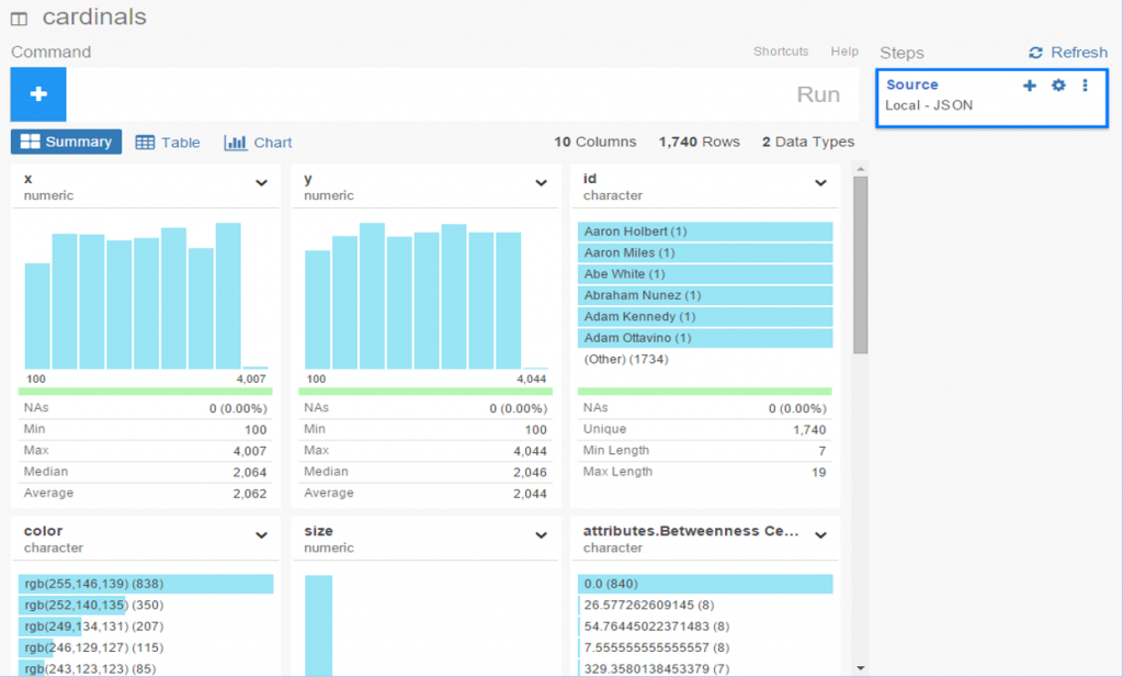
Since we’re satisfied with the import, we can move on to the summary data, which in this case doesn’t make a whole lot of sense. No matter, let’s see what can be done with some charts and analysis.
To start with, we have x and y values associated with each node, which sounds like a perfect candidate for a scatter plot. We add the x value to the x-axis (how convenient was that!), the y value to the y-axis, node size as the Size attribute, and finally the Eccentricity attribute for color. FWIW, eccentricity is not a measure of flakiness, but rather the distance between the most remote points in a graph. This is where the six degrees of separation (or Kevin Bacon, take your pick) concept comes into play; an eccentricity value of 6 equates to 6 degrees of distance. Here’s our result:

Not bad, eh? We can also hover over each node to see who it is (after adding Id to the Label field):
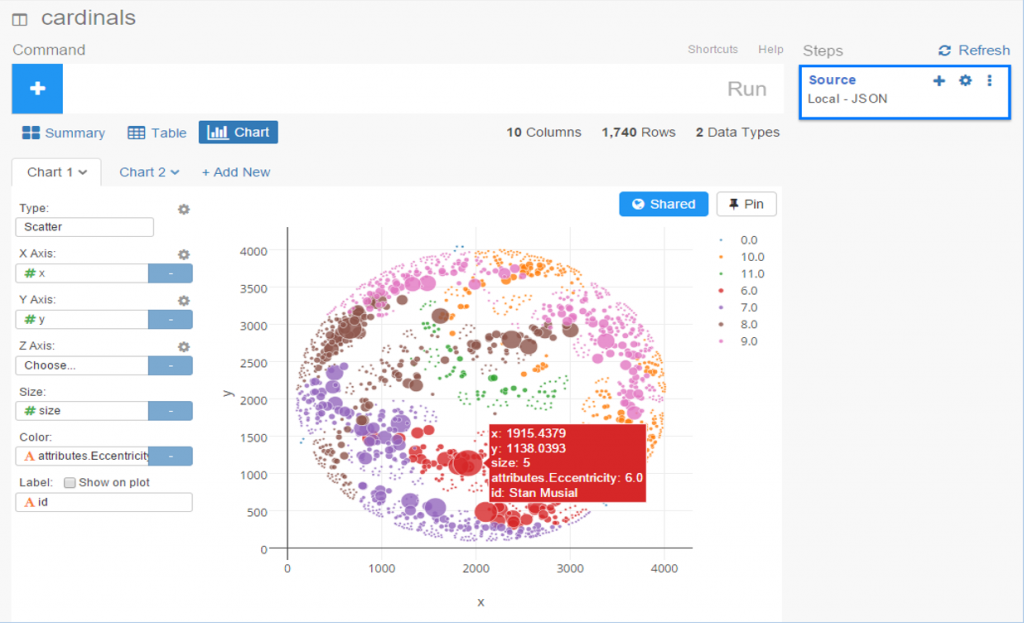
We still have a lot of activity in a limited space, so now let’s use a simple filter (see the command line at top) to grab the top 50 values, and see the results:
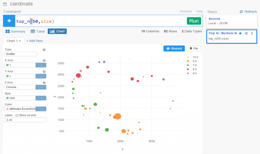
Now let’s create a new branch to explore further. I would like to sort my dataset using the Betweenness Centrality attribute, but there’s one problem – it’s a character value at the moment, so it doesn’t sort numerically. No matter, we can fix that easily using the Mutate command to convert the variable type. This can be seen in the right margin, where Exploratory conveniently stores all actions. Now we can sort our values in descending order to understand who is most influential in the network (at least by this measure). FYI – Betweenness Centrality tells us which nodes others must pass through most frequently to connect elsewhere within the network. Typically, but not always, it is someone centrally located within a network; sometimes it may be a less influential character (Pedro Borbon in this case) who connects more distant groups to one another.

So there you have it, another quick walk-through with Exploratory. Before I sign off, here’s the live scatter plot you can play with via the Exploratory server. Be sure to use the simple zoom features to traverse the chart!
[iframe src=”https://exploratory.io/chart/kc2519/1e4b6b0c24e1?cb=1467821749896&embed=true” width=”100%” height=”600″ frameborder=”0″]