Our next entry in the MLB Radial Axis Series features the Cardinals, one of the National League teams dating back to 2001. In total, we’re talking about 125 seasons from 1901 through 2025. We’re going to walk through some highlights from the network, and then provide the link so you can explore it in detail. For some background on how the network graphs work, select this link – Anatomy of MLB radial axis graphs.
The Cardinals Network
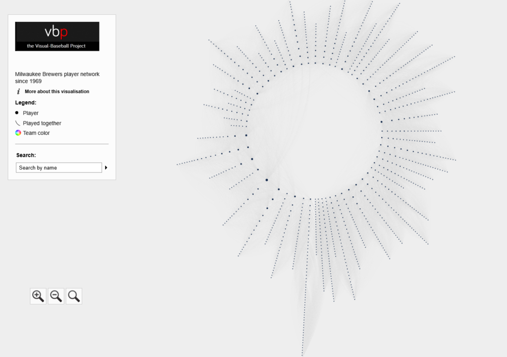
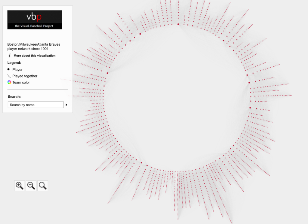
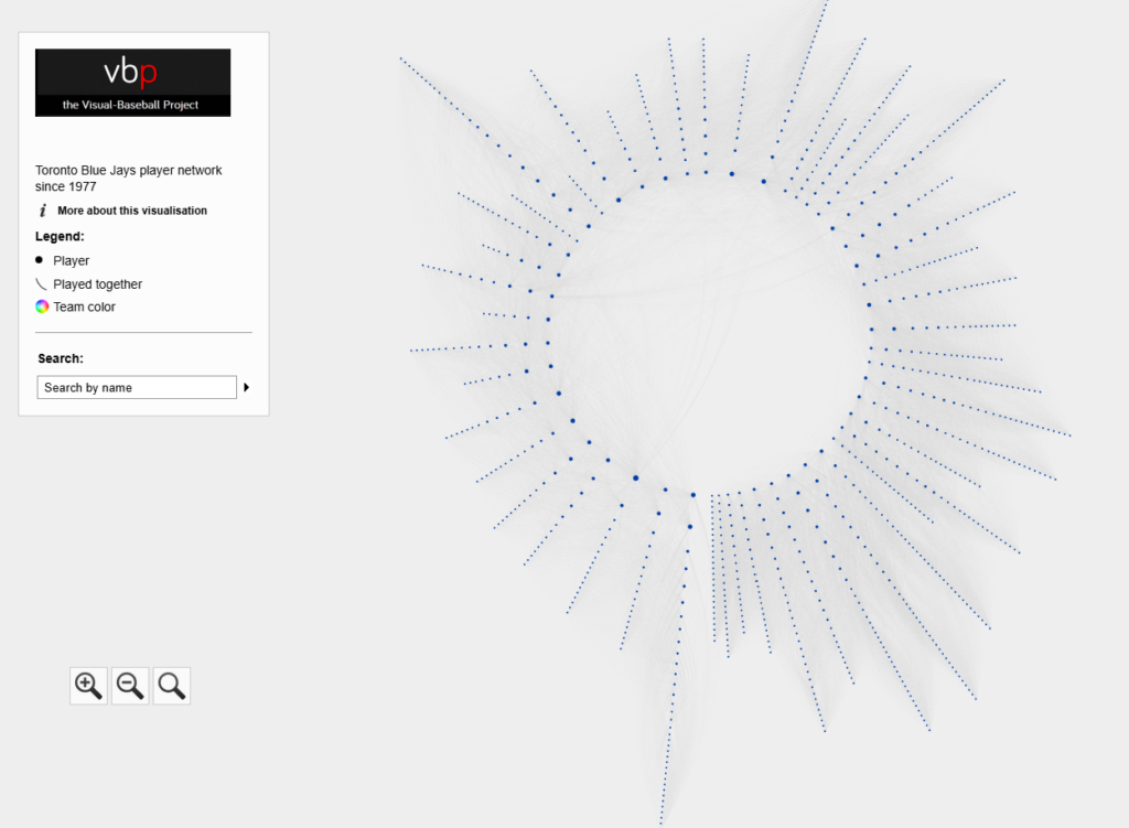
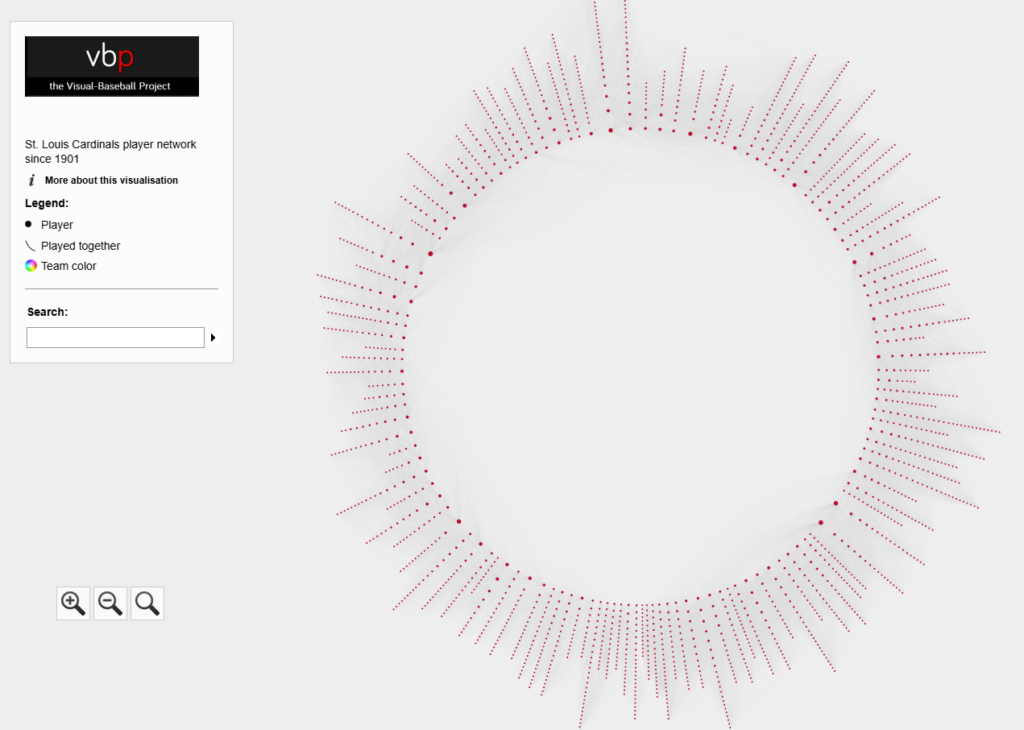
The Cardinals’ radial axis network reflects the connections among all players who spent time with the franchise from 1901 to 2025. The 1901 season is found at the bottom center of the graph. Subsequent seasons are arranged clockwise, eventually returning to the bottom center with the 2025 season. Player nodes are sized by the number of seasons spent with the team, and the gray lines between nodes reflect connections to other players. The interactive version of the network is here – Cardinals Network.
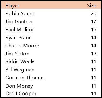
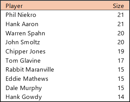
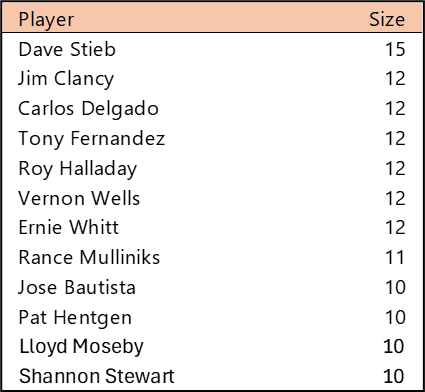
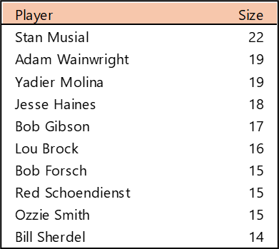
Top 10 by Seasons Played (Size)
Stan Musial stands alone on top of the Cardinals’ tenure ranking after playing 22 seasons (1941-1944, 1946-63) with the team. A handful of other Cardinals stars follow Musial. This group is led by Adam Wainwright (2005-2023), Yadier Molina (2004-2022), Jesse Haines (1920-1937), and Bob Gibson (1959-1975). Other long-time standouts include Lou Brock (1964-1979), Red Schoendienst (195-1956, 1961-1963), and Ozzie Smith (1982-1996).
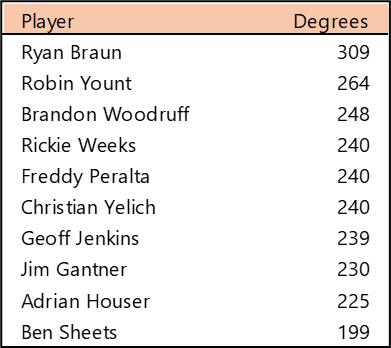
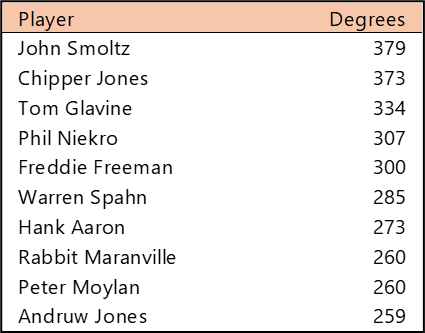
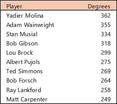
Top 10 by Degree (the number of connections)
Yadier Molina and Adam Wainwright were teammates for nearly their entire careers, so their number of connections (and who they are connected to) is very similar. Stan Musial played more seasons, but in an era without free agency. Bob Gibson and Lou Brock also overlapped careers and teammates to a substantial degree.
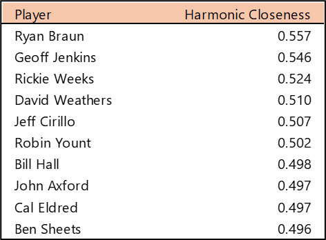
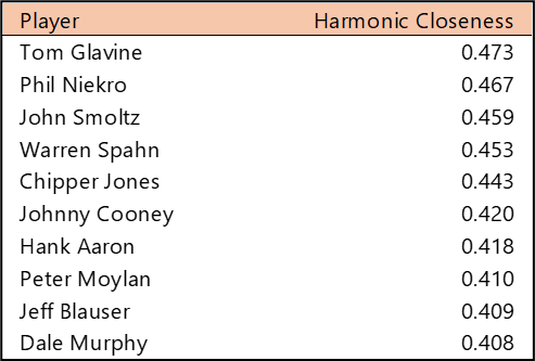
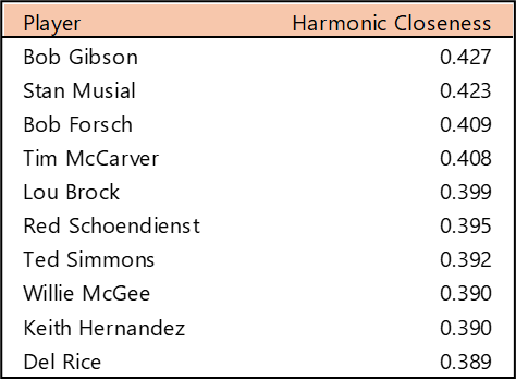
Top 10 by Harmonic Closeness Centrality
With Harmonic Closeness Centrality, we measure how closely an individual player is related to all other players in the network. This number (scaled from 0 to 1) may indicate a player’s importance to the network and may also indicate that they played with influential teammates. Bob Gibson and Stan Musial have nearly identical scores at the top, followed by a number of well-known Cardinals, including Bob Forsch (1974-1988), Ted Simmons (1968-1980), Willie McGee (1982-1990, 1996-1999), and Keith Hernandez (1974-1983).
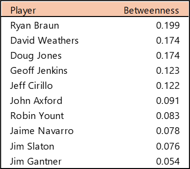
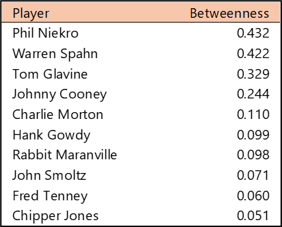
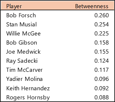
Top 10 by Betweenness Centrality
Betweenness Centrality measures which players rank highest in their ability to connect all other players. In simple terms, which player provides the most efficient path through the network (scaled from 0 to 1)? Bob Forsch tops the list, followed closely by Stan Musial. Willie McGee also scored highly on this metric, well ahead of the remaining members of the top 10. We don’t see any real surprises in this list; unlike some franchises with more volatile histories, the Cardinals’ top players offer few.
Summary
That’s it for our overview of the Cardinals network. Be sure to visit the interactive graph to discover additional insights about the Cardinals players over the last 125 seasons. We’ll be back shortly with our next franchise entry. Thanks for reading!