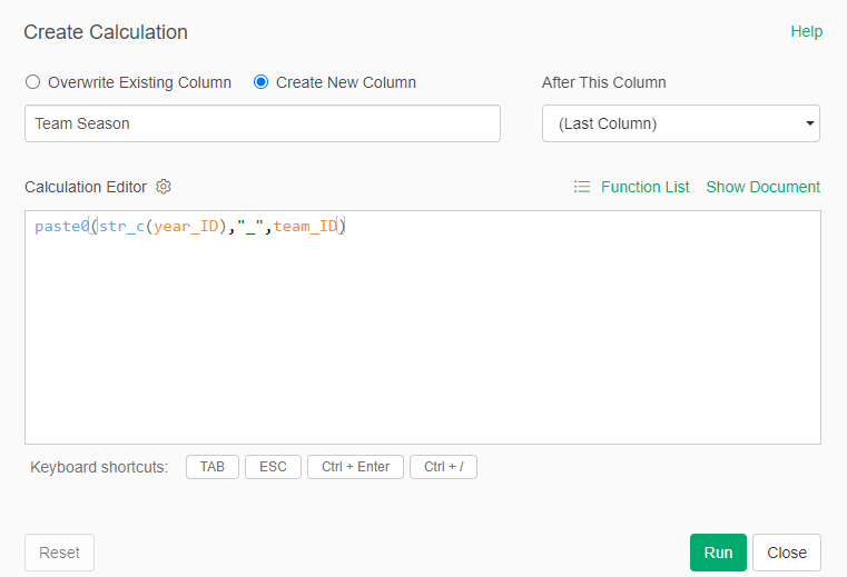
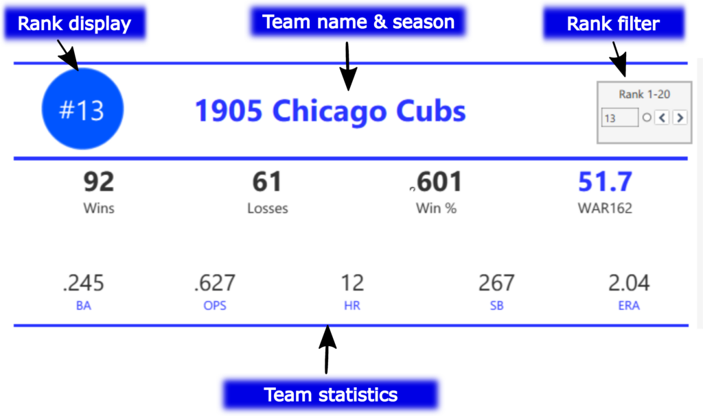
My 2025 book, The Visual Book of WAR, focused on both players and teams with outstanding WAR162 numbers. I’m expanding on that content with MLB team dashboards focused on the top 20 teams by decade. Let’s walk through the completed dashboard format; we’ll take a section-by-section tour and provide a little background for each element in the dashboard. In the following weeks, I’ll be counting down the top 20 teams by decade, starting with the 1900s. In this post, the 1905 Chicago Cubs (ranked #13 for the 1901-1909 period) will be my example.
The MLB Team Dashboard – Team Info and Stats
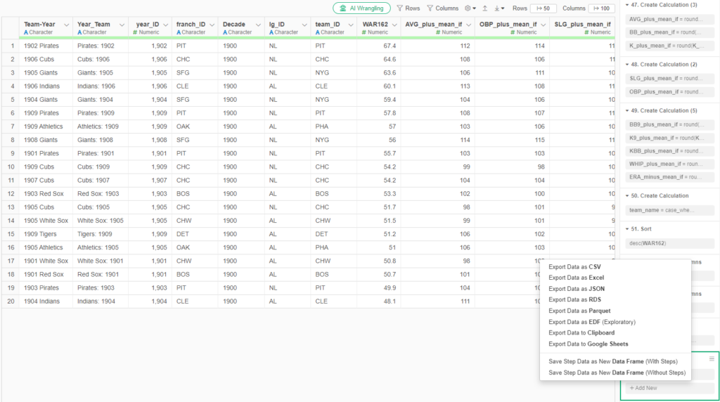
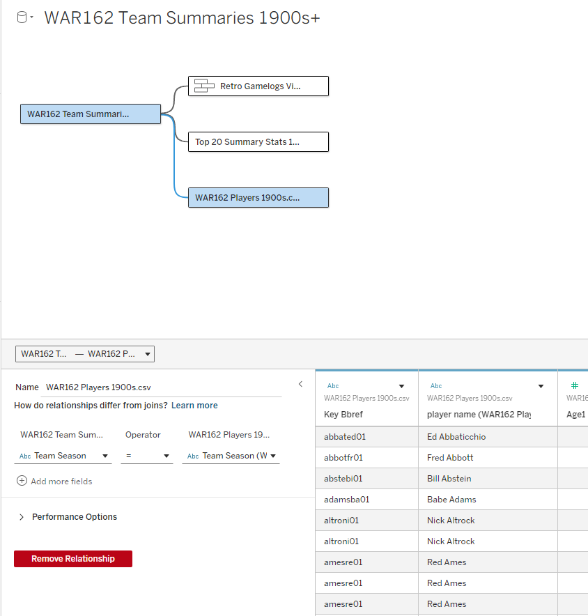
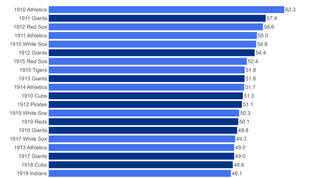
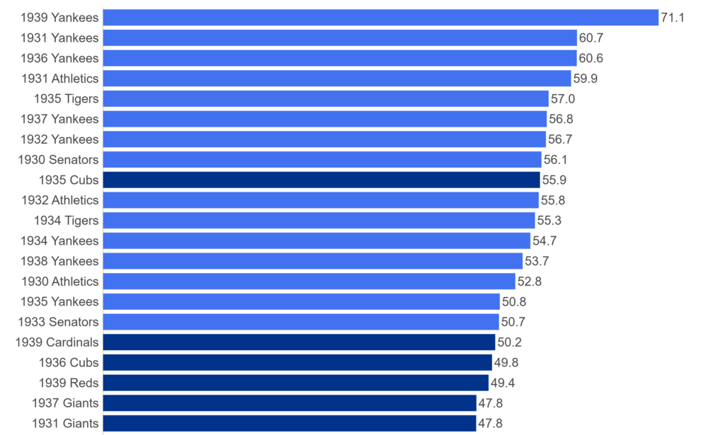
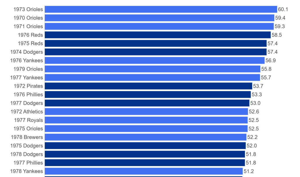
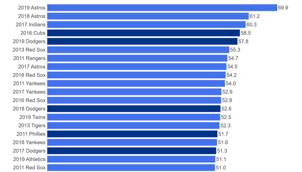
We’ll start with the top section, which includes the team rank, team name and season, a filter where users enter a rank (from 1 to 20), and some summary statistics capturing key measures such as wins and losses. The rank display and all other information automatically update based on the rank filter. What is the rank based on, you may ask? We are using WAR162, shown in blue in the top section; this measure is an aggregate value based on the sum of individual player WAR values for the season.
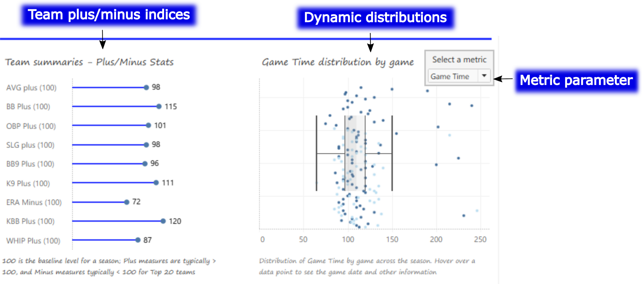
The MLB Team Dashboard – Plus/Minus and Distribution Charts
Moving down the page, we now see some interesting charts; a series of team-level plus/minus indices is shown on the left, while a dynamic distribution chart (with box plot) can display anything from runs to hits, to attendance and game time (in minutes). The metric parameter allows users to update the adjacent chart quickly and easily. Hovering over any data point in either chart provides further detail on the respective measure.
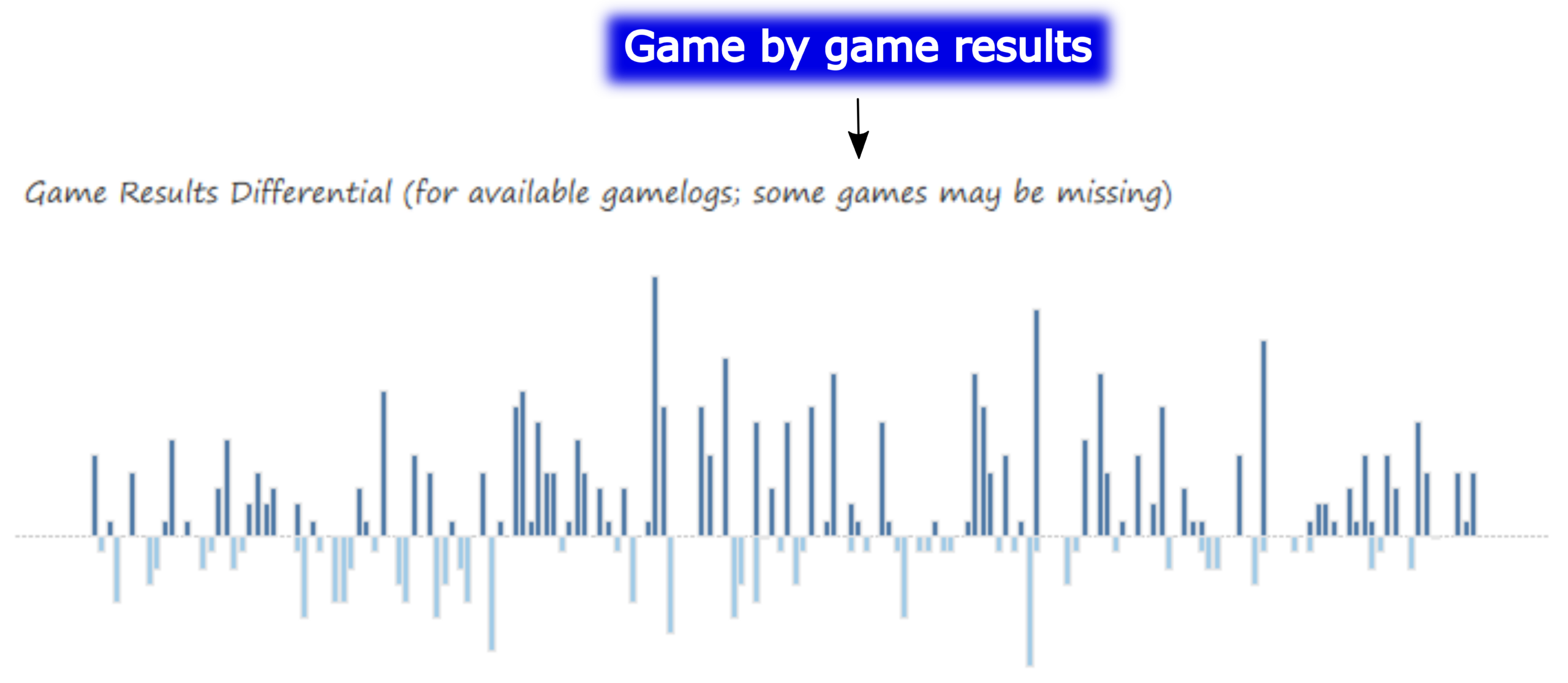
The MLB Team Dashboard – Game-by-Game Results Chart
The next chart displays game-by-game results (where available), showing the run differential for a win (above the zero axis) or loss (below the axis). Selecting a single game bar tells us the date, teams, and score for that specific game. The taller the bar, the greater the run differential; in other words, tall bars are an indication of a one-sided game, win or lose.
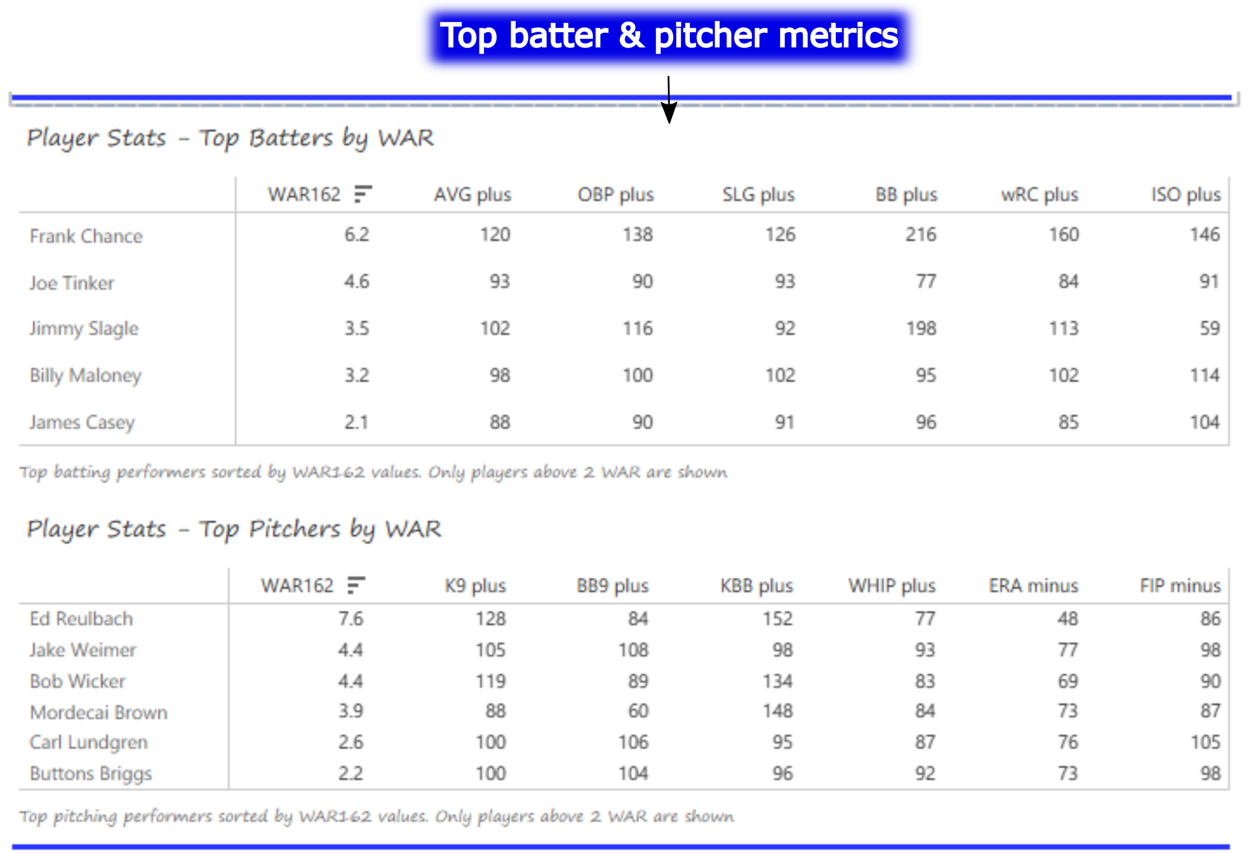
Batter and Pitcher Performance
Our final section features the top-performing batters and pitchers (ranked by WAR162), along with a handful of indexed measures that provide insight into their performance relative to league averages (always set to 100). Hovering over any value provides a summary of the player and his indexed value for that metric. In this section we can see the top players for the 1905 Cubs – Frank Chance, Joe Tinker, and especially Ed Reulbach.
I’ll be sharing the live link to the Tableau Public dashboard shortly, as I begin the countdown posts next week. I’m excited to premiere the dashboard and start the countdowns. As always, thanks for reading!