Welcome to the first countdown post in our series of MLB team rankings for the 2000s. As a reminder, the teams are ranked from #20 through #1 based on aggregate WAR162. The 2000s (for the first time since the 1950s) saw no teams added through expansion. For the decade (2000-2009), a total of 300 team-seasons were eligible, so the top 20 teams are a rather exclusive group – the top 7% for the decade. We’ll summarize each team and include portions of their team dashboard. Then we’ll explain how they attained their ranking. So, without further ado, here are the teams ranked #20 through #16.
Here’s the interactive dashboard at Tableau Public: 2000s Top 20 MLB Teams Dashboard
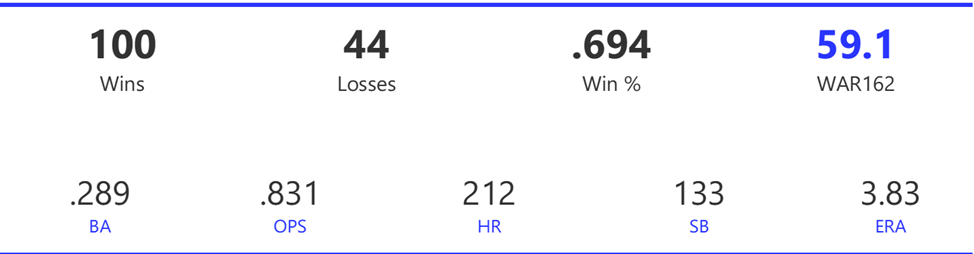
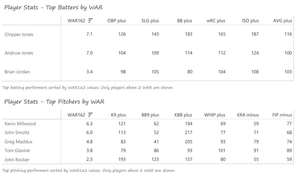
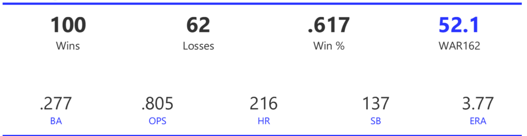
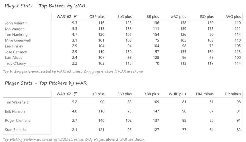
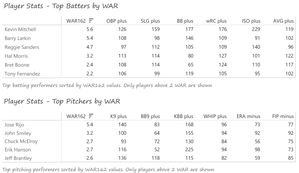
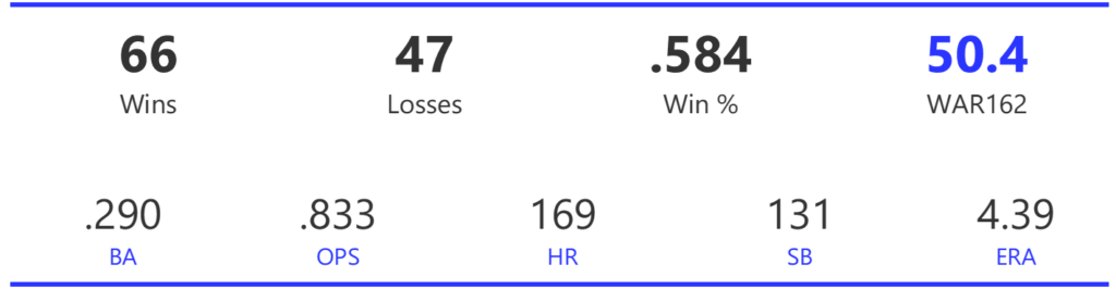
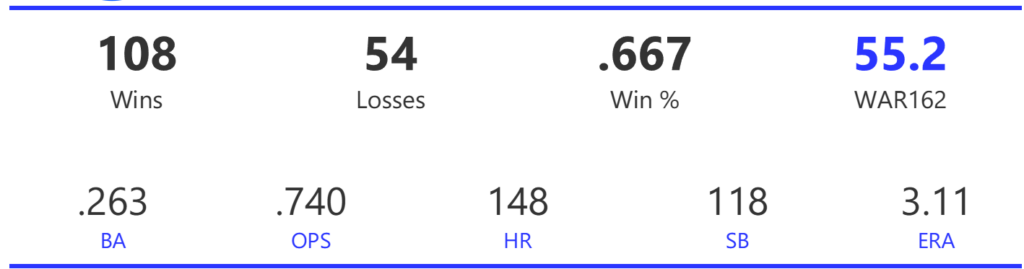
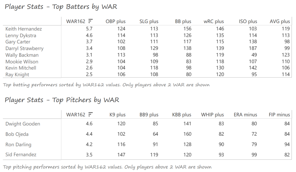
#20: 2001 Arizona Diamondbacks, 49.7 WAR162
The Diamondbacks captured the NL West by two games over the Giants before going on a tear through the postseason, defeating the Cardinals (NLDS), Braves (NLCS), and Yankees (World Series) to claim their first World Series in just their fourth year as a franchise.
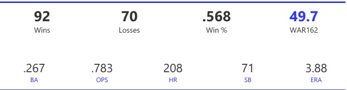
The DBacks featured a solid offense that placed in the top five in multiple offensive categories. They ranked fourth in BA, OBP, OPS, and home runs, and third in runs scored. Pitching was a real strength, with the Arizona staff ranking a clear first in WHIP, second in ERA, and first in strikeout-to-walk rate. They also tied the Braves with 13 shutouts on the season.
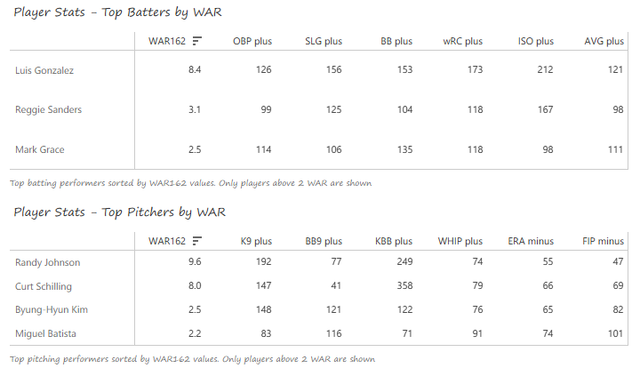
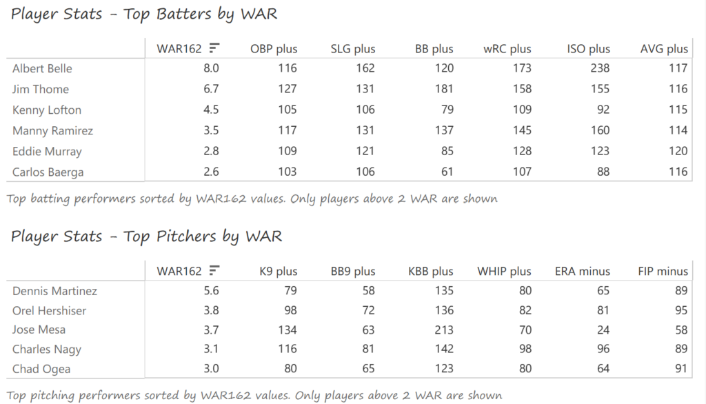
Outfielder Luis Gonzalez had a career year for Arizona, batting .325 with 57 homers, 128 runs scored, and 142 RBI. He also drew 100 walks in posting a .429 OBP. Gonzalez’s main support came from Reggie Sanders (33 homers, 90 RBI) and the 37-year-old Mark Grace (.298 BA, 78 RBI). On the mound, the DBacks featured one of the most dominant starter duos in MLB history. Randy Johnson claimed NL Cy Young honors with a 21-6 record, 2.49 ERA (NL-best) and 372 strikeouts (NL-best). Johnson also topped the NL in WHIP in a dominant season. Curt Schilling was the Cy Young runner-up, thanks to a 22-6 record, 2.98 ERA, and 293 strikeouts.
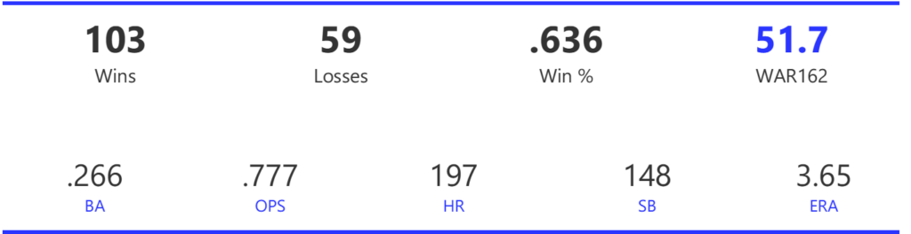
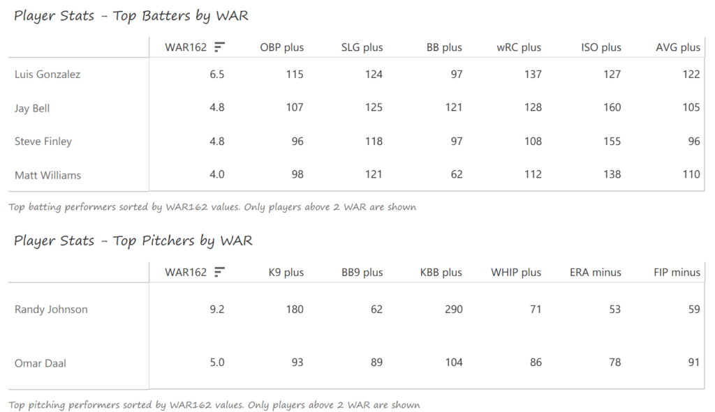
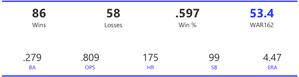
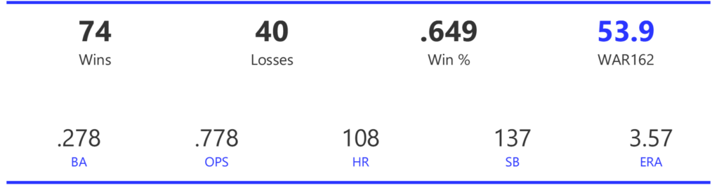
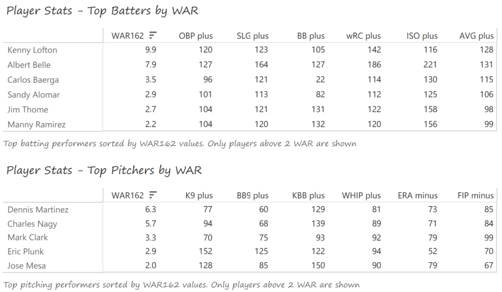
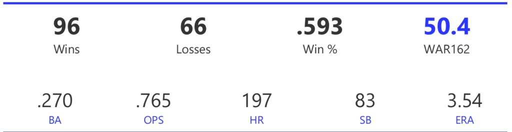
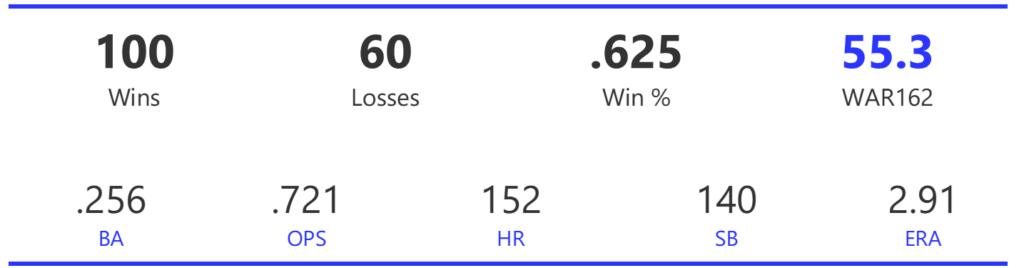
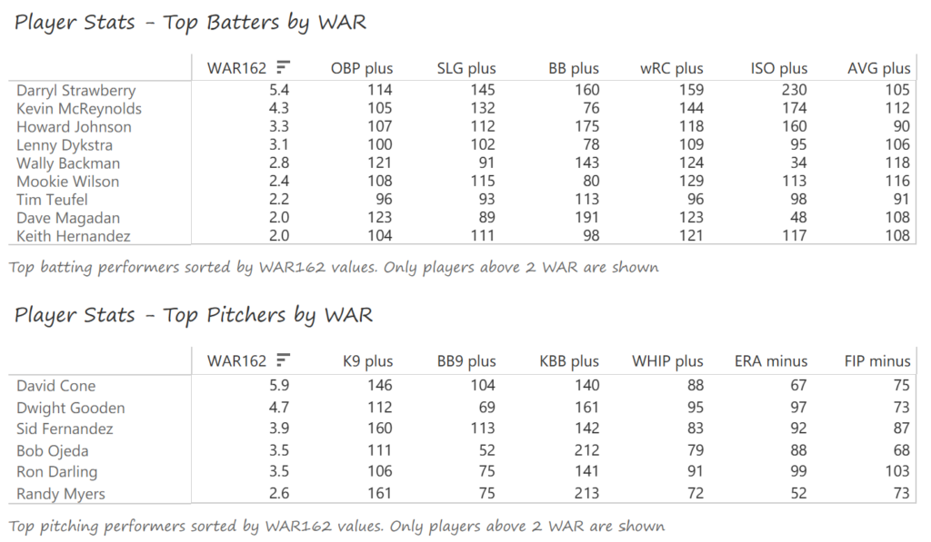
#19: 2000 San Francisco Giants, 49.8 WAR162
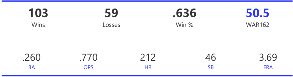
The 2000 Giants coasted to an 11-game margin over the Dodgers to claim the NL West title. Their season then came to a sudden end with a 4-game defeat at the hands of the Mets in the ALDS.
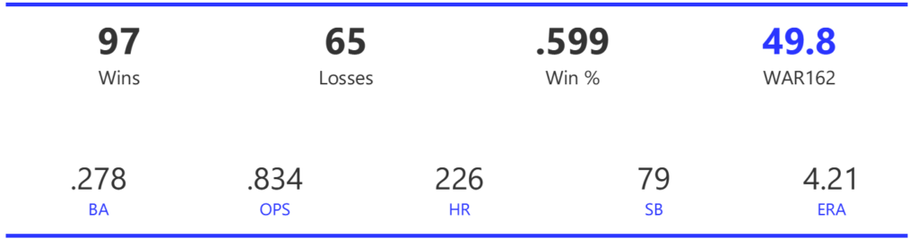
The Giants had a potent offense, trailing only the Rockies and Astros with 925 runs scored for the season. They also ranked third in home runs and BA, and second in both OBP and OPS. Pitching was less of a strength, as the Giants ranked fourth in ERA and seventh in WHIP, despite leading the NL with 15 shutouts.
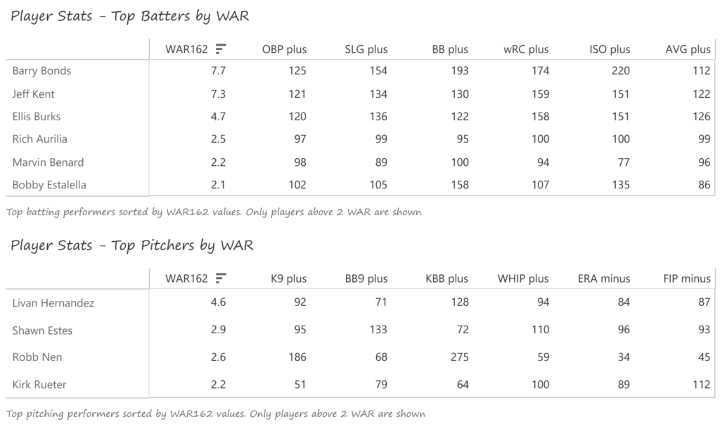
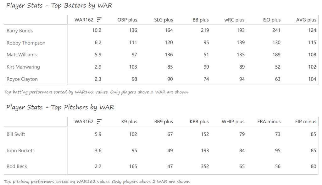
Barry Bonds and Jeff Kent formed the league’s best offensive duo, with Kent earning MVP honors over Bonds. Bonds batted .306 with a .440 OBP, 49 homers, 129 runs, and 106 RBI. Kent batted .334 with 33 homers, 125 RBI, and 114 runs scored. Ellis Burks was a capable third cog in the team’s offense, batting .344 with 24 homers and 96 RBI. Livan Hernandez led the Giants’ staff with a 17-11 mark, complemented by Shawn Estes‘ 15 wins. Robb Nen saved 41 games with a microscopic 1.50 ERA as the Giants’ closer.
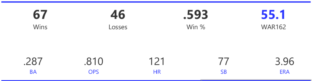
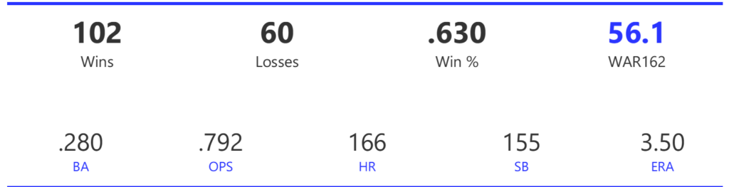
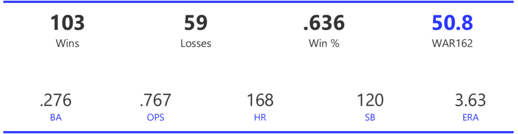
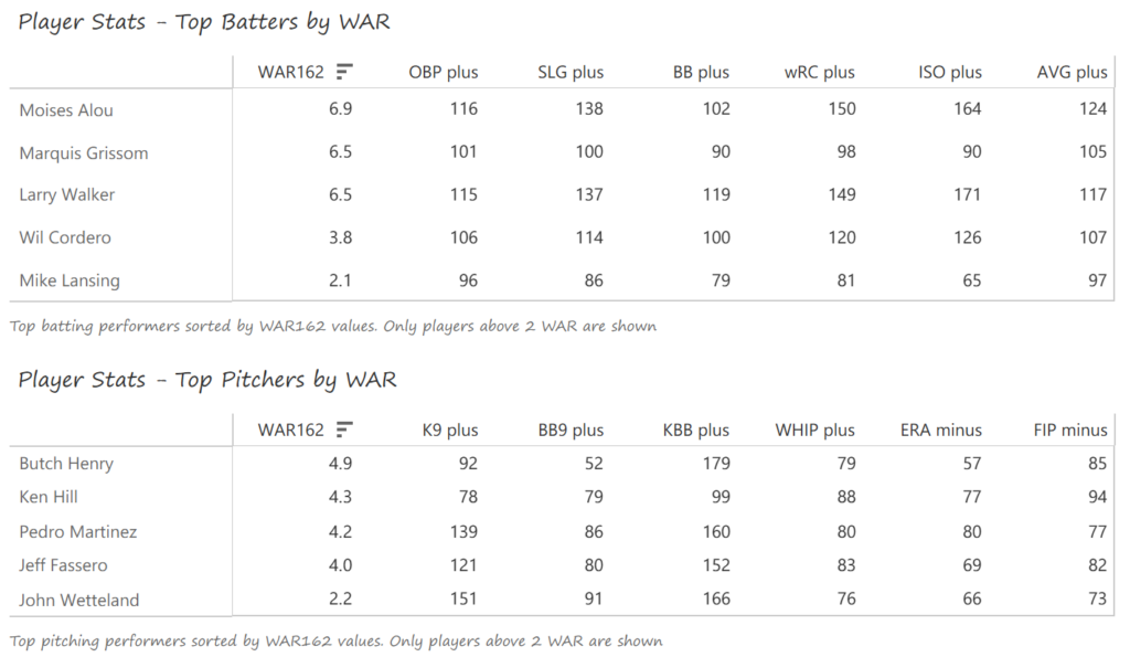
#18: 2002 Oakland Athletics, 50.5 WAR162
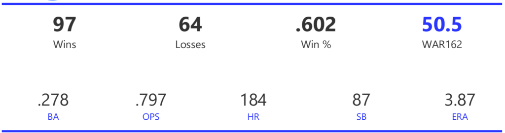
The 2002 A’s were part of the famed Moneyball era, winning 103 games to top the Angels by four games in the AL West. Unfortunately, the Twins beat them in the ALDS round in a 5-game series to end their season.
The Athletics ranked just eighth in the 14-team AL with 800 runs scored for the season, although they rose to fourth in homers and sixth in OPS. Pitching is where the team topped their rivals, as the A’s led the league in ERA and shutouts, despite ranking just fourth in WHIP.
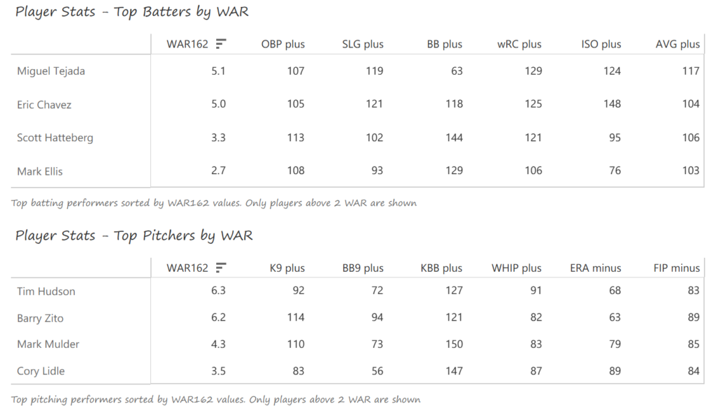
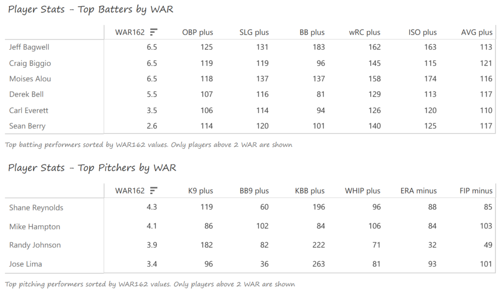
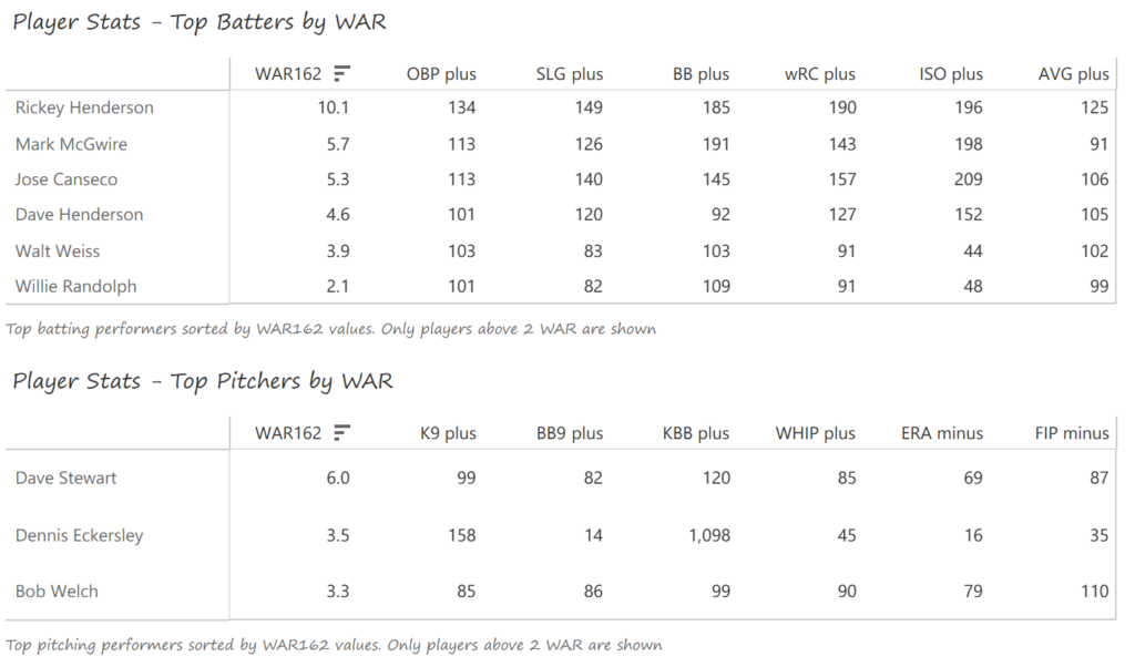
The left side of the Athletics infield provided much of their offense, led by shortstop Miguel Tejada and 3rd baseman Eric Chavez. Tejada won AL MVP honors with a .308 BA, 34 homers, 131 RBI, and 109 runs scored. Chavez launched 34 homers as well and added 109 RBI. Scott Hatteberg added a .280 BA with a .374 OBP from his first-base spot. The A’s pitching was led by starters Tim Hudson and Barry Zito. Hudson posted a 15-9 record with a 2.98 ERA, while the left-hander Zito claimed Cy Young honors with a 23-5 record and 2.75 ERA. Mark Mulder was a strong third option, recording a 19-7 mark, and Cory Lidle added another 8 wins.
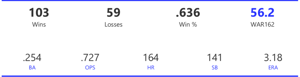
#17: 2008 Chicago Cubs, 50.7 WAR162
The Cubs cruised to the NL Central title by 7.5 games before being upended by an 84-win Dodgers squad in the NLDS. The 3-game sweep brought a disappointing end to a great season.
The Cubs rode a strong offense that led the league in runs, doubles, OBP, and OPS, while ranking second with a .278 BA. Their pitching was also effective, ranking third in both ERA and WHIP, and first in strikeouts.
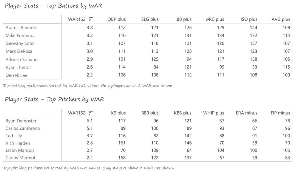
The Cubs’ offense was notable for its balance, with no star-level performances. Contributions came from a variety of sources, led by Aramis Ramirez (.289 BA, 27 homers, 111 RBI), Mike Fontenot (.305 BA), Geovany Soto (23 homers, 86 RBI, Rookie of the Year), and Mark DeRosa (.285 BA, 21 homers, 87 RBI). Alfonso Soriano added 29 home runs to the mix. Ryan Dempster (17-6, 2.98 ERA) and Carlos Zambrano (14-6) led the Cubs’ pitching in 2008, backed by Ted Lilly (17-9).
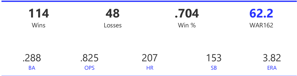
#16: 2008 Tampa Bay Rays, 50.8 WAR
The newly renamed Rays (formerly Devil Rays) rose to the top of the AL East, beating the Red Sox by two games for the regular season crown. In the playoffs, they took down the White Sox in the ALDS and the Red Sox in a 7-game ALCS. Their great season ended with a 5-game World Series defeat to the Phillies.
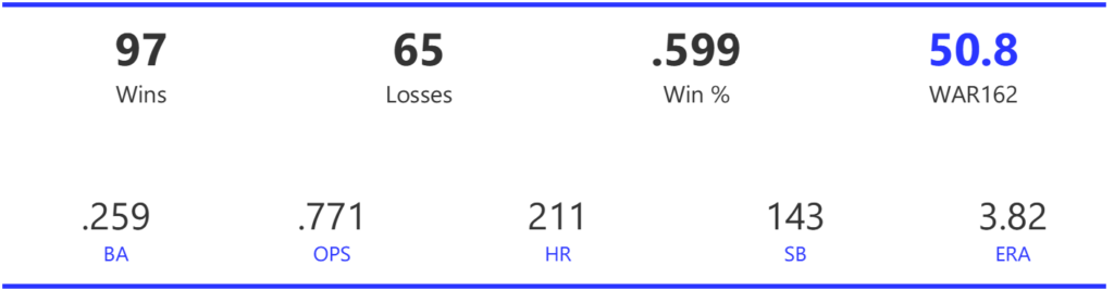
The Rays’ offense was quite ordinary by many measures, finishing ninth (out of 14 teams) in runs scored and a lowly 13th in BA. They did draw the second-most walks in the league, giving them above-average numbers for OBP and OPS. They also led the AL in stolen bases. Tampa had a fine pitching staff for 2008, ranking second in both ERA and WHIP, trailing only Toronto. They also ranked second with 52 saves.
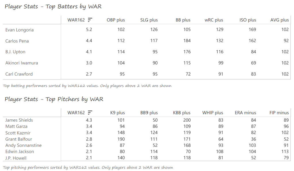
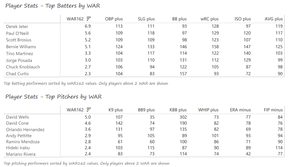
Evan Longoria led the Rays offense with 27 homers and 85 RBI, winning Rookie of the Year honors in the process. Carlos Pena had perhaps his best season, belting 31 homers with 102 RBI and a .377 OBP. B.J. Upton posted a .383 OBP with 44 steals and 85 runs scored to balance the Rays’ offense. James Shields led the mound staff with a 14-8 record and a strong 4.00 strikeout-to-walk rate. Matt Garza (11-9) and Scott Kazmir (12-8) joined Shields in forming one of the AL’s best rotations. Grant Balfour (6-2, 1.54 ERA) was particularly effective out of the bullpen.
Summary
That’s it for the first entry in our MLB Team Rankings for the 2000s decade! Stay tuned for the countdown from #15 to #11, arriving in a few days. As always, thanks for reading!