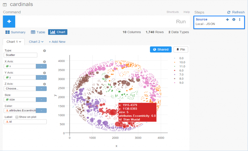
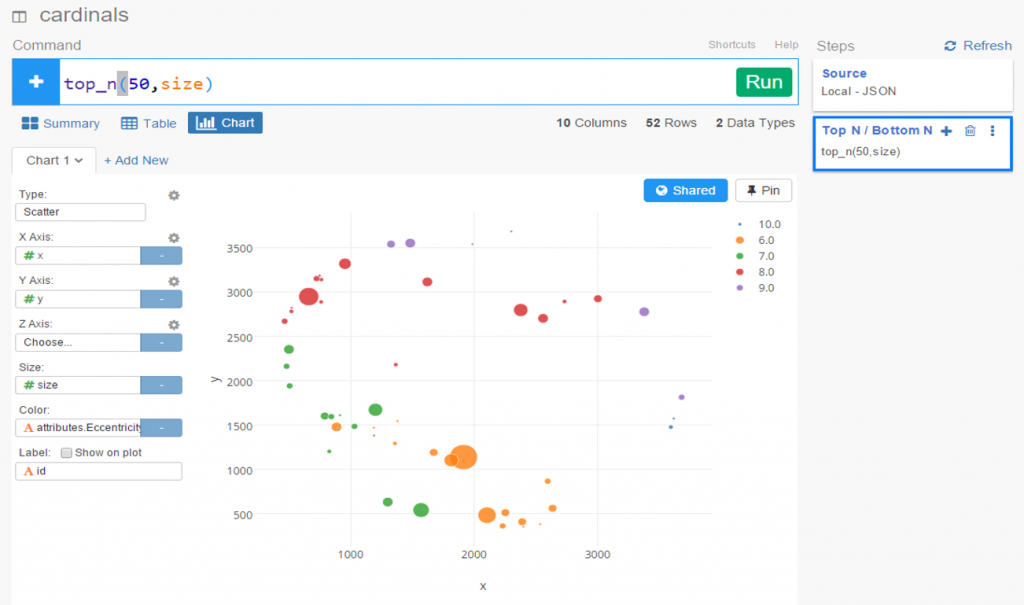
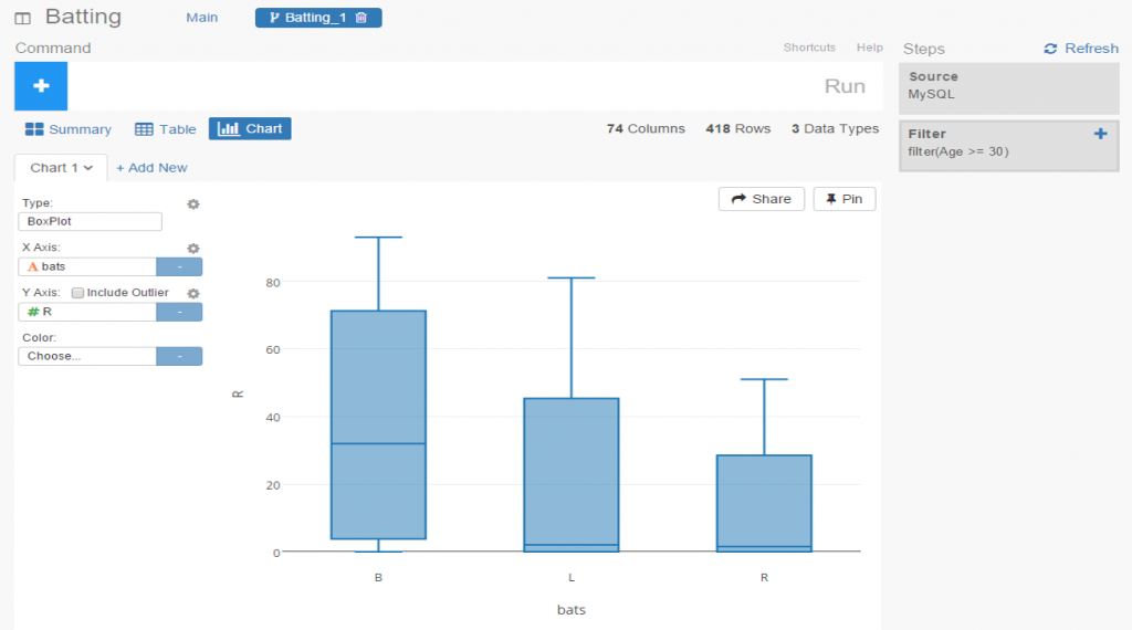
I spent the day today flagging the top 20 teams by decade (based on WAR162 calcs) in the Retrosheet game logs data, which opens the door to some fun upcoming analyses. In my Visual Book of WAR, there is a section looking at the top 10 teams per decade (1900s-2010s); we’re going to expand that to the top 20 for this next project. The aim is to produce a fun and informative dashboard for each of these teams that will highlight why they rank where they do.
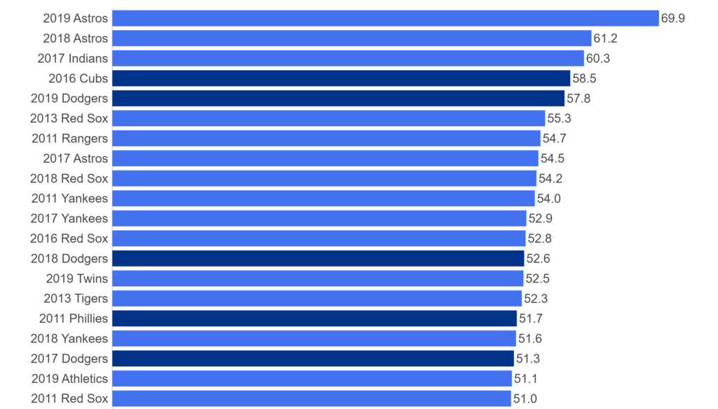
While the dashboard is still in the ideation stage, expect deeper insights into each team’s patterns within their featured season – individual WAR levels, run differentials, interesting statistics, and much more. Here are some teaser charts showing a few decades worth of who the top 20 teams are:
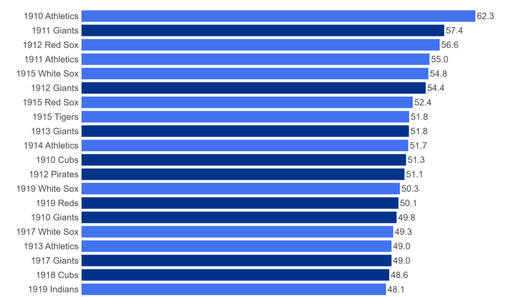
First, the 1910s:
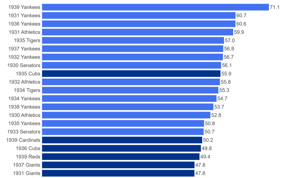
Next, the 1930s:
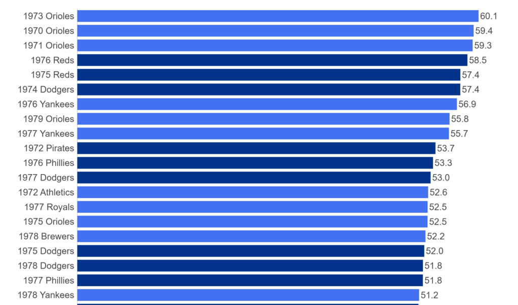
And the 1970s:
And the 2010s:
For each of the above teams, plus those from the other decades, we’ll have a sweet dashboard highlighting each of their seasons that rank in the top 20 for the decade.
The plan is to roll these out, with five teams at a time from each decade. The #20 through #16 teams will come first, followed by #15 through #11, #10 through #6, and finally, numbers 5 through 1. We’ll then move on to the next decade and repeat the same cadence. This should make for a fun series of posts that allow for interesting comparisons and insights.
I’m looking forward to kicking off this series very soon, and believe you’ll find it quite interesting. More to come as I finalize the dashboard format and how to deploy it for the greatest impact. As always, thanks for reading, and see you soon!