Category: Team Networks

Updating Player Networks – Part 2

In our previous post, we looked at how to acquire and load our baseball player data into Gephi. In this second installment, the focus will be on creating a player network graph in Gephi, and customizing many settings to deliver a network graph we can export to the web. Player networks are used to detail the connections between all players who are connected to one another in some fashion. In this instance, it is based on players having played for the same team in one or more common seasons. So let’s begin with the process of creating the graph using our raw data from the first installment.

Importing .csv data into Gephi is quite simple – we create individual node and edge files (as we showed in the previous post), and use the Gephi import functions to pull the data in. I always start with the node file, since it will typically have additional information not included in the edges file. After importing the node data, I then import the edge data, which gives us the information to form our initial graph. If we were to start with the edge file, Gephi will create our node data automatically, and we will not have the detail needed for our graph. This approach may work for simple graphs, but not for our current case.

Once both data files have been imported, we can begin thinking about what we want form our graph. Here are several questions we might pose:

  • How will we use color?
  • What sort of layout will be best?
  • Which measures should we calculate?
  • How should we depict node sizes?

In many cases, the answers to these questions come about through trial and error. We may have some ideas going into the process, but invariably, there will be modifications along the way. So be patient, and be willing to experiment as you create network graphs. The graph you will see in this post went through many of these modifications, which I won’t take the time to detail. Instead, this post will detail my final choices, along with some explanations for why these choices were made. So let’s take a walk through the various facets of the visualization.

Layout

While a network will retain the same underlying structure from a statistical point of view (degrees, centrality, eccentricity, etc.) regardless of our layout choices, it is still important to select a layout that will visually represent the underlying patterns in the network. Otherwise, we could just as well deliver a spreadsheet with all of the network statistics. So layout selection is critical, and often involves an iterative process.

For the baseball network graphs I built in 2014, I eventually settled on the ARF layout algorithm, which ran quickly and created an attractive circular network graph display using the player connection data. Alas, there is no ARF algorithm available for Gephi 0.9.2, so I required a different approach for the updates. Ultimately, this led to a 2-step approach using a pair of layout algorithms – OpenOrd followed by Force Atlas 2. OpenOrd is especially effective at creating a quick layout from large datasets, although with far less precision than some other force-directed approaches. Still, it is a great tool for creating a general understanding of the structure of a network very quickly. Force Atlas 2, is the near opposite of OpenOrd – a very precise approach that can be tweaked easily using the various settings in Gephi. It is ideal for putting the finishing touches on what OpenOrd started.

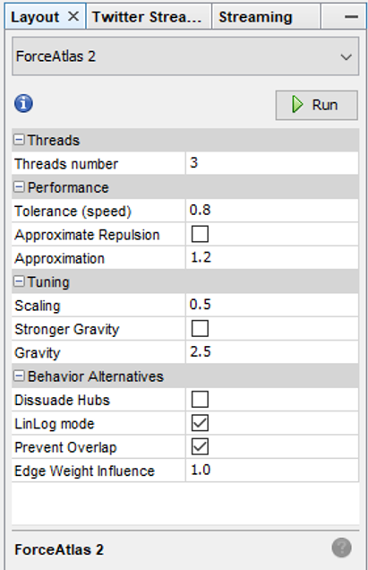
Here are the settings I eventually settled on for Force Atlas 2, after much trial and error:

Force_Atlas_2

Some of the more important things to note here are the Scaling and Gravity settings. I reduced the scaling to 0.5 so the network would display appropriately in a single window without the need for scrolling. The Gravity setting was increased to 2.5 to force nodes slightly toward the center of the display. The LinLog mode and Prevent Overlap options are also selected in order to make this particular graph more visually effective. For other graphs, I have used the Dissuade Hubs option, forcing large nodes to the perimeter of the graph; in this case, that was not an ideal choice.

Color

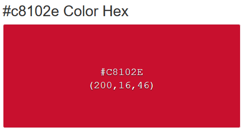
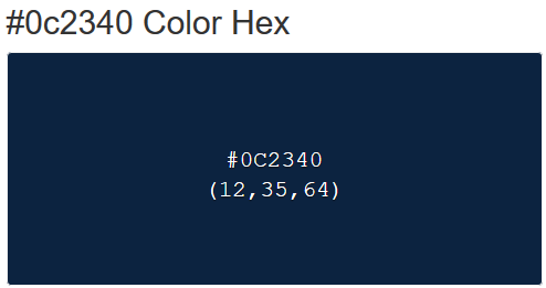
The use of color is also important within a network graph display. Color can be used to highlight nuances in the data that distinguish one or more nodes relative to another group of nodes. Often we use color to visually represent clusters within the graph, as grouped using the modularity classes statistic or some similar input. In the case of this series of graphs (ultimately one graph per team), I made a decision to use the official team colors to differentiate each graph. Thus my initial graph for the Boston Red Sox would be based on the two primary hex colors for the current team (these colors do change over time for many teams).

Here are the Red Sox primary colors:

c8102e_Color_Hex_-_2018-06-10_09.15.48 0c2340_Color_Hex_-_2018-06-10_09.16.33

After capturing current team colors in a spreadsheet for easy reference, I used the color-hex.com site to select complementary colors for the Red Sox graph. Using complementary colors allows me to differentiate clusters in the graph while remaining true to the original concept of employing team colors for each graph. So instead of a wide range of colors one would normally see in a Gephi output, I was able to input the complementary colors for each group. Thus, one team color could be used for the graph background, while the other color (and it’s complements) could be used for the graph structure (nodes & edges). We’ll share the effect later in this post.

Statistics

Graph statistics are critical to the full understanding of the structure of a network. While we can view a graph and begin to understanding the general structure of a network, the various statistics will aid and reinforce our initial visual comprehension. Gephi provides a nice range of statistical measures to choose from:

  • Eccentricity (the number of steps needed to traverse the network)
  • Centrality – betweenness, eigenvector, closeness, harmonic closeness (various measures of importance of an individual node)
  • Clustering coefficient (to discern cliques in the network)
  • Number of triangles (a friends of friends measure)
  • Modularity Class (clusters)
  • Degrees (the number of connections)

Sizing

Node sizing is another key element of effective graph design. In this case, there were a few options I could pursue for node sizing – the number of seasons played (I used this in the 2014 graphs), one of the various centrality measures we calculated, or the number of degrees (connections) an individual player possesses. After computing each of these statistics, I eventually decided to use the number of degrees as a representation of influence in the graph. Visually, I want to show how many other players a single individual is related to, and using node size is an effective means of doing so.

Summary

Our final graph in Gephi is shown below; the eventual web-based version will differ slightly and include additional functionality, but that’s for another post.

red_sox_20180610

Next Post

My third and final post in this series will address exporting this graph to the web using the sigma.js plugin, and making some additional customization to the web version. Thanks for reading, and see you soon!


Updating Baseball Team Networks – Part 1

A few years back, I used Gephi and sigma.js to create a series of interactive baseball team networks, one for each current MLB franchise. These networks displayed all players through the 2013 season, going all the way back to 1901 for the original American and National League franchises. Now that we have data through the 2017 season, it’s time for an update, not only from a data perspective, but also stylistically. This post will walk through the process of creating one of these networks using Toad for MySQL, Gephi, and sigma.js to create web-based interactive network visualizations.

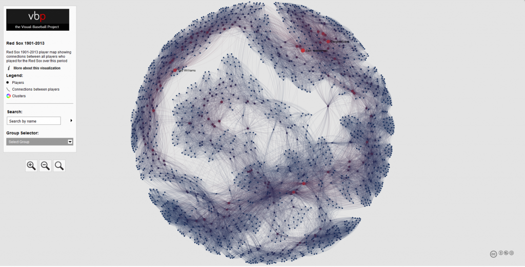
Here’s a typical network from the 2013 series; the full list of networks can be found here. We’ll use the existing networks as a baseline for the new networks, although a few modifications will be made.

baseball_team_network_2013
a 2013 baseball team network for the Boston Red Sox

Source Data & MySQL Queries

Let’s start our discussion with the source data. Season-level baseball data is available through the seanlahman.com website, in the form of .csv files or Microsoft Access database tables. I use the .csv format, as it can be easily added to existing MySQL databases on the visual-baseball.com server. MySQL also makes it simple to add derived fields through some simple coding. These fields can be utilized later for a variety of activities.

For the purpose of our network graphs, there are a handful of critical fields we want to use. These include the following:

  • playerID, a unique identifier for every player who ever donned a major league uniform
  • player name, which can be used to provide a meaningful reference based on the playerID field
  • yearID, which refers to the season (or seasons) a player suited up for a specific franchise
  • franchID, a unique identifier for each MLB franchise

We also need to do a little manipulation of the source data in our code to deliver our results in the proper form for use in Gephi. This means we need to create two input files – one for nodes, and a second for edges. The nodes will contain information about each player, the number of seasons played for the franchise and the first and last seasons, which may differ from the number of seasons, as players frequently leave a franchise only to return later in their career. Here’s our node code:

SELECT Id, Label, MAX(Size) as Size
FROM
(SELECT bp.playerID AS Id, CONCAT(bp.name, ” “, MIN(bp.yearID), “-“, MAX(bp.yearID)) AS Label, COUNT(bp.yearID) AS Size
FROM BattingPlus bp
WHERE bp.franchID = ‘BOS’ and bp.yearID >= 1901
GROUP BY bp.name

UNION ALL

SELECT pp.playerID AS Id, CONCAT(pp.name, ” “, MIN(pp.yearID), “-“, MAX(pp.yearID)) AS Label, COUNT(pp.yearID) AS Size
FROM BattingPlus pp
WHERE pp.franchID = ‘BOS’ and pp.yearID >= 1901
GROUP BY pp.name)  a
GROUP BY Id
ORDER BY Id;

Here’s the simple interpretation – since we are attempting to display all players for a given franchise, we are executing a UNION ALL statement to combine batters and pitchers into a single result file. We have used the playerID field to create the required Id value for Gephi, while also creating a Label field by combining the player’s name with their first and last years playing for this franchise. Finally, we have created a Size field based on the number of seasons played for the franchise. We can then choose to use this in Gephi to size each node, if we so choose.

We also need to create the edge file for Gephi. In this case, we want to understand how many seasons two players were on the same team. This code is a bit trickier, since we want to show only one connection between two players, since this will be an undirected graph. More on that distinction later. Here’s our edge code:

SELECT b.playerID AS Source, m.playerID  AS Target,  ‘Undirected’ as Type,  ‘ ‘ as Id, ‘ ‘ as Label, count(*) as weight
FROM
(SELECT a.playerID, CONCAT(m.nameFirst, ” “, m.nameLast) name, a.yearID, a.franchID

FROM Appearances a
INNER JOIN Master m
ON a.playerID = m.playerID

WHERE a.franchID = ‘BOS’ and a.yearID >= 1901) b

INNER JOIN Appearances a
ON b.yearID = a.yearID and b.franchID = a.franchID and b.playerID <> a.playerID and a.playerID > b.playerID
INNER JOIN Master m
ON a.playerID = m.playerID

GROUP BY b.playerID, a.playerID
ORDER BY b.playerID

Here we use the Master table to provide player name information, and we also gather the ID information to match the node values. The critical piece in this code is in our join criteria:

INNER JOIN Appearances a
ON b.yearID = a.yearID and b.franchID = a.franchID and b.playerID <> a.playerID and a.playerID > b.playerID

Here we are matching players based on the same season and the same franchise. We then specify that we do not want to connect any player to himself, and that we want only values where the playerID value from our main query is greater than the playerID value from the sub-query. This gives us a single connection between two players, which is what we need for an undirected graph. We then define a Source node (required by Gephi) and a Target node (also required), as well as specifying ‘Undirected’ as the graph type. We leave the ID and Label values empty, and then summarize the number of seasons played together as an edge weight. This value can be used in Gephi to show the strength of a connection between two nodes (e.g.- did they spend one season together, or 10 seasons together?).

After exporting each of these files to a .csv format, we have our source data for Gephi. In Part 2 our focus will shift to creating the network in Gephi.