Our next entry in the MLB Radial Axis Series features the Diamondbacks, one of the National League expansion teams dating back to 1998. In total, we’re talking about 28 seasons from 1998 through 2025. We’re going to walk through some highlights from the network, and then provide the link so you can explore it in detail. For some background on how the network graphs work, select this link – Anatomy of MLB radial axis graphs.
The Diamondbacks Network
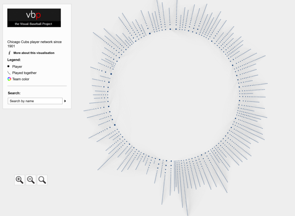
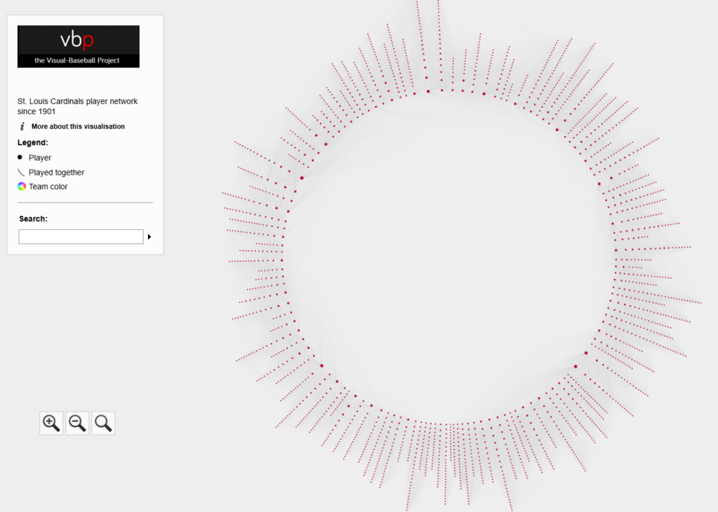
The Diamondbacks’ radial axis network reflects the connections among all players who spent time with the franchise from 1998 to 2025. The 1998 season is found at the bottom center of the graph. Subsequent seasons are arranged clockwise, eventually returning to the bottom center with the 2025 season. Player nodes are sized by the number of seasons spent with the team, and the gray lines between nodes reflect connections to other players. The interactive version of the network is here – Diamondbacks Network.

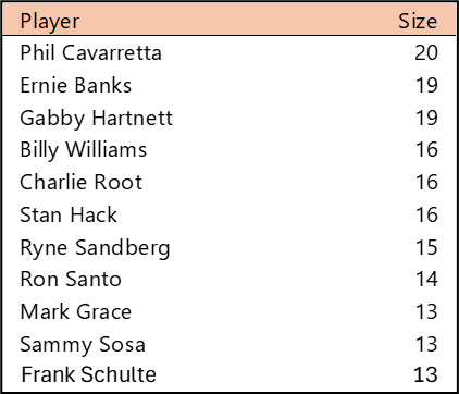
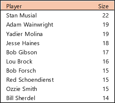
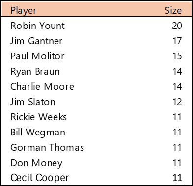
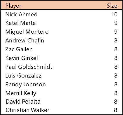
Top 10 by Seasons Played (Size)
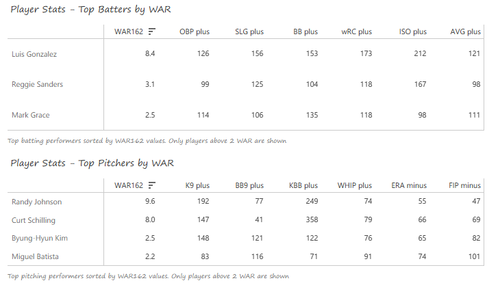
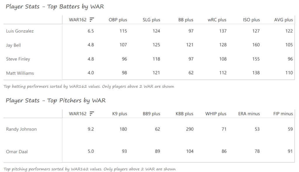
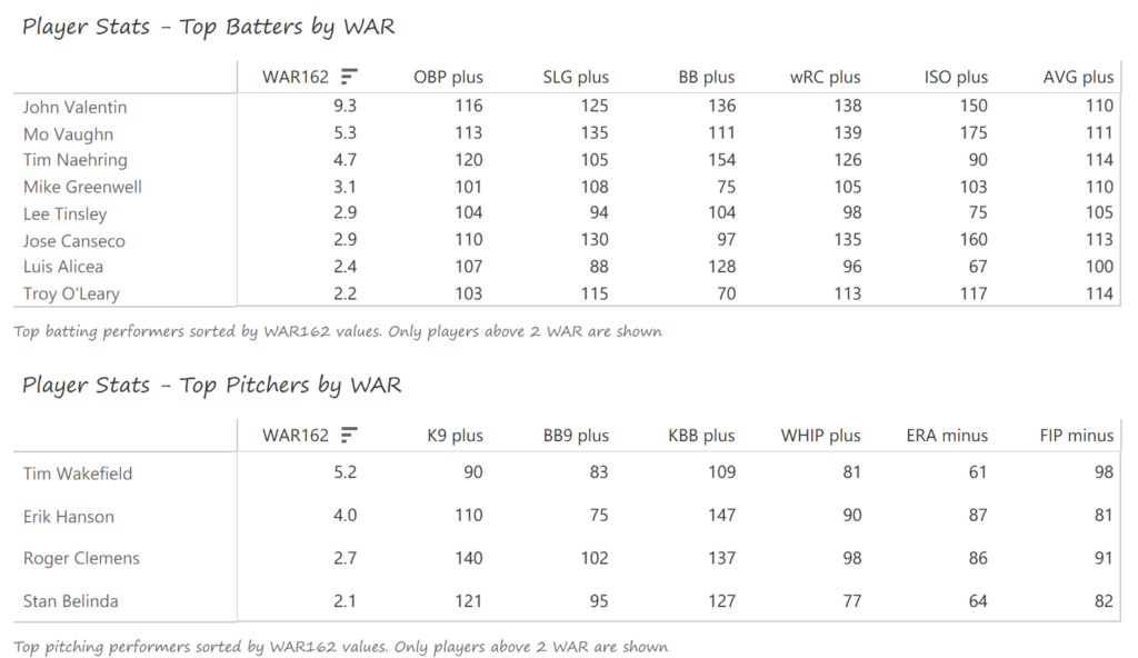
Nick Ahmed (2014-2023) has logged the most seasons for the short-lived Arizona franchise, followed closely by the still active Ketel Marte (2017-2025) plus Miguel Montero (2006-2014). A host of other players were DBacks for eight seasons, including notables such as Paul Goldschmidt (2011-2018), Luis Gonzalez (1999-2006), and Randy Johnson (1999-2004, 2007-2008).
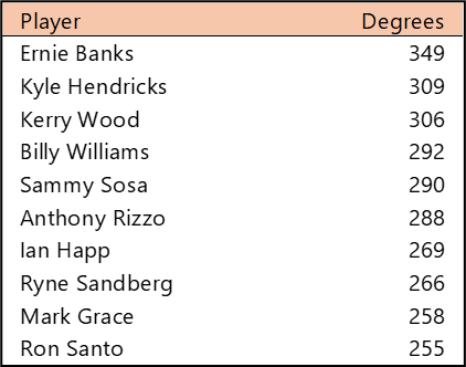
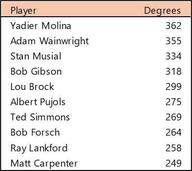
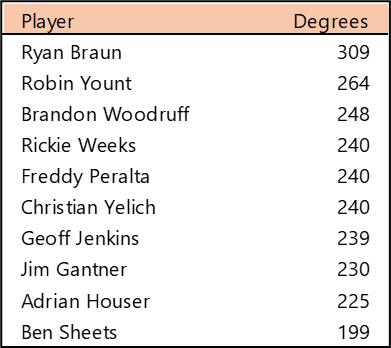
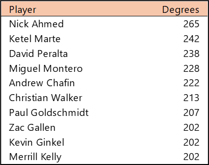
Top 10 by Degree (the number of connections)
Nick Ahmed also has the most connections for Arizona, although Ketel Marte may eventually surpass him. David Peralta (2014-2022), Miguel Montero, and Andrew Chafin (2014-2020, 2023) have well over 200 connections apiece to rank in thed top five in franchise history.
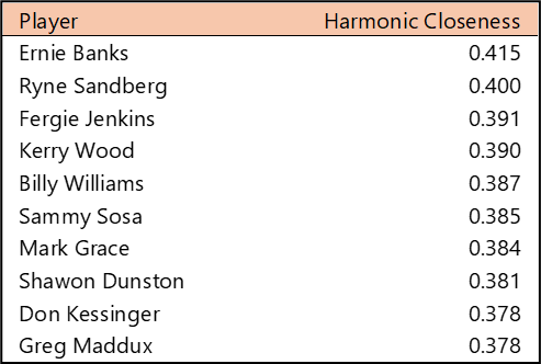
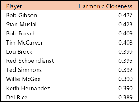
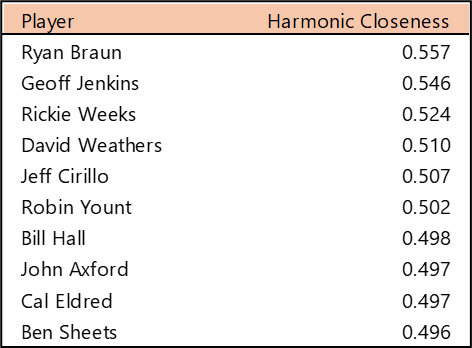
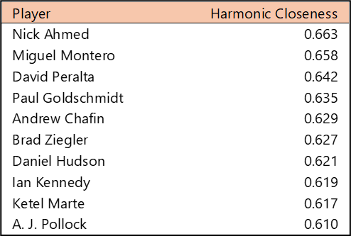
Top 10 by Harmonic Closeness Centrality
With Harmonic Closeness Centrality, we measure how closely an individual player is related to all other players in the network. This number (scaled from 0 to 1) often indicates a player’s importance to the network and may also note that they played with influential teammates. The top five here are familiar names from our prior metrics. They are followed closely by a handful of additional DBacks players. Numbers here are higher than for longer-tenured teams, given that a high percentage of players either played together or in adjacent periods.
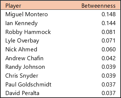
Top 10 by Betweenness Centrality
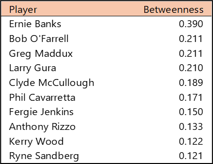
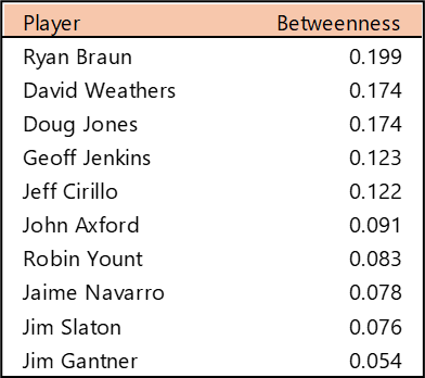
Betweenness Centrality measures which players rank highest in their ability to connect all other players. In simple terms, which player provides the most efficient path through the network (scaled from 0 to 1). Miguel Montero and Ian Kennedy (2010-2013, 2022). Kennedy indexes high due to his separate stints with the club, giving him two different networks of teammates.
Summary
That’s it for our overview of the Diamondbacks network. Be sure to visit the interactive graph to discover additional insights about the Diamondbacks players over the last 28 seasons. We’ll be back shortly with our next franchise entry. Thanks for reading!