Category: Data

MLB Trade Networks Part 3: Edges Code

In our previous post I shared the SQL code I created to pull data for our upcoming set of trade networks based on WAR (Wins Above Replacement) numbers from the Neil Paine 538 MLB data set. The prior post dealt with creating nodes for a network graph; this post will share code for edge creation. In simple terms, a graph needs edges that connect related nodes; for our case we need to connect transaction (trade) nodes to the teams and players involved in each transaction.

Part of what makes this case interesting is my desire to show edge weights based on the future WAR value each team received. Showing edges with varying weights will quickly help users to identify the relative importance of a trade. Wider edges will indicate a trade that involved high future value for one or both teams. In seeing the individual players involved in a common trade we can pinpoint where the future value (or lack thereof) comes from. This will become much clearer when the graphs are posted; I’ll do one or more posts on how to use and interpret each graph.

For now let’s examine the code. Gephi requires users to identify Source nodes and Target nodes whether the edges are Undirected (i.e.- it doesn’t matter which node leads to the other) or Directed. Our initial code is for transactions to teams:

SELECT CONCAT(tr.TransactionID, ‘-‘, tr.PrimaryDate) AS Source, t.franchID AS Target, CONCAT(‘The ‘, t.name, ‘ received ‘, ROUND(SUM(h.WAR162),1),
‘ wins in future WAR value’) AS Label,
IF(ROUND(SUM(h.WAR162),1) = tr.season and tr.Type = ‘T’ AND tr.Season >= 1901 and LENGTH(tr.TeamTo) = 3 AND LENGTH(tr.TeamFrom) = 3
AND tr.Season = t.yearID
GROUP BY tr.TransactionID, tr.PrimaryDate, t.franchID, t.name;

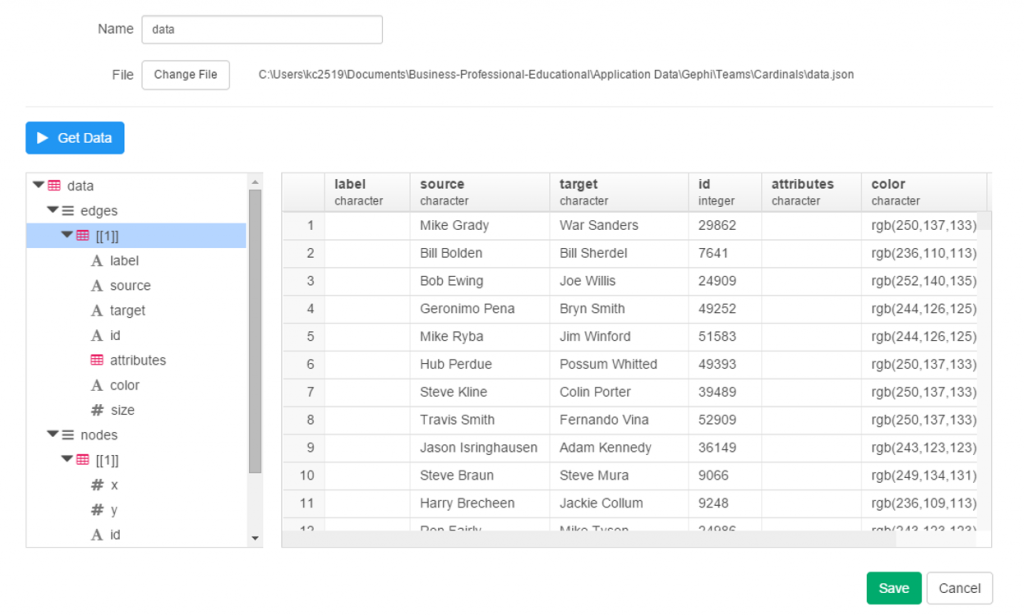
With this code we are linking every transaction to the teams receiving one or more players in a trade. Note that we are summing the WAR value to create an edge weight based on the total value received by each team. If four players were involved (two to each team) these edge weights will reflect the combined values of these players. Note that we are setting edge weight = 1.0 if the future WAR is less than 1 (some will actually be negative so we need a minimal edge to show). Here’s a sample of results:

In contrast, the edges linking a transaction to individual players are based solely on that one player’s value. In the case cited above we will wind up with four lines of varying weights. Otherwise the code is quite similar:

SELECT CONCAT(tr.TransactionID, ‘-‘, tr.PrimaryDate) AS Source, p.playerID AS Target, CONCAT(p.nameFirst,’ ‘, p.nameLast, ‘ provided ‘, ROUND(SUM(h.WAR162),1),
‘ wins in future WAR value for the ‘, t.name) AS Label,
IF(ROUND(SUM(h.WAR162),1) = tr.season and tr.Type = ‘T’ AND tr.Season >= 1901 and LENGTH(tr.TeamTo) = 3 AND LENGTH(tr.TeamFrom) = 3
AND tr.Season = t.yearID AND t.franchID = h.franch_ID
GROUP BY tr.TransactionID, tr.PrimaryDate, p.nameFirst, p.nameLast, p.playerID, t.name;

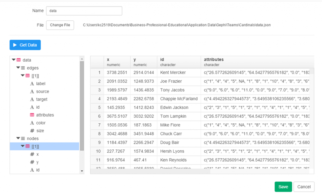
The same logic on edge weights applies but now at the player level. Here are a few results:

I hope this makes sense – it will all become much more clear when the network graphs are produced. The good news is that I already have three graphs created and many more to come shortly. I’ll have some of them available on the site later this week. As always, thanks for reading.

Trade Network Updates, Part 2 (node code)

Over the last 10 days I’ve been playing around with code that will enable some new versions of the MLB trade networks I premiered way back in 2015. The goal this time around is to factor in the future value of a trade to each of the participating teams. There are multiple measures that could be used for this assessment but I’m going with the WAR162 value from Neil Paine’s 538 github data source. Here’s how the site describes the War162 measure: JEFFBAGWELL WAR per 162 team games. Now you may ask why Jeff Bagwell? While he was a talented hitter for many years, his name is used as an acronym for this:

“The file “jeffbagwell_war_historical.csv” contains wins above replacement (WAR) data — according to JEFFBAGWELL (the Joint Estimate Featuring FanGraphs and B-R Aggregated to Generate WAR, Equally Leveling Lists), which averages together WAR from Baseball-Reference.com and FanGraphs — plus various other metrics for MLB since 1901.” Fun stuff, right?

The bottom line from my perspective is that this measure provides a robust way of assessing the value of a trade based on performance after the trade date. Did one team benefit while another team received a player who added no future value? Or did both teams make out equally well? Or was the trade of minimal value for both sides? These are the questions I’m attempting to visually address using network analysis and visualization.

Now comes the technical aspect for all you database and code lovers. First step is to create the network nodes; in this case we need to display the individual trade transactions, teams, and players. Let’s look first at the transactions using the Visual-Baseball MySQL source data:

SELECT CONCAT(a.Id, ‘-‘, a.PrimaryDate) as Id, CONCAT(‘Transaction ‘,a.Id,’ is from the ‘, a.Season, ‘ season’) AS Label,
‘Trade’ AS Type, SUM(a.Size) AS Size
FROM
(SELECT tr.TransactionID AS Id, tr.Season, tr.PrimaryDate, ROUND(SUM(h.WAR162),1) as Size
FROM historical_WAR_and_more h
INNER JOIN People p
ON h.key_bbref = p.bbrefID
INNER JOIN trades2021 tr
ON p.retroID = tr.Player
INNER JOIN Teams t
ON tr.TeamTo = t.teamID

WHERE tr.Season >= 1901 and h.year_ID >= tr.season and tr.Type = ‘T’ and tr.TeamTo = t.teamID and LENGTH(tr.TeamFrom) = 3
AND tr.Season = t.yearID and t.franchID = h.franch_ID

GROUP BY tr.TransactionID, tr.season, tr.TeamFrom, tr.TeamTo, tr.PrimaryDate) a

GROUP BY a.Id, a.PrimaryDate, a.Season;

Here we are simply creating a node for each trade transaction, a label showing the teams involved and the trade date, and summing up the previously mentioned WAR162 to size the nodes. This will be an important part of the graph – trades that created large future values (for one or both teams) will be more prominent in the graph. Small value trades will be represented by very small nodes indicating their relative lack of importance. This one was a challenge, but finally got the code to deliver the expected results.

The next step is to create team nodes; in this case we’ll provide a constant size:

SELECT t.franchID AS Id, tf.franchName AS Label, 15 AS Size

FROM historical_WAR_and_more h
INNER JOIN People p
ON h.key_bbref = p.bbrefID
INNER JOIN trades2021 tr
ON p.retroID = tr.Player
INNER JOIN Teams t
ON tr.TeamFrom = t.teamID
INNER JOIN TeamsFranchises tf
ON t.franchID = tf.franchID

WHERE tr.season >= 1901 and h.year_ID >= tr.season and tr.Type = ‘T’ and h.team_ID = tr.TeamTo and LENGTH(tr.TeamFrom) = 3

GROUP BY t.franchID, tf.franchName;

By applying a constant node size of 15, each team will have a similar appearance in the graph which will not distract us from the trade values (some will be much larger than 15).

Our third and final node step is to provide information on all players involved in one or more trades:

SELECT Id, Label, ‘Player’ AS Type, 5 AS Size
FROM
(SELECT p.playerID AS Id,
CONCAT(h.player_name, ‘ (‘, p.birthYear,’-‘,p.deathYear,’)’,’ played from ‘,LEFT(p.debut,4),’ to ‘,LEFT(p.finalGame,4)) AS Label

FROM historical_WAR_and_more h
INNER JOIN People p
ON h.key_bbref = p.bbrefID
INNER JOIN trades2021 tr
ON p.retroID = tr.Player

WHERE tr.season >= 1901 and h.year_ID >= tr.season and tr.Type = ‘T’ and LENGTH(tr.TeamFrom) = 3
and LENGTH(tr.TeamTo) = 3
AND p.deathYear > 1900

GROUP BY h.player_name, p.playerID, p.birthYear, p.deathYear, p.debut, p.finalGame

UNION ALL

SELECT p.playerID AS Id,
CONCAT(h.player_name, ‘ (‘, p.birthYear,’-‘,’ )’,’ played from ‘,LEFT(p.debut,4),’ to ‘,LEFT(p.finalGame,4)) AS Label

FROM historical_WAR_and_more h
INNER JOIN People p
ON h.key_bbref = p.bbrefID
INNER JOIN trades2021 tr
ON p.retroID = tr.Player

WHERE tr.season >= 1901 and h.year_ID >= tr.season and tr.Type = ‘T’ and LENGTH(tr.TeamFrom) = 3
and LENGTH(tr.TeamTo) = 3
AND ISNULL(p.deathYear)

GROUP BY h.player_name, p.playerID, p.birthYear, p.deathYear, p.debut, p.finalGame) a
GROUP BY Id, Label;

Here we are running a UNION query so we can gather information about the players moving in each direction of a trade (from one team to another). We then combine that information and apply a fixed size of 5 since there are far more players than teams. We’ll have the ability in the finished networks to zoom in and see more about each player.

Each of these 3 outputs (trades, teams, and players) is combined into a single input file that will feed Gephi. We should wind up with between 10k and 20k nodes which we’ll be able to filter
and zoom on in the network graph. I have high hopes for this set of networks (there may be one for each team as well as a comprehensive one) as it should really help display the most important trades in MLB history.

That’s it for our node creation process; the next post will share how we create the edges that will connect trades to teams and teams to players. Thanks for reading!

Trade Network Updates, Part 1

A few years back (2016 o be specific) I created network graphs displaying the history of trades made for each MLB franchise, using transactions data from the wonderful Retrosheet project. These graphs presented more than a few challenges in how to present the data but I wound up with what I consider to be a very interesting set of results, which you can find here. I also created some posts on the process at that time, found here and here.

Here’s a snapshot within a graph:

Six seasons have elapsed since I created those graphs, so I thought it was beyond time to update them, but this time with a twist. Last fall I came across a great dataset that captures an array of advanced sabermetric statistics which I hope to use on a regular basis. These statistics can be used to assess a player’s true value relative to his peers each season. What if I could incorporate those into the trade network updates to show the post-trade value of each player to their new team? Ideally, this will help to show the value of each trade and which team wound up getting the better part of the deal.

Of course this would involve adding a degree of complexity to the MySQL code for pulling the data and shaping it for use in creating network graphs. However, the end result could be very revealing and worthwhile. Today I’m at the start of the process, tinkering with SQL code to extract the data in a proper format. Here’s an example:

SELECT h.player_name, p.playerID, tr.season, tr.TransactionID, tr.TeamFrom, tr.TeamTo, ROUND(SUM(h.WAR162),1) as WAR

FROM historical_WAR_and_more h
INNER JOIN People p
ON h.key_bbref = p.bbrefID
INNER JOIN trades2021 tr
ON p.retroID = tr.Player

WHERE tr.season >= 1901 and h.year_ID > tr.season and h.team_ID = tr.TeamTo AND tr.Type = ‘T’

GROUP BY h.player_name, p.playerID, tr.season, tr.TransactionID, tr.TeamFrom, tr.TeamTo

In this case, I’m looking at the cumulative WAR (Wins Above Replacement) for each traded player with their new team. This could be a single season total or the sum of many years in some cases. Here are some results:

We now have post-trade results (starting if the season following the trade) as measured by WAR for each traded player. We see one fairly substantial figure – the second Aaron Harang trade which netted 16.9 WAR points for his new team, the Cincinnati Reds (CIN in the results). Given that a single season WAR above 3 or 4 is considered substantial, it’s clear that his new team probably benefited from a few of those high-value seasons. What we can’t see yet is what they gave away in their half of the trade.

Fortunately, we can access this using the TransactionID field, which provides all the information for each party within the trade. But we’ll save that for another day as I figure out the next progression of the code. As always, thanks for reading!

2021 Data is Here!

Happy day! Just finished uploading the 2021 baseball dataset from the Lahman baseball archive and Baseball-Databank, just in time for the 2022 season. Next step is inserting and updating the existing tables (with data back to 1901!) with the 2021 season stats. I can then move on to the fun side of the equation – updating existing visualizations and creating some new analyses and visuals. Stay tuned!

Recapping 2017

Observers of this blog will note that posts were scarce in 2017 – in fact this is the only one, and it’s being completed in 2018! This is the result of a variety of causes, including external projects, busy schedules, and focus that was shifted in other, unrelated directions. Still, 2017 was not without its moments.

For starters, I managed to create three data visualization courses for Packt:

Learning Data Visualization

Data Visualization Techniques

Advanced Data Visualization

Retrosheet data for the 2016 and 2017 seasons has also been downloaded, and is in the update process as we speak, which will enable some new visualization work (and perhaps a new book title) in 2018. Soon, annual season data from the Baseball-Databank and Sean Lahman will be available as well.

I’m also in the process of launching a new site at jazzgraphs.com, where I’ll use network visualizations to uncover the complex web of relationships between jazz musicians, labels, and recordings. Posters and a book are in the plans for 2018, so stay tuned.

Wishing all a happy and prosperous 2018, and I promise more content to come this year!

Exploratory DataViz Part 2

Having discussed some of Exploratory’s cool features in a prior post, I thought it would be fun to continue the exploration using JSON data as a starting point. I happen to have a fair amount of JSON on hand, thanks to a series of network graphs produced using Gephi and sigma.js, so why not put it to use with Exploratory and start creating a new dataviz?

If you have previously worked with JSON, you’re no doubt aware that it can be a bit fickle – miss a bracket or brace in one place and the entire file fails to load a visualization. However, knowing that my JSON has been successful in producing network graphs (see here for examples), I figured it was worth a shot with Exploratory.

To begin, start with the local import option, selecting the json option, and pointing it to your local file. Give it a name, run the process and cross your fingers! After a few seconds, I’ve got my results, and Exploratory has done a good job categorizing the data:

exploratory_2.1

Since this is network data, we have nodes and edges, as well as any additional attributes, such as color or size. Exploratory has picked up those groupings, first the edges, and now the nodes.

exploratory_2.2

Finally, the attribute values:

exploratory_2.3

Since we’re satisfied with the import, we can move on to the summary data, which in this case doesn’t make a whole lot of sense. No matter, let’s see what can be done with some charts and analysis.

exploratory_2.4

To start with, we have x and y values associated with each node, which sounds like a perfect candidate for a scatter plot. We add the x value to the x-axis (how convenient was that!), the y value to the y-axis, node size as the Size attribute, and finally the Eccentricity attribute for color. FWIW, eccentricity is not a measure of flakiness, but rather the distance between the most remote points in a graph. This is where the six degrees of separation (or Kevin Bacon, take your pick) concept comes into play; an eccentricity value of 6 equates to 6 degrees of distance. Here’s our result:

exploratory_2.5

Not bad, eh? We can also hover over each node to see who it is (after adding Id to the Label field):

exploratory_2.6

We still have a lot of activity in a limited space, so now let’s use a simple filter (see the command line at top) to grab the top 50 values, and see the results:

exploratory_2.7

Now let’s create a new branch to explore further. I would like to sort my dataset using the Betweenness Centrality attribute, but there’s one problem – it’s a character value at the moment, so it doesn’t sort numerically. No matter, we can fix that easily using the Mutate command to convert the variable type. This can be seen in the right margin, where Exploratory conveniently stores all actions. Now we can sort our values in descending order to understand who is most influential in the network (at least by this measure). FYI – Betweenness Centrality tells us which nodes others must pass through most frequently to connect elsewhere within the network. Typically, but not always, it is someone centrally located within a network; sometimes it may be a less influential character (Pedro Borbon in this case) who connects more distant groups to one another.

exploratory_2.9

So there you have it, another quick walk-through with Exploratory. Before I sign off, here’s the live scatter plot you can play with via the Exploratory server. Be sure to use the simple zoom features to traverse the chart!

Open Source Data Viz: Exploratory

It’s absolutely a great time to be alive and involved in data viz, courtesy of the wealth of exceptional open source projects. Several recent open source discoveries are currently on my radar, and worthy of further exploration. Over the next few weeks I’ll examine a few of these options, using baseball data (of course) to illustrate the possibilities within each application. Specifically, we’ll take a look at Trelliscope, bokeh, rbokeh, and Exploratory, and provide some insight and examples into how each of these projects function. This post will focus on Exploratory, an exciting new tool from Kan Nishida.

Exploratory is another R-based application that leverages a multitude of R capabilities while providing its own intuitive interface. While still in beta testing, Exploratory appears to have a very bright future as a powerful visualization tool that allows non-coders to tap into the enormous power of R. The ability to harness a considerable portion of the R language through Exploratory’s GUI is a powerful option for those (like me) with limited R experience and expertise.

Exploratory has a very clean, intuitive interface that may feel a little unusual to long-time R users accustomed to multiple panes and workspaces. Yet beneath the surface, it possesses considerable power, as we’ll see in this tutorial. To start our process, we’ll need a data frame, a familiar object for R users. Let’s begin by examining our data frame options.

First up, we can load a local source file in a variety of formats:
exploratory_local
Some of the usual suspects are here – text and Excel files, but we also have the ability to load json data as well as some of the more prominent statistical formats including SAS and SPSS data. Very cool. We’ll come back to this later.

Now let’s see the remote options:

exploratory_rscript

Great! Not only can we gain direct access to MySQL databases (a huge plus for me), Exploratory also provides access to a diverse range of option including Twitter search, MongoDB, and web scraping. We’re going to look at some specific examples later, but for now, here’s a glimpse of the MySQL data import window:

exploratory_mysql

As with the entire app, the design is clean and intuitive. In a bit, I’m going to load details into this window so we can test the MySQL functionality.

A third import option exists in the availability to access any existing R scripts you may have previously created:

exploratory_rscript

I’m not going to spend a lot of time here, due to the fact that I don’t have a lot (any?) of personal scripts. However, for seasoned R coders, this seems like a great feature.

Now let’s walk through some of Exploratory’s capabilities using a MySQL connection. The MySQL setup is really easy – just fill in your database connection parameters and you’re good to go. Here’s what it looks like for this example, with a few fields grayed out for security reasons.

MySQL connection

Once the connection is established, Exploratory will display the initial rows in the dataset. If we click the Run button, our data is pulled into a Summary view, where every variable in the data is summarized. This is a great way to see if our data looks as expected, and allows us to determine if the correct variable type (integer, date, etc.) is associated with each field.

exploratory_summary

If everything looks good, we can move on to the Table option, which will resemble the MySQL view we just saw. No surprises here:

exploratory_table

If we’re satisfied so far, then it’s time to move on to the fun aspects of Exploratory. For me, this starts with viewing data using the Charts selection. As of this writing, there are 10 chart options (two are actually mapping selections for geo data) including bars, scatter plots, box plots, heatmaps, and more. For me, this is a real strength of Exploratory; the ease with which we can see plots of our data is great! Here I’ve chosen a couple stat fields (at bats (AB) and runs (R)) to illustrate the scatter plot functionality.

exploratory_chart

The charts are clean and attractive, and provide some additional options. For scatter plots, labels can be added via a simple check box. This permits me to add hover labels, as seen below:

exploratory_chart_label

Pretty nice so far, don’t you think? But as the old commercials used to say ‘wait, there’s more’. The considerable power of R lies beneath the surface, enabling statistical testing, filtering, data manipulation, and so much more. Here’s a glimpse of just a handful of available options for working with your data:

exploratory_options

Let’s select a filter option, where we’ll reduce the data to look only at players age 30 or greater. One of the other great aspects of Exploratory is it’s exposition of R code. We can use the built in menu commands while viewing the actual R code. For experienced R users, the functions can be entered directly in a text box, and for us less experienced coders, we can learn on the fly by seeing the output.

exploratory_filter

Now we see the same scatter plot populated with players 30 and older.

Another great feature is the ability to create branches within a project. This facilitates going down multiple paths within one workspace, rather than having to retrace our steps or rerun charts each time something changes. All we need to do is click the branch button, and a new tab is created for us. Very simple and intuitive, as is virtually everything in Exploratory.

exploratory_branch

In this instance, we’ve elected to run a correlation on the chart variables in our main flow, while we create a new box plot in our branch.

exploratory_branch_chart

I’ve been very impressed thus far with Exploratory, and have barely scratched the surface. My next step will be to create some real content that can be shared in a post or via some new visualizations on the site. I love the ease of accessing my data via MySQL, and immediately having the ability to create plots, filter data, and run statistical explorations.

ODSC: Analyzing Complex Networks Part 2

This is part two of a brief series sharing components of my presentation titled Analyzing Complex Networks Using Open Source Software at ODSC East in Boston on May 21st. The first post looked at a few examples from a Boston Red Sox players network, while this one examines a Miles Davis album and musician network. I’ll share a few examples of network analysis within the context of the Miles Davis graph.

The Miles Davis network could be described as a tripartite network, or one with three layers. Miles is at the center, and connects to each of nearly 50 recordings. Other musicians then connect to the respective recording(s) they played on, but not to one another. This approach provides a very clear look at musical phases in the career of the legendary trumpeter, without the graph being clouded by excessive detail. Here’s a view of the final network, after which we’ll look at some components of the graph.

miles_1

We see some interesting patterns in the graph, specifically in viewing the pink circles, which represent individual albums. Musicians playing on a recording can be seen adjacent to that recording, except in the case of musicians present on multiple albums. We would expect them to be positioned relative to all of the recordings they played on. A quick visual scan leads to five distinct clusters, as seen in the next screenshot.

miles_2

Now that we have identified these clusters, it would be helpful to understand their meaning and relevance to Miles career. Using the graph in interactive fashion, we can learn more about the recordings and musicians, and begin to formulate some insights. These can be confirmed by referring to album links on the web or in Wikipedia, which give context to what we are viewing. Based on these steps, here is a quick overview of the five clusters.

miles_3

A final step might be to add some verbiage using PowerPoint or Inkscape, which I’ve done below in very minimalist fashion. We could also add this to a web version using CSS attributes to position the text, although this could get tricky as we pan and zoom on the graph. We might be better off using some sort of stylized marker (color or shape) to communicate some of this information.

miles_4

There is much more that could be done, but I hope this brief example shed some light on the usefulness of network graphs, especially from a pure visual perspective.

ODSC: Analyzing Complex Networks Using Open Source Software

I’ll be presenting at the 2016 ODSC East event in Boston May 20-22. ODSC stands for Open Data Science Conference, where the focus is on using open data or open source tools to do clever things in the information space. The topic of my presentation is Analyzing Complex Networks Using Open Source Software, where I’ll talk through several example networks built using Gephi and Sigma.js.

While the slides are not all prepared at this stage, I’ll share a few bits that will wind up in the talk. My goal is to convey to the audience how networks can be used to statistically and visually understand complex information. After providing an overview of network analysis (at a very high level), I’ll be sharing slides from three very different networks – a Miles Davis album network (created in 2014 and rebuilt in 2016), a Boston Red Sox player network (also built in 2014), and a brand new example using data from the amazing GDELT Project.

Here’s a glimpse into what I’ll be sharing, starting with the Red Sox examples, where we examine the networks of three well known players from the last 100 years. First, Ted Williams network:

odsc_williams

Followed by Carl Yastrzemski:

odsc_yaz

Now Jason Varitek, longtime catcher and captain for two World Series championship teams:

odsc_varitek

In talking through each of these networks, I will attempt to highlight some differences in their respective structures based on the era in which each player spent time with the Red Sox. For example, there are many more connections in the Varitek network compared to Williams and Yaz, despite a shorter duration with the team. Why would this be the case? Perhaps spending time in the era of higher salaries, larger pitching staffs, and the evolution of free agency might go a long way towards explaining why Jason Varitek crossed paths with far more players than did his earlier predecessors.

Stay tuned for additional posts featuring the Miles Davis and GDELT networks.